Table of Contents >> Show >> Hide
- A Cottage Kitchen With Good Bones and Better Instincts
- The Layout: Small-Galley Problems, Smart Open-Plan Solutions
- The Materials Do the Heavy Lifting, Quietly
- Lighting That Solves a Problem Without Looking Like a Compromise
- The Details That Keep It From Feeling Precious
- Why This Los Feliz Kitchen Feels So Timeless
- Design Lessons to Borrow From This Cottage Kitchen
- What This Kitchen Gets Right About Modern Cottage Style
- Extra: Living With a Kitchen Like This in Real Life
- Conclusion
Some kitchens want applause. This one just wants to make coffee, roast a chicken, and look impossibly charming while doing it. That, in a nutshell, is why this Los Feliz cottage kitchen works so well. It is stylish without being smug, thoughtful without becoming fussy, and warm without slipping into “farmhouse-but-make-it-a-theme-park” territory. In a design era that sometimes confuses more with better, this kitchen goes in the opposite direction. It edits. It calms down. It keeps what matters.
The space belongs to architect George Kypreos and designer Shana Sherwood, the husband-and-wife team behind Sherwood Kypreos. Their own home project, a 1938 colonial cottage in Los Feliz, became the perfect test case for the design values many homeowners say they want but do not always commit to: respect the architecture, improve the function, choose materials that age well, and resist the urge to bulldoze every trace of the past. The result is a kitchen that feels deeply personal and oddly universal at the same time. Even if your house is not in Los Angeles, and even if your ceiling does not soar quite so dramatically, there is a lot here worth borrowing.
A Cottage Kitchen With Good Bones and Better Instincts
The story begins with the kind of house design people love to romanticize: old, unrenovated, a little dark, a little awkward, and full of original character. In other words, exactly the sort of place that can either become a dream home or an expensive emotional support project. Sherwood and Kypreos saw the good version. The cottage had architectural detail, age, and soul. What it lacked was a kitchen that could keep up with modern life.
Before the remodel, the kitchen was a small galley. Functional enough, perhaps, if your daily menu was toast and denial. But for a growing family and two design professionals who understand how space shapes routine, it was too closed off and too dim. Their answer was not to erase the house’s identity. Instead, they reoriented the kitchen so it opened to the dining area while preserving the features that gave the room its specific personality: vaulted ceilings, wall cladding, and a tall brick fireplace element. That decision is the entire thesis of the project. The renovation does not pretend the cottage was born yesterday. It lets the house keep its accent.
The Layout: Small-Galley Problems, Smart Open-Plan Solutions
One reason this Los Feliz cottage kitchen feels so successful is that the layout changed just enough. Not in a flashy “let’s add a stadium-size island and three sinks” way, but in a measured way that makes daily life easier. By moving walls and opening the kitchen to the dining room, the couple turned a narrow work zone into a social space. Suddenly, the room could support cooking, conversation, and family life at the same time.
That move matters because cottage kitchens often live or die by circulation. In smaller or older homes, the challenge is not only storage. It is flow. Where do you stand when someone opens the oven? Can two people cook without performing an apologetic little sidestep dance? Does the kitchen connect to the rest of the house, or does it sulk in the corner like it is grounded? Here, the new plan creates visual openness while keeping the room intimate. It still feels like a cottage kitchen, not a generic open-concept box.
The dining connection also helps the kitchen read as part of a lived-in home rather than as a showroom set. That distinction is huge. A lot of beautiful kitchens look amazing in photos and strangely nervous in real life. This one appears ready for an actual Tuesday.
The Materials Do the Heavy Lifting, Quietly
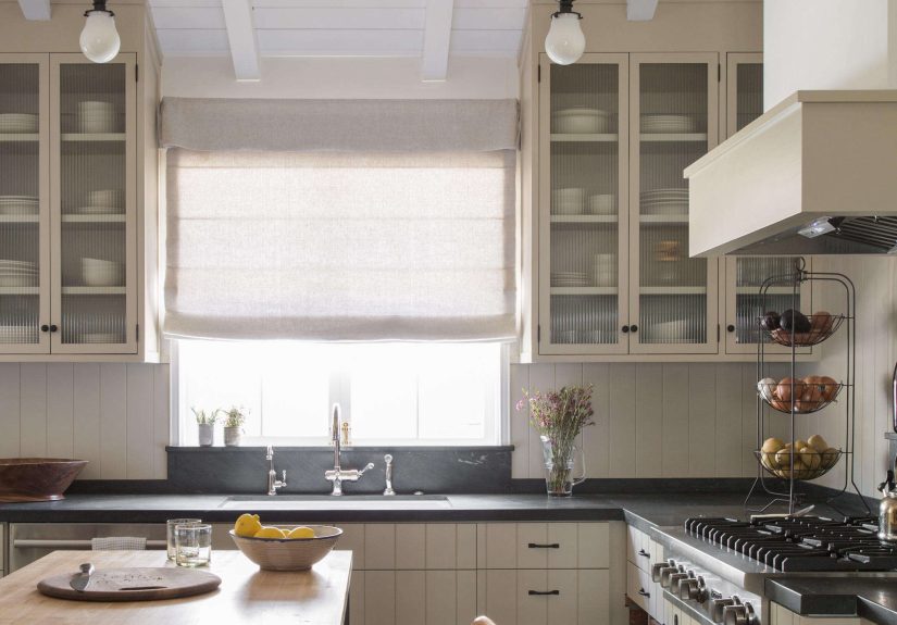
If the layout is the brain of this kitchen, the materials are the mood. Sherwood reportedly landed on the central palette in a flash: khaki-toned cabinetry paired with black counters. It is a terrific combination because it feels grounded, natural, and slightly unexpected. Not stark. Not sugary. Not trend-bait. Just calm.
The cabinetry carries that mood beautifully. Rather than slick modern fronts, the cabinets feature V-groove detailing that echoes the home’s existing cladding and wainscoting. That one choice ties the new work back to the original architecture, which is why the room feels cohesive instead of merely renovated. It is an excellent reminder that cabinetry is not only storage. It is also one of the strongest architectural statements in a kitchen.
Then come the counters, and this is where the space gets especially smart. The main counters and range backsplash are soapstone, while the island is topped in maple butcher block. This mixed-material approach gives the room texture and purpose. Soapstone brings depth, softness, and old-house credibility. It also develops patina, which means scratches and wear do not read like failure; they read like time. Butcher block on the island adds warmth and furniture-like character, making the center of the room feel less like built-in millwork and more like an heirloom worktable that just happens to be very useful.
This is one of the best ideas in the whole kitchen. Too many remodels choose a single counter material and spread it everywhere, hoping consistency will create elegance. Sometimes it does. Sometimes it just creates a giant slab of sameness. Here, the contrast between soapstone and wood makes the room feel layered and intentional.
Lighting That Solves a Problem Without Looking Like a Compromise
The vaulted ceiling is part of the kitchen’s charm, but it also created a practical challenge. Recessed lighting was not an easy option, so the couple chose black pendant lights installed on exposed conduit. This could have gone terribly wrong. Exposed conduit can look either delightfully honest or aggressively hardware-store. In this kitchen, it works because the fixtures suit the house and the palette. The black pendants add definition and rhythm without dragging the eye downward.
More importantly, the lighting respects the architecture instead of forcing a different language onto it. That is a lesson worth underlining. Good renovation is often less about adding expensive things and more about choosing the right kind of compromise. The best solution is not always the most invisible one. Sometimes it is the one that says, “Yes, this old house has quirks, and we designed with them instead of against them.”
The Details That Keep It From Feeling Precious
One of the most appealing things about this architect-designed kitchen is that it does not take itself too seriously. Yes, the materials are thoughtful. Yes, the palette is elegant. But there are also vintage cane-seat stools from a flea market, salvaged appliances sourced through professional connections, and storage above the ovens and refrigerator for extra cookware and novelty mugs. Novelty mugs! At last, representation for the people whose kitchens contain both artisanal cutting boards and one cup with a terrible joke on it.
That mix of refinement and reality is exactly why the room feels believable. The island was designed to feel like furniture, not just cabinetry with delusions of grandeur. The brick arch under the range was retained and integrated instead of demolished. Shelves were repurposed for cutting boards. A former indoor barbecue was adapted into a counter-height fireplace. The room is full of moves that are economical in spirit, even when they are not strictly cheap. They respect existing conditions, reuse what works, and let character accumulate.
Why This Los Feliz Kitchen Feels So Timeless
“Timeless” is one of those design words that gets used so often it starts to sound like a scented candle description. But this kitchen earns the label. It feels timeless because it is not chasing novelty. The colors are muted and earthy. The materials improve with wear. The millwork belongs to the house. The island looks like furniture. The room opens to daily life rather than standing apart from it.
It also understands something many great kitchens understand: timeless design is emotional, not just visual. A room lasts when it feels calm, intuitive, and human. This one does. There is a sense that the kitchen will look even better after years of dinners, morning light, oil-rubbed counters, and mildly chaotic family life. That is the dream, really. Not a kitchen that never changes, but a kitchen that changes well.
Design Lessons to Borrow From This Cottage Kitchen
1. Preserve the oddities that give the house its personality
The vaulted ceiling, paneling, and brick elements are not inconveniences here. They are assets. If you are renovating an older home, do not start by asking what can be removed. Start by asking what gives the room its memory.
2. Let your island feel like furniture
A furniture-style island softens a kitchen instantly. It makes the room feel collected rather than factory-installed. This works especially well in cottage kitchens, where warmth matters as much as efficiency.
3. Mix countertop materials with purpose
Soapstone near the range and butcher block on the island is not random. It creates functional zones while adding visual depth. One material does not have to do every job.
4. Choose muted colors that work with age
Khaki, bone, soft gray, muddy olive, black, and warm wood all age gracefully. They also play nicely with old homes, where bright trend colors can sometimes feel like an unexpected guest who overstayed.
5. Build in beauty, then leave room for life
The best part of this kitchen is not any single item. It is the atmosphere. It feels designed, but not overdesigned. That is an important difference. Real kitchens need room for fruit bowls, school notes, cast-iron pans, and the occasional baking disaster.
What This Kitchen Gets Right About Modern Cottage Style
Cottage style can go very wrong, very fast. Too many ruffles, too much faux-rustic distressing, too many signs announcing that the kitchen is, in fact, a kitchen. This Los Feliz project avoids all of that. It proves that cottage kitchen design does not have to be twee. It can be architectural. It can be edited. It can feel sophisticated while still being welcoming.
That balance is what makes the project worth studying. The room has all the warmth people want from a cottage kitchen: wood, paneling, patina, collected seating, soft color, visible texture. But it also has the discipline people forget they need: restraint, proportion, continuity, and function. Put simply, it is cozy with standards.
Extra: Living With a Kitchen Like This in Real Life
Now for the part photos cannot fully explain: what it is actually like to live with a kitchen designed this way. A room like this changes your routine in small, sneaky ways. You notice it in the morning first. Soft light hits the muted cabinetry instead of bouncing harshly off a glossy finish. The space does not jolt you awake; it eases you in. Coffee feels a little more ceremonial, even if you are still standing there in yesterday’s sweatshirt trying to remember whether you already fed the dog.
During the day, the openness to the dining room makes the kitchen feel social rather than isolated. One person can cook while someone else reads at the table, answers emails, folds laundry, or pretends to help by cutting exactly one lemon. That visual connection matters more than square footage alone. It turns cooking from a back-of-house task into part of family life.
The mixed materials also become more enjoyable over time. Soapstone is one of those surfaces that gets better the moment you stop expecting perfection from it. It darkens, softens, and develops character. The butcher block island feels warm under your hands in a way stone never will. It invites use. You can imagine rolling dough there, unloading groceries there, wrapping birthday gifts there, or letting a child sit nearby with crayons while dinner happens. A kitchen island that feels like furniture also changes the tone of the room. It says, “Stay a while,” not just, “Prepare ingredients efficiently.”
Then there is the storage experience, which rarely gets poetic treatment but absolutely should. Custom cabinetry with the right detailing does more than hide clutter. It lowers visual stress. You are not staring at twelve mismatched appliances begging for attention. You are moving through a room where things have a place, even if that place is above the ovens next to a ridiculous souvenir mug. Good storage is not glamorous, but it is the reason a kitchen keeps feeling beautiful after the renovation high wears off.
A kitchen like this also teaches you to appreciate maintenance that feels meaningful. Oiling butcher block. Letting soapstone age. Watching painted cabinetry soften in the changing light. None of it feels sterile. It feels participatory. The room asks for care, but in return it becomes more itself over time. That is very different from high-gloss kitchens that look amazing for six weeks and then send you into a panic every time someone sets down a spoon.
Most of all, a Los Feliz cottage kitchen like this succeeds because it supports ordinary life beautifully. It does not need a dinner party to prove its worth. It is just as convincing on a rainy afternoon with a simmering pot, a stack of mail, a friend leaning on the island, and toast crumbs you have not gotten to yet. That is the real luxury here. Not perfection. Not trendiness. Just a kitchen that knows how to live.
Conclusion
The genius of this Kitchen of the Week is not that it is dramatic. It is that it is disciplined. Shana Sherwood and George Kypreos created a Los Feliz cottage kitchen that feels rooted in its 1938 home while working beautifully for modern family life. By preserving character, opening the layout, mixing soapstone and butcher block, using furniture-like forms, and leaning into muted, earthy color, they built a room that feels both polished and deeply comfortable.
For homeowners planning a historic kitchen remodel, this project offers a valuable reminder: the goal is not to make an old house behave like a new one. The goal is to make it function better while letting its best qualities stay visible. This kitchen does exactly that, and that is why it lingers in your mind. It is charming, yes. But more important, it is convincing.