Table of Contents >> Show >> Hide
Some kitchens try to impress you in the first five seconds. They arrive dressed like they are headed to a gala, dripping in statement stone, dramatic pendants, and enough polished brass to blind a sleepy houseguest before coffee. The kitchen from Another Country and Husk in England takes the opposite route. It does not shout. It murmurs. It says, “Come in, put the kettle on, and stop panicking about trends for a minute.” And honestly, that level of confidence is far more attractive.
This space works because it understands something many kitchen remodels forget: beauty is not only about what looks expensive. It is about rhythm, proportion, materials, touch, and the quiet intelligence of a room that knows how it will be used. In this collaboration, Another Country brings its refined, furniture-minded point of view, while Husk contributes the technical know-how of bespoke kitchen fronts and in-house making. The result is a kitchen that feels warm, practical, and deeply settled, even though the underlying idea is surprisingly modern: elevated fronts designed to work with IKEA and Howdens cabinet systems.
That combination is a big reason this project feels relevant far beyond England. Homeowners in the United States have been moving toward kitchens that feel less sterile and more lived-in, less showroom and more home. Warm wood, layered texture, mixed storage, and English-inspired ease are all having a moment. But this kitchen avoids the trap of looking like it was assembled from a trend report and a Pinterest emergency. It has restraint. It has personality. And, best of all, it has a little wit.
A Collaboration That Makes Sense the Minute You See It
Another Country has long been associated with furniture and interiors that reinterpret familiar forms without sanding away their soul. You can see hints of British country style, Shaker simplicity, Scandinavian calm, and Japanese clarity in the brand’s design language, but nothing feels costume-y. Husk, meanwhile, specializes in made-to-order fronts and kitchen customization, with craftsmanship and sustainability baked into the process. Put the two together and you get a collection that feels neither fussy nor flat. It lands in that sweet spot where design nerds nod approvingly and regular people say, “I just like how this feels.”
The smart move here is the structure behind the style. These are bespoke fronts designed to fit standard cabinet systems. That matters because it brings flexibility to the project. Instead of blowing the entire budget on fully custom joinery, homeowners can start with a dependable cabinet framework and put more attention into the surfaces they actually see and touch every day. It is a classic high-low move, but done with enough elegance that no one feels like they are “settling.” They are choosing wisely, which is much less glamorous than overspending, but far better for real life.
Why This Kitchen Feels So Calm
The V-groove detailing creates rhythm without fuss
The standout feature is the V-groove cabinet detailing. Instead of flat fronts that disappear or ornate paneling that demands applause, these fronts create a subtle vertical cadence across the run of cabinetry. The grooves draw the eye sideways and make the kitchen feel composed, almost architectural. According to the project materials, the patterning takes inspiration from ridge-and-furrow lines in the landscape, which gives the detailing a pleasing logic. It is decorative, yes, but it is not decoration for decoration’s sake. It feels rooted.
That is the genius of the design. The texture does the heavy lifting. It adds movement, shadow, and personality without relying on a loud color or a trendier profile that might age badly. Kitchens are full of hard surfaces, so a detail like this softens the overall impression. It gives the room a pulse. In design terms, it is subtle. In daily life, it is the kind of subtle that keeps a room from becoming boring.
The palette looks borrowed from the landscape, not the paint aisle panic zone
The collection is offered in earthy painted tones as well as natural ash veneer, and that choice tells you a lot about the philosophy behind the kitchen. These are not colors that scream for attention from across the street. They sit low in the room. Misty green, warm red, muted yellow, gray, and deep green all nod to the West Country landscape, while the natural ash option leans more Scandinavian and stripped back. Either way, the palette is grounded, tactile, and intentionally un-flashy.
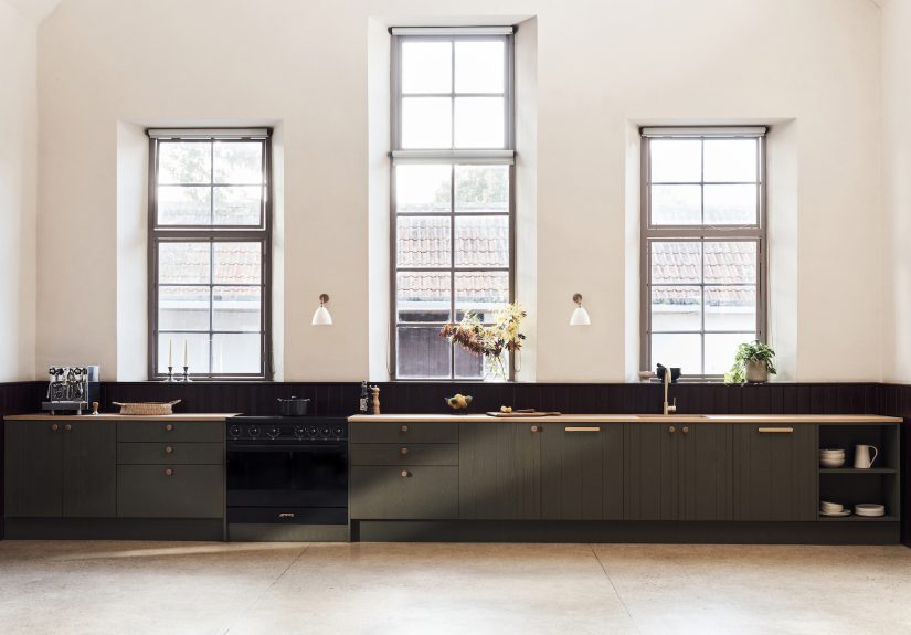
In the featured kitchen, the darker green finish feels especially effective because it balances sophistication with a kind of rural practicality. It makes the room moody in the best way, but not gloomy. Pair that with a long wood countertop and the whole kitchen starts to feel like a piece of furniture stretched to architectural scale. It is rich, but not precious. Think less “show home” and more “someone here actually cooks soup in a big pot and owns real cutting boards.”
The room balances open and closed storage like an adult
One of the easiest ways to wreck a kitchen is to go all-in on either hiding everything or displaying everything. Hide it all and the room can feel cold and overbuilt. Display it all and suddenly your colander has become a public speaking engagement. This kitchen gets the balance right. There are drawers, cabinet doors, and undercounter open shelving, which means the visual weight shifts in a relaxed, useful way.
The open sections lighten the long run of cabinetry and make everyday items feel accessible. Bowls and plates become part of the composition instead of clutter. At the same time, the closed storage preserves calm and hides the inevitable chaos of modern kitchen life: half-used parchment paper, the blender attachment you swear you need, and at least three mystery lids with no visible pot. It is a humane setup, not a fantasy setup.
The Details Worth Stealing
The beadboard backsplash is a quiet masterstroke
A glossy beadboard surround serving as backsplash is one of those details that could have gone terribly twee if handled badly. Here, it works because the finish is clean, the lines are simple, and the rest of the room stays disciplined. Beadboard brings vertical texture that echoes the fronts, which helps the entire kitchen feel coherent. It also introduces a familiar, almost nostalgic note without pushing the space into cottage-core cosplay.
This is a useful reminder that backsplashes do not always have to be tile Olympics. Sometimes the best move is a material that adds depth and continuity rather than a pattern that hijacks the room. The beadboard does exactly that. It connects the kitchen to the surrounding architecture and lets the cabinetry remain the star.
The countertop keeps the whole composition warm
The long wood worktop is doing more than providing prep space. It acts as a visual bridge, warming up the darker cabinetry and softening the room’s geometry. Wood surfaces can make a kitchen feel less clinical, which is one reason they continue to appeal to designers who want a room to age gracefully rather than perform like a pristine operating theater. In this project, the worktop reinforces the feeling that the kitchen belongs to the house rather than sitting inside it like a modular alien spacecraft.
There is also something emotionally useful about a wood surface in a kitchen. It absorbs light differently from stone. It feels better under the hand. It develops character. In a room centered on repetition and cabinetry, that natural grain keeps everything from feeling overly controlled.
The hardware reads like furniture, not filler
Solid wood knobs and pull bars are a small choice with a big effect. They keep the kitchen from tipping into metallic overstatement and support the furniture-like quality of the cabinetry. Hardware is often where kitchens lose the plot. A beautifully calm room gets interrupted by pulls that look like they came from a luxury submarine. Not here. The wood hardware keeps the mood consistent and adds one more layer of tactility.
The dining zone finishes the sentence
Another Country’s table and chairs in the room matter more than they might seem at first glance. They reinforce the idea that this kitchen is not merely a cooking station. It is a place for eating, talking, working, lingering, and pretending you are only sitting down for five minutes before suddenly realizing it is dark outside. The best kitchens today often blur the line between workspace and living space, and this one does so naturally.
<h before suddenly realizing it is dark outside. The best kitchens today often blur the line between workspace and living space, and this one does so naturally.
Why It Feels Current Without Feeling Trendy
One reason this kitchen resonates now is that it aligns with several broader design movements without leaning too hard on any one of them. There is the renewed affection for English kitchens, with their layered warmth, practicality, and sense of history. There is the ongoing love for wood-forward spaces and material honesty. There is the popularity of custom fronts that elevate standard cabinet systems. There is also the rise of kitchens that feel a bit less fitted and a bit more collected over time, even when they are brand-new.
But this kitchen’s real achievement is that it filters those ideas through discipline. It does not beg to be called timeless, which is usually the first sign something is not. It simply uses durable forms, restrained color, and good proportions. That is what actually lasts. The room understands that trend-resistant design is not about avoiding personality. It is about choosing a personality that will still be likable in ten years.
What Homeowners Can Learn From This Kitchen
Upgrade the visible layers first
If you are remodeling on a realistic budget, this kitchen offers a valuable lesson: spend where your eyes and hands go. Fronts, handles, worktops, lighting, and finishes shape the emotional experience of the room. When the cabinet structure underneath is smart and serviceable, you can create a remarkably custom result without paying for every cubic inch to be reinvented.
Use texture as your drama source
Not every kitchen needs a screaming stone slab or a color that can be seen from space. Texture can do the job instead. V-groove fronts, beadboard, visible grain, and open shelving create richness without visual fatigue. That is a particularly useful strategy if you want a kitchen that feels designed but not exhausting.
Let practicality become part of the beauty
Open shelves for everyday dishes, accessible drawers, unfussy lighting, and sturdy finishes all contribute to the appeal here. None of those choices feel compromised. In fact, they are what make the room beautiful. Good kitchens do not separate utility from style. They let each improve the other.
Make the kitchen sociable
The presence of a real dining setup is a reminder that kitchens should support gathering, not just meal prep choreography. Even a compact room benefits from some gesture toward staying a while, whether that is a small table, a bench, or an island edge where someone can sit and distract the cook with unnecessary stories. Hospitality is a design feature too.
Living With a Kitchen Like This: The Experience
Now for the part glossy design stories sometimes skip: what would it actually feel like to live with a kitchen like this? Quite wonderful, I suspect, and not in a dramatic influencer way. More in the quietly addictive way that good rooms get under your skin. You would notice it first in the morning. The cabinetry would not assault you before coffee. The dark green or natural ash fronts would sit there looking composed, the wood counter warming up as daylight moved across it, the grooves catching just enough shadow to remind you that flat and blank are not the same thing. Even making toast would feel slightly more dignified.
Then there is the tactile side of the experience, which matters far more than people admit when planning kitchens. You would wrap your fingers around a solid wood pull instead of a cold, generic metal bar. You would rest a hand on a timber worktop that feels more forgiving and alive than a slick engineered surface. You would open a cabinet and see shelves or drawers that make immediate sense. Nothing in this kitchen appears designed to impress strangers for six minutes during a holiday party. It appears designed to make repeated daily use feel pleasant. That is a much harder thing to achieve.
The kitchen also seems likely to age well emotionally, which is different from simply aging well visually. Some rooms are exciting on day one and irritating by month six. They ask too much of you. They demand tidiness, perfect styling, or an endless supply of matching ceramics. This one feels more generous. The open shelving is limited enough that you can keep practical things at hand without turning the whole room into a museum of bowls. The darker tones and visible grain are forgiving. A cutting board left out looks intentional. A vase with branches looks charming. Even a pot on the stove looks like it belongs there. That kind of room makes you feel more competent than you are, which is one of design’s nicest tricks.
I can also imagine the social experience being especially strong. Someone leans against the counter while you chop onions. Another person sits at the table pretending to help while mostly offering opinions. Light from the sconces comes on in the late afternoon. The beadboard darkens a bit, the wood glows a bit, and suddenly the room shifts from workspace to hangout without any theatrical transformation. That is the beauty of a kitchen with furniture DNA. It is not only about efficiency. It is about atmosphere, and atmosphere is what makes people linger.
Perhaps the biggest pleasure, though, would be the lack of regret. This kitchen does not feel attached to a short shelf life. It is not trying to be futuristic, aggressively rustic, or algorithmically perfect. It trusts material, craft, and proportion. Living with a room like that tends to be calming because it does not ask you to keep up with it. It keeps up with you. It lets the wood patina, the shelves evolve, and the table become a landing spot for ordinary life. In a world full of interiors that perform for the camera, that may be the most luxurious thing of all.
Final Thoughts
The Another Country + Husk kitchen in England succeeds because it understands that a memorable kitchen is rarely built from one flashy move. It comes from many smart, modest decisions working together: textured fronts, earthy color, honest materials, useful storage, furniture-like hardware, and a layout that invites people to stay. It is a lesson in how to make a kitchen feel elevated without making it feel uptight.
If your dream kitchen is one that looks custom, feels grounded, and still seems like a good idea after the excitement of renovation has worn off, this project is packed with takeaways. Borrow the wood tones. Borrow the open-and-closed storage mix. Borrow the confidence to let texture do more than color. Most of all, borrow the philosophy. A kitchen does not need to scream to be unforgettable. Sometimes the smartest room in the house is the one that knows exactly how to keep its voice down.