Table of Contents >> Show >> Hide
- What You’ll Need (and a Tiny Bit of Planning)
- Option 1: Use a Word Invitation Template (Fastest Path to “Wow”)
- Option 2: Build an Invitation from Scratch (More Control, Still Totally Doable)
- Step 1: Set the invitation page size
- Step 2: Set margins (aka your “don’t cut off my text” safety zone)
- Step 3: Turn on helpful guides
- Step 4: Build the layout with text boxes (recommended)
- Step 5: Add design elements (without overdoing it)
- Step 6: Choose fonts like a grown-up (even if the event is a kids’ party)
- Step 7: Use hierarchy so people know what to read first
- Invitation Wording That Works for Any Occasion
- Make Your Invitation Look “Designed” (Even If You’re Not a Designer)
- Printing Your Invitation Without Drama
- Mailing Tips: Envelopes, Addresses, and the “Please Don’t Lose This” Strategy
- Making Multiple Invitations Fast: Mail Merge for Names (Optional, but Powerful)
- Troubleshooting: Common Invitation Problems (and Fixes)
- Conclusion: Your Invitation, Your Rules (Just Sized Correctly)
- Real-World Experiences: What Usually Happens (So You Can Avoid It)
Microsoft Word might not sound like the hottest invitation “design studio” on the planet, but don’t underestimate it.
Word is like that friend who shows up to the party in sensible shoes… and then absolutely carries the night.
With the right setup, you can make invitations that look clean, polished, and intentionalwithout paying a designer,
learning complicated software, or sacrificing your weekend to the chaos gods.
In this guide, you’ll learn two foolproof ways to create invitations in Microsoft Word (templates and from-scratch),
plus design rules that make anything look more professional, wording formulas for basically every occasion,
and printing tips that reduce the odds of you whispering “why” at your printer at 1:00 a.m.
What You’ll Need (and a Tiny Bit of Planning)
Before you click around in Word like it owes you money, decide these three things:
- Delivery style: print (hand out/mail) or digital (PDF/email/text)?
- Invitation size: common picks are 5×7, 4×6, or half-page (5.5×8.5). If you’re using pre-cut cardstock, match that size.
- Single-sided or double-sided: double-sided looks fancy, but requires more care when printing.
Pro tip: If you’re printing at home, choose a size your printer supports comfortably and do a test print on plain paper.
If you’re printing at a shop, ask whether they prefer PDF and whether they recommend bleed/safe margins (more on that later).
Option 1: Use a Word Invitation Template (Fastest Path to “Wow”)
If you want a good-looking invitation in the shortest amount of time, templates are your best friend.
You can start with Microsoft’s template galleries or templates built into Word.
Step-by-step: Find and customize a template
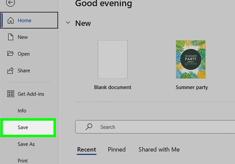
- Open Word and go to File > New.
- In the search bar, type invitation, party invitation, wedding, birthday, or your event type.
- Pick a design that matches the vibe (formal, playful, modern, minimalist).
- Replace the text with your event details. Keep your fonts consistentdon’t turn it into a “font buffet.”
- Swap images (if the template includes them). Use high-resolution photos for print.
- Save a working copy (DOCX) and a “final” version (PDF) for sharing/printing.
Template bonus move: Once you make a version you love, save it as your own reusable template (great for clubs, teams, or yearly events).
Option 2: Build an Invitation from Scratch (More Control, Still Totally Doable)
Starting from a blank document sounds scary until you realize you’re just assembling text, shapes, and images on a correctly sized page.
The biggest “secret” is getting the page size right firstbecause everything looks wrong if the canvas is wrong.
Step 1: Set the invitation page size
- Go to Layout (or Page Layout) > Size.
- If your size isn’t listed, choose More Paper Sizes.
- Enter the Width and Height for your invitation (example: 5 in x 7 in).
- Set Orientation (Portrait or Landscape) based on your design.
Important: Your document size should match your cardstock size exactly, or printing can scale/crop in annoying ways.
Step 2: Set margins (aka your “don’t cut off my text” safety zone)
- Go to Layout > Margins > Custom Margins.
- For most invites, start with 0.5 inches on all sides.
- If you want a clean, airy look, increase margins slightly. If you need more room, decrease carefullybut keep enough space to avoid edge cropping.
Step 3: Turn on helpful guides
- Go to View and turn on Ruler.
- Turn on Gridlines (also under View) for easier alignment.
- Use Zoom (View > Zoom) to design comfortably (120–160% is a sweet spot).
Step 4: Build the layout with text boxes (recommended)
You can type directly on the page, but text boxes make invitations easier because they let you position content precisely.
- Go to Insert > Text Box > choose a simple text box.
- Type your headline (event name) in one box and details in another.
- To make it look cleaner, select the text box and set:
- Shape Fill: No Fill
- Shape Outline: No Outline
- Use Align and Distribute tools (Shape Format) to keep spacing consistent.
Step 5: Add design elements (without overdoing it)
- Shapes: Insert > Shapes (lines, borders, simple icons).
- Icons: Insert > Icons (if your version supports it) for clean, modern visuals.
- Images: Insert > Pictures. Use high-quality images, and crop inside Word if needed.
If you resize an image, keep proportions so faces don’t become “wide-screen comedy mode.”
Use corner handles when resizing to maintain the aspect ratio.
Step 6: Choose fonts like a grown-up (even if the event is a kids’ party)
A simple “font system” makes your invitation look instantly more professional:
- Title font: one decorative or bold font (1 choice)
- Body font: one easy-to-read font (1 choice)
- Rule: max 2 fonts total; use size/weight for variety instead of adding a third font “just because.”
Step 7: Use hierarchy so people know what to read first
Make the most important info visually obvious:
- Biggest: event name (Birthday Bash, Grand Opening, Baby Shower)
- Next: date and time
- Then: location + address
- Finally: RSVP info + extras (dress code, theme, registry, parking)
Invitation Wording That Works for Any Occasion
You don’t need to write like a Victorian poet (unless that’s your brand).
A great invitation just answers the guest’s brain-questions quickly.
The “Five W’s + RSVP” formula
- Who is hosting / who it’s for?
- What is the event?
- When (date + start time; add end time if helpful)
- Where (venue + address; add room name if needed)
- Why/What else (theme, dress code, bring-a-dish, gifts optional)
- RSVP (deadline + how to reply)
Example 1: Casual birthday dinner
Join us for Ava’s Birthday Dinner!
Saturday, May 16 at 6:30 PM
The Harbor Room, 123 Main St, San Diego, CA
Come hungry. Laugh loudly. Dessert is not optional.
RSVP by May 2 to Jordan: (555) 123-4567
Example 2: Graduation open house
Graduation Open House
Celebrating Marcus Lee, Class of 2026
Sunday, June 7 • 1:00–4:00 PM
45 Pine Lane, Austin, TX
Drop in anytime. Light refreshments served.
RSVP appreciated by May 24: [email protected]
Example 3: Corporate networking event
Spring Networking Mixer
Thursday, April 9 • 5:30 PM
Riverview Conference Center, Suite 300
Business casual • Complimentary appetizers
RSVP by April 1: companysite.com/rsvp
If you include a dress code, put it near the bottom or on a separate details line so it’s visible but not screaming.
Make Your Invitation Look “Designed” (Even If You’re Not a Designer)
Use alignment and spacing like it’s your job
- Pick one alignment style (centered is common for formal invites; left-aligned often feels modern).
- Keep spacing consistent between sections (use paragraph spacing settings, not extra random line breaks).
- Group related info together (date/time as a block; address as a block; RSVP as a block).
Color: keep it simple and readable
- Use 1 main color + 1 accent color, max.
- Make sure text contrast is strongespecially if printing at home.
- Avoid tiny light-gray text unless you enjoy mystery novels and squinting.
Images: prioritize quality
For print, blurry images show up fast. Use the highest resolution version you have.
If you’re using a logo, try to use a crisp format (vector if available, or a high-res PNG).
Printing Your Invitation Without Drama
Home printing checklist
- Test print on plain paper first. Hold it up to the cardstock to confirm placement.
- In your printer settings, choose a paper type like Cardstock or Heavy if available.
- Select the correct tray (some printers behave better with manual feed for thicker paper).
- Print at Actual Size (avoid “Fit to Page” unless you truly need scaling).
- Let ink dry fully before stacking. Smudges love fresh ink.
Using a print shop (Staples/local printers)
Print shops often recommend uploading a PDF and keeping important text/logos inside a “safe area.”
If they offer bleed trimming, extend background colors/images to the edge while keeping key text away from the cut line.
When in doubt, ask for their design guidelines and do one proof before printing 100 copies.
Export your invitation as a PDF
PDFs are the safest way to preserve formatting when sharing or printing.
In Word, export or save your document as a PDF so your layout doesn’t shift on someone else’s device.
Mailing Tips: Envelopes, Addresses, and the “Please Don’t Lose This” Strategy
- Use a return address (top left) and a delivery address (bottom center) on the same side of the envelope.
- Keep address text legible and simpleespecially if you’re printing addresses in bulk.
- If your invitation is thick or oddly shaped, confirm postage at the post office before mailing 50 of them and discovering surprise fees.
Making Multiple Invitations Fast: Mail Merge for Names (Optional, but Powerful)
If you want each invitation to say “Dear Taylor” instead of “Dear Valued Human,” mail merge is your friend.
You can also mail merge address labels for envelopes.
Basic mail merge flow
- Create your guest list in Excel (columns like FirstName, LastName, Address, City, State, ZIP).
- In Word, go to Mailings > Start Mail Merge and choose a document type (letters/labels).
- Select recipients (your Excel file), insert merge fields (like «FirstName»), preview results, and finish.
For invitations, many people mail merge envelopes or labels rather than the invitation itselfcleaner design, less risk of alignment headaches.
Troubleshooting: Common Invitation Problems (and Fixes)
“My printer chopped off the edges.”
- Increase margins slightly.
- Make sure scaling is set to Actual Size.
- Keep important text away from the edges (printers have unprintable areas).
“My invitation prints off-center.”
- Confirm your document page size matches your paper size.
- Check printer tray guides are snug against the paper.
- Do a one-page test print, adjust, then print the batch.
“The fonts changed when I opened it on another computer.”
- Export to PDF before sharing.
- Stick to widely available fonts for maximum compatibility.
“The picture looks fuzzy.”
- Use a higher-resolution image.
- Avoid stretching small images larger than their original size.
Conclusion: Your Invitation, Your Rules (Just Sized Correctly)
Making an invitation in Microsoft Word is mostly about three things: choosing the right page size, building a clear layout,
and exporting/printing carefully. Templates get you there fast, a from-scratch build gives you full control,
and a few design principles (consistency, hierarchy, spacing) make the result look like you meant it.
Whether you’re throwing a birthday dinner, planning a baby shower, hosting a fundraiser, or organizing a corporate mixer,
Word can absolutely handle it. Your guests will get the details, your invitation will look sharp,
and your printer might even respect you. Might.
Real-World Experiences: What Usually Happens (So You Can Avoid It)
Let’s talk about the stuff nobody mentions until you’re already three test prints deep and your desk looks like a paper snowstorm.
In real life, invitation-making tends to go through a few predictable “phases,” and knowing them ahead of time saves you time and sanity.
First, most people underestimate how much page size matters. They start designing on Letter size (8.5×11),
make it gorgeous, then remember at the end that the invitation is supposed to be 5×7. When they switch sizes, everything jumps:
text boxes shift, spacing gets weird, and suddenly the elegant border is hugging the edge like it’s afraid of the margin.
The fix is simple: set your final invitation size at the beginning. If you forget, don’t panicjust expect to re-align elements afterward.
Second, printing is where confidence goes to take a nap. A typical home-printer moment looks like this:
you load cardstock, hit Print, and Word politely asks, “Would you like me to scale this?” while your printer quietly thinks,
“Would you like me to interpret your request as a suggestion?” This is why test prints on plain paper are magic.
People who skip test prints often discover that “centered” on screen becomes “a little too adventurous” on paper.
Once you confirm alignment, then switch to cardstock and use a heavy-paper setting if your printer offers it.
Third, invitation wording tends to grow… extra limbs. You start with the basics: who/what/when/where. Then you add parking info.
Then a dress code. Then “no gifts please.” Then “but if you insist, here’s the registry.” Then a QR code. Then a joke.
Then a second joke because the first joke “didn’t land.” Before you know it, your invitation reads like a short novel.
A helpful habit is to keep the main invitation clean and move overflow details to a second card, a follow-up message,
or a short link/QR code where guests can read more.
Fourth, there’s the “font spiral.” People start with a classy script for the headline, which is great.
Then they add a bubbly font for “RSVP!” because it feels fun.
Then they pick a third font because “this one looks like brunch.”
By font number four, the invitation is basically hosting its own typography conference.
The calmer approach: pick one display font (headline) and one body font (details), then use bold/size/spacing for variety.
Your design instantly looks more intentionaland your future self will thank you when you edit one line without reformatting half the page.
Finally, the most common real-world lesson: save versions. People edit late at night, accidentally delete a text box,
and then try to “undo” their way back through 47 actions like they’re defusing a bomb. Save a working file (DOCX),
then save a final print-ready PDF. If you’re doing a big batch, name versions clearly (Invitation_v1, Invitation_v2_FINAL,
Invitation_v2_FINAL_FOR_REAL_THIS_TIME). Yes, that last one is a tradition.
The good news is that once you’ve made one great invitation in Word, you’ve basically built yourself a repeatable system.
Next time, you’ll spend less time fighting alignment and more time choosing the fun partscolors, wording, and the small design touches
that make guests think, “Oh, this is going to be a good event.”