Table of Contents >> Show >> Hide
- What Makes a Basement Paint Color Feel Inviting?
- 1. Benjamin Moore White Dove OC-17
- 2. Benjamin Moore Revere Pewter HC-172
- 3. Sherwin-Williams Drift of Mist SW 9166
- 4. Benjamin Moore October Mist 1495
- 5. Benjamin Moore Hale Navy HC-154
- How to Choose the Right One for Your Basement
- Design Moves That Make These Colors Work Even Better
- Real-Life Experiences With Basement Paint Colors
- Conclusion
- SEO Tags
Basements have a branding problem. The word alone can make people picture sad concrete, mystery boxes from 2009, and a single bulb hanging like it has given up on life. But a basement does not have to feel like the set of a low-budget detective show. With the right paint color, it can become a warm family room, a polished guest suite, a cozy media den, or even the only place in the house where nobody steals your snacks.
The trick is not simply choosing a “light color” and hoping for the best. Basements usually have limited natural light, odd ceiling lines, and a tendency to amplify the wrong undertones. A chilly gray can feel even colder underground. A stark white can look flat and sterile. And a bold dark paint can either feel rich and enveloping or like you accidentally painted a cave. That is why designers tend to favor shades with balanced undertones, softness, and enough flexibility to work with artificial lighting, low ceilings, and real-life furniture.
Below are five designer-loved paint colors that can make a basement feel more inviting, stylish, and intentionally designed. These picks include bright-but-not-blinding whites, warm greiges, a soft sage, and one moody dark shade for people who want their basement to feel less “storage overflow” and more “private lounge with excellent throw blankets.”
What Makes a Basement Paint Color Feel Inviting?
Before we get to the colors, it helps to understand why some shades work so well downstairs. In basements, paint has to do more than look pretty on a swatch. It has to correct mood, bounce light, and help the room feel finished.
Warm undertones matter
Colors with warm or balanced undertones often feel more welcoming in low-light spaces. Think creamy whites, soft taupes, gentle greiges, and muted greens. These shades add softness without making the room look yellow or muddy.
Light reflection helps, but stark is risky
Higher light-reflective colors can help a basement feel brighter, but a bright, icy white is not always the answer. Many basements benefit more from off-whites and layered neutrals that reflect light while still feeling lived-in and cozy.
Color should match function
A basement playroom can handle a fresher, lighter feel. A movie room may actually look better with a deeper, moodier tone. The smartest color choice depends on whether your basement is a guest room, office, gym, lounge, or all of the above because apparently modern basements like side hustles too.
Moisture still deserves respect
Even the prettiest paint cannot out-charm damp walls. If your basement has humidity issues, leaks, or that suspicious “old towel meets rainwater” smell, solve that first. Then choose a quality primer and a finish suitable for basement conditions so the room looks good and holds up.
1. Benjamin Moore White Dove OC-17
If your basement needs a clean slate but you do not want it to feel like an overexposed hospital hallway, White Dove is a beautiful place to start. This warm off-white has built a loyal following among designers for good reason. It feels soft, classic, and bright without turning harsh under artificial light.
In a basement, White Dove works especially well when you want the room to feel open and airy but still relaxed. It is ideal for family rooms, guest bedrooms, craft rooms, and multipurpose spaces where flexibility matters. It pairs nicely with warm woods, black accents, brass hardware, greige upholstery, and woven textures. In other words, it is a team player.
What makes White Dove so effective is its balanced warmth. It helps offset the coolness that basements often have, while still reading fresh and neutral. If your basement gets only a little daylight from small windows, White Dove can help maximize that light instead of swallowing it.
Best use: All-over wall color for small or medium basements that need brightness without feeling sterile.
Pair it with: Natural oak, linen textiles, warm leather, soft black metal, and creamy trim.
Designer vibe: Easy, timeless, polished, quietly expensive.
2. Benjamin Moore Revere Pewter HC-172
Revere Pewter is one of those rare paint colors that has managed to stay popular without becoming tired. That is not easy in a world where paint trends change faster than people rearrange their throw pillows. This shade sits comfortably between gray and beige, which is exactly why it works so well in basements.
In practical terms, Revere Pewter gives you warmth, softness, and enough depth to define a room without making it feel darker. It works particularly well in finished basements that function like second living rooms. If you have a sectional, a wall-mounted TV, some built-ins, and a strong emotional attachment to movie night, this color earns its keep.
Because it bridges warm and cool tones, Revere Pewter is also one of the easiest colors to decorate around. It looks good with white trim, walnut furniture, charcoal accents, muted blues, earthy greens, and even the random exercise equipment that somehow ends up living in every finished basement.
Best use: Large basement family rooms, open-plan lower levels, or spaces that connect multiple zones.
Pair it with: White trim, warm wood floors, bronze or matte black hardware, camel upholstery.
Designer vibe: Sophisticated, grounded, flexible, comfortably grown-up.
3. Sherwin-Williams Drift of Mist SW 9166
If White Dove is the warm welcome and Revere Pewter is the dependable best friend, Drift of Mist is the calm, modern minimalist who still remembers to bring snacks. This soft, airy gray has a gentle warmth that keeps it from feeling cold, and it is often praised for working well in spaces that lack natural light.
That makes it especially useful in basements. Drift of Mist can visually lift a space without making it feel washed out. It is a smart choice if your basement has low ceilings, limited windows, or a layout that already feels a little boxed in. The color is subtle, but not sleepy. Clean, but not clinical. Soft, but not boring.
It also works beautifully if your basement decor leans modern: pale woods, low-profile furniture, simple lighting, built-in shelves, and a tidy palette of cream, black, and tan. If you are aiming for that “quiet luxury” look without spending “loudly expensive” money, this is a clever color to consider.
Best use: Basements with limited daylight, low ceilings, or modern furnishings.
Pair it with: Crisp white trim, pale oak, black picture frames, soft brown textiles, layered lighting.
Designer vibe: Fresh, understated, calming, architect-approved without trying too hard.
4. Benjamin Moore October Mist 1495
Neutrals are wonderful, but sometimes a basement needs a little personality. Enter October Mist, a muted sage green that feels soft, natural, and incredibly easy to live with. It brings color into the room without shouting about it, which is exactly why designers and homeowners keep falling for shades like this.
Green works especially well in basements because it can counterbalance the lack of outdoor connection. Underground rooms often feel detached from the natural world, and a gray-green or sage tone helps restore some of that calm, organic energy. October Mist manages to feel serene and current at the same time.
This color is a strong choice for a basement office, reading room, guest suite, yoga room, or relaxed hangout space. It looks lovely with creamy whites, warm woods, leather, brushed brass, and textured fabrics. If your basement has stone, brick, or rustic beams, even better. October Mist plays well with materials that already have warmth and depth.
Best use: Guest rooms, home offices, hobby spaces, or quiet basement lounges.
Pair it with: Ivory trim, oak or walnut furniture, brass accents, beige upholstery, leafy plants.
Designer vibe: Softly earthy, soothing, current, and a little bit poetic.
5. Benjamin Moore Hale Navy HC-154
Now for the wildcard. Yes, basements can absolutely wear dark paint well. In fact, some of the most memorable lower-level spaces lean into mood rather than fighting it. Hale Navy is a smoky, softened navy that brings drama, depth, and a cocoon-like feel without reading flat black.
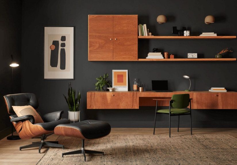
This is not the right choice if your goal is to make a tiny basement feel visually larger from wall to wall. But if you want the room to feel intimate, polished, and intentionally cozy, Hale Navy can be magic. It is especially effective in media rooms, game rooms, bars, reading nooks, or accent walls behind built-ins and fireplaces.
The key is balance. Pair it with good lighting, warm metals, natural wood, creamy upholstery, and enough contrast so the room feels layered rather than heavy. In a basement, dark paint looks best when it feels deliberate. Think lounge, not dungeon. Club room, not cave. Sophisticated retreat, not “we had leftover navy and made a bold choice at midnight.”
Best use: Accent walls, media rooms, basement bars, and cozy entertainment spaces.
Pair it with: Warm white trim, walnut wood, brass sconces, cognac leather, off-white rugs.
Designer vibe: Moody, tailored, cinematic, and quietly luxurious.
How to Choose the Right One for Your Basement
Pick by mood first
If you want light and open, start with White Dove or Drift of Mist. If you want balanced warmth, look at Revere Pewter. If you want a natural, comforting touch of color, October Mist is a winner. If you want cozy drama, go with Hale Navy.
Test samples in your actual basement
Paint colors behave differently downstairs than they do online or in a sunny showroom. Sample boards are your friend. Move them around the room, check them morning and night, and look at them under lamps, recessed lighting, and any natural light the basement gets.
Think about sheen
For basement walls, many homeowners prefer eggshell, matte, pearl, or satin depending on the wall condition and room use. A softer sheen can hide imperfections, while a more durable finish may be better for high-traffic family zones, kids’ spaces, or damp-prone areas.
Do not forget the ceiling and trim
A basement can feel much more inviting when the trim, doors, and even the ceiling are considered as part of the whole palette. Warm whites on trim can soften grays and greens. A darker ceiling can create intimacy in a media room. A lighter ceiling can help bounce light and make the room feel taller.
Design Moves That Make These Colors Work Even Better
Paint does a lot, but it should not have to carry the entire basement on its back. To make any of these colors look their best, layer in a few smart design choices:
- Use layered lighting: Combine overhead lights, sconces, floor lamps, and table lamps so the color looks intentional and dimensional.
- Add texture: Basements love texture. Rugs, boucle, wood, linen, leather, and baskets keep the room from feeling flat.
- Bring in warmth: Brass, bronze, oak, walnut, and camel tones can make even cool-leaning neutrals feel more inviting.
- Create contrast: White trim with greige walls, dark walls with creamy furniture, or sage walls with warm wood can give the room structure and energy.
- Address moisture first: No paint color looks luxurious next to peeling caulk and a struggling dehumidifier.
Real-Life Experiences With Basement Paint Colors
One of the most common experiences homeowners describe after painting a basement is simple but powerful: the room finally feels like part of the house. Before painting, the basement is often treated like a backup space. After painting, it becomes somewhere people actually want to sit, read, host, work, or unwind. That emotional shift matters more than people expect.
Homeowners who choose warm whites like White Dove often say the biggest surprise is how much cleaner and brighter the room feels without looking harsh. They expected “white,” but what they got was softness. Furniture looked better, lamps seemed warmer, and even older finishes felt a little more intentional. Instead of trying to pretend the basement was a sunroom, the color worked with the basement’s character and gently improved it.
People who go with Revere Pewter or Drift of Mist usually talk about flexibility. These shades tend to absorb the chaos of real life in the best possible way. A beige sectional, black workout bench, children’s art supplies, a desk, and a giant TV somehow all manage to coexist without the room looking confused. That is the quiet superpower of a smart neutral. It makes a multipurpose basement feel cohesive, even when the room is wearing several hats at once.
Those who try a color like October Mist often mention that the basement stops feeling disconnected from the rest of the home. The soft green brings a relaxed energy that feels fresh and grounded, especially when paired with plants, warm wood, or cream textiles. It is a favorite in basement offices and guest spaces because it feels calm without being dull. People often describe it as peaceful, which is high praise for a room that may also be storing holiday bins three doors away.
And then there are the brave souls who choose Hale Navy or another moody shade. Their experience is usually dramatic in the best sense. Instead of fighting the basement’s lower light, they lean into it and end up with a room that feels cinematic, intimate, and memorable. Movie rooms become true hideaways. Basement bars feel more polished. Reading corners suddenly look like they belong in a design magazine rather than next to a pile of extension cords.
The pattern across all these experiences is clear: the best basement paint color is the one that makes the room feel intentional. Not brighter just for the sake of brightness. Not trendier just to impress the internet. Intentional. When the color suits the room’s lighting, purpose, and furniture, people spend more time there. They decorate more confidently. They stop apologizing for the basement and start showing it off.
That is the real magic of paint in a basement. It does not merely change a wall color. It changes how the room is used, how comfortable it feels, and whether people think of it as “downstairs” or as a genuine living space. And that is a very good return on a few gallons of paint.
Conclusion
If you want to make a basement feel more inviting, do not just chase the lightest paint chip on the wall. Choose a color with the right undertones, enough softness for low light, and a mood that fits how the space is actually used. White Dove brightens without feeling stark. Revere Pewter adds flexible warmth. Drift of Mist keeps things airy and calm. October Mist introduces gentle, nature-inspired color. Hale Navy proves that a basement can look stunning when it embraces a little mood.
The best part is that none of these shades rely on gimmicks. They are designer-loved because they work in real homes, with real lighting, and real furniture. So if your basement currently feels chilly, dim, or forgotten, paint may be the easiest way to give it a personality upgrade. That, and maybe finally labeling those mystery storage bins.