Table of Contents >> Show >> Hide
- Before You Start: How to Choose the Right Wall (So It Looks Intentional)
- 25 Accent Wall Ideas (Room by Room, Mood by Mood)
- Idea #1: The “Moody Fireplace” Wall
- Idea #2: Limewash or Roman Clay for Soft, Cloudy Texture
- Idea #3: A Full Gallery Wall That Acts Like Wallpaper
- Idea #4: Vertical Wood Slats (a.k.a. “Instant Architecture”)
- Idea #5: Painted Color Block “Headboard” (No Actual Headboard Required)
- Idea #6: Floor-to-Ceiling Built-In Shelves as the Accent
- Idea #7: Wallpaper the Bed Wall (Pattern Where You Want Calm)
- Idea #8: Board-and-Batten for a Classic, Tailored Accent
- Idea #9: Half Wall + Wallpaper Above (The Best of Both Worlds)
- Idea #10: Upholstered Panels for a Soft, Luxe Bedroom Wall
- Idea #11: A Mural-Style Wallpaper Wall That Feels Like Art
- Idea #12: Painted Arch or Scallop Accent (Whimsy Without Chaos)
- Idea #13: Take the Kitchen Backsplash to the Ceiling
- Idea #14: A Two-Tone Cabinet Wall (Paint the Wall to Match)
- Idea #15: Chalkboard or Writable Wall for a Breakfast Nook
- Idea #16: Picture-Frame Molding + Bold Paint in the Dining Room
- Idea #17: A Plate Wall (Collected, Personal, Surprisingly Chic)
- Idea #18: A Tile “Wet Wall” in the Bathroom
- Idea #19: Wallpaper Behind the Vanity (Small Room, Big Payoff)
- Idea #20: The Entryway “Hello Wall” (First Impressions Matter)
- Idea #21: Painted Stripes or Geometry in a Hallway
- Idea #22: Staircase Accent Wall with a Photo Story
- Idea #23: Home Office “Focus Wall” in a Deep, Low-Glare Color
- Idea #24: A Cork or Pinboard Accent Wall (Pretty + Functional)
- Idea #25: The Ceiling Accent (Yes, Look Up)
- Quick Checklist: Make Any Accent Wall Look “Designed,” Not Random
- Conclusion
- Experiences: Real-World Lessons People Learn After Doing Accent Walls
An accent wall is the design equivalent of putting on sunglasses indoors: bold, slightly dramatic, and somehow it works when you do it on purpose. Done right, it can spotlight your room’s best feature, add depth to a plain box of drywall, and give you that “I hired a designer” energyeven if your “designer” was a late-night scroll and a half-empty paint tray.
This guide synthesizes common, field-tested guidance from major U.S. home-and-design authorities (think HGTV, Better Homes & Gardens, Architectural Digest, The Spruce, This Old House, Martha Stewart, and more) into one practical, non-cringey playbook. You’ll get room-by-room ideas, plus tips to choose the right wall and avoid the classic mistakes (like accenting the wall with the thermostatbrave, but no).
Before You Start: How to Choose the Right Wall (So It Looks Intentional)
1) Pick a natural focal point
The easiest wins happen when the wall already wants attention: behind a bed, around a fireplace, the wall you see first when you walk in, or a built-in wall of shelves. Accent walls are most convincing when they amplify what the room is already “about,” instead of randomly yelling “SURPRISE!” in a corner.
2) Avoid “busy” walls with too many interruptions
A wall chopped up by multiple doors, tiny windows, vents, and switches can make your accent look accidental. If the room has a single long, clean wall, that’s often your MVP. If not, choose the wall with the cleanest, most continuous surface area.
3) Decide what kind of drama you want: color, pattern, or texture
Color is the quickest route. Pattern (like wallpaper) adds personality fast. Texturepaneling, slats, limewash, tileadds “wow” even in neutrals. If you’re nervous, choose one: don’t do bold color and busy wallpaper and heavy texture unless you’re going for “maximalist museum gift shop.”
4) Remember light changes everything
Morning light, evening light, and “why does this look green at 8 p.m.?” are all real. Test large paint swatches or sample wallpaper in the room, then look at it across a full day before committing. A color that feels cozy at noon can feel like a cave at night if your lighting is warm and low.
5) Choose a finish that matches the room’s reality
In real homes, walls get touched. Eggshell and satin are popular because they balance washability with a softer look, while higher sheen can highlight imperfections. In moisture-prone spaces (bathrooms, some kitchens), durability matters even morejust make sure ventilation and prep are on your side.
25 Accent Wall Ideas (Room by Room, Mood by Mood)
Idea #1: The “Moody Fireplace” Wall
Best for: Living rooms, family rooms.
Paint the fireplace wall (including built-ins) in a deep, grounding colorcharcoal, inky blue, forest green, or warm chocolate. It frames the room’s natural focal point and makes art and decor pop. Keep adjacent walls lighter so the fireplace reads as a feature, not a blackout curtain.
Idea #2: Limewash or Roman Clay for Soft, Cloudy Texture
Best for: Living rooms, bedrooms, dining rooms.
If flat paint feels a bit “builder beige trauma,” try mineral-style finishes like limewash or clay-like paints. They create subtle movement and depth especially gorgeous in neutrals. Bonus: the texture can be forgiving on less-than-perfect walls, and it looks rich even without loud color.
Idea #3: A Full Gallery Wall That Acts Like Wallpaper
Best for: Living rooms, hallways, staircases.
A gallery wall is an accent wall you can edit over time. Pick a consistent frame color (all black, all oak, or mixed but intentional), then hang art, photos, and prints in a cohesive grid or salon style. Pro move: repeat one accent color in multiple pieces so it feels curated, not chaotic.
Idea #4: Vertical Wood Slats (a.k.a. “Instant Architecture”)
Best for: Living rooms, bedrooms, offices.
Vertical slats add height and a modern, warm vibe. Stain for a Scandinavian feel or paint to match the room for a softer effect. Hide outlets with careful planning, and consider adding LED picture lighting or a sconce to make the texture glow at night. It’s dramatic without screaming.
Idea #5: Painted Color Block “Headboard” (No Actual Headboard Required)
Best for: Bedrooms, guest rooms, studios.
Paint a large rectangle, arch, or soft-edged shape behind the bed to create the illusion of a headboard. This is great for small rooms where a bulky headboard would crowd the space. Keep bedding simple and let the shape do the talking. It’s budget-friendly and surprisingly high-impact.
Idea #6: Floor-to-Ceiling Built-In Shelves as the Accent
Best for: Living rooms, dining rooms, home libraries.
Turn a wall into storage and style at once. Built-ins (or convincingly DIY’d units) become the feature, especially when painted a distinct shade from the rest of the room. Style shelves with books, baskets, and “breathing room” so it doesn’t look like a garage sale display.
Idea #7: Wallpaper the Bed Wall (Pattern Where You Want Calm)
Best for: Primary bedrooms, guest rooms.
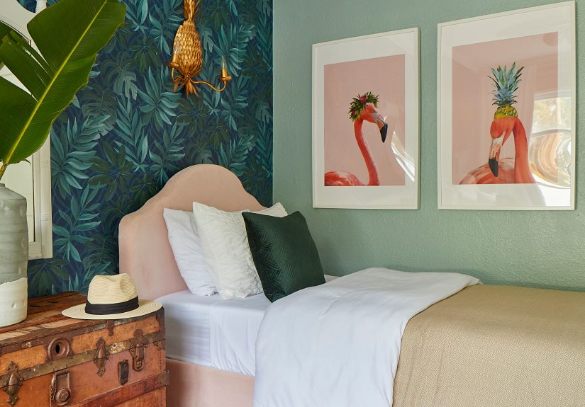
Wallpaper behind the bed gives instant personality without wrapping the entire room in pattern. Choose oversized botanicals, subtle geometrics, or soft murals for a calmer feel. If your bedroom is already busy (lots of furniture, bold bedding), pick a quieter pattern so your room doesn’t feel like it’s trying to win an argument.
Idea #8: Board-and-Batten for a Classic, Tailored Accent
Best for: Bedrooms, dining rooms, entryways.
Board-and-batten adds structure and dimensionperfect when the room feels “flat.” You can keep it traditional (vertical battens) or go modern with a grid pattern. Paint it the same color as the wall for a tone-on-tone look, or make it pop with contrast. This is one of the most timeless accent options.
Idea #9: Half Wall + Wallpaper Above (The Best of Both Worlds)
Best for: Dining rooms, nurseries, powder rooms.
Install a chair rail or wainscoting below, then wallpaper above. It feels custom and helps protect walls in high-traffic zones. Choose wallpaper with a repeating color that matches the paint below to keep it cohesive. This combo reads expensiveeven if you did it with weekend energy and podcasts.
Idea #10: Upholstered Panels for a Soft, Luxe Bedroom Wall
Best for: Bedrooms, reading nooks.
Upholstered wall panels (or a DIY padded headboard wall) add softness, sound absorption, and hotel vibes. Stick to neutral fabrics for longevity, or go velvet for drama. This is especially great in rooms where you want cozy acousticslike if your neighbors think 11 p.m. is the ideal time for karaoke.
Idea #11: A Mural-Style Wallpaper Wall That Feels Like Art
Best for: Dining rooms, bedrooms, offices.
Mural wallpaper turns an accent wall into a scenelandscapes, abstracts, hand-painted looks, or vintage-inspired art. It’s a “one move” transformation that can make a plain room feel designed. Keep other decor simpler so the mural reads as intentional art, not background noise.
Idea #12: Painted Arch or Scallop Accent (Whimsy Without Chaos)
Best for: Bedrooms, nurseries, entryways.
A painted arch behind a console, bed, or desk creates a focal point with almost no cost. Scallops work too, especially in kids’ spaces. Choose a color that already appears somewhere in the room (rug, pillows, art) so it feels tied in. Painter’s tape and patience are your best friends here.
Idea #13: Take the Kitchen Backsplash to the Ceiling
Best for: Kitchens, wet bars.
Instead of stopping tile at the standard backsplash height, extend it up to the hood or ceiling for a true statement wall. Use elongated subway tile, zellige-style tile, or bold shapes (like hex or scallops). This creates a vertical “feature” that feels architectural and often makes kitchens look taller.
Idea #14: A Two-Tone Cabinet Wall (Paint the Wall to Match)
Best for: Kitchens, butler’s pantries.
If one wall is mostly cabinetry, treat it like the accent and make it specialdarker lowers, lighter uppers, or a bold color on a run of tall cabinets. Then paint the surrounding wall a coordinating neutral to let cabinetry be the star. It’s an accent wall that also holds your snack stash. Practical magic.
Idea #15: Chalkboard or Writable Wall for a Breakfast Nook
Best for: Kitchens, mudrooms, kids’ zones.
A writable wall is functional and fun: menus, grocery lists, doodles, reminders. Keep it to a contained area so it doesn’t take over the room, and pair it with warm wood or bright textiles so it feels charmingnot like a classroom corner you can’t escape.
Idea #16: Picture-Frame Molding + Bold Paint in the Dining Room
Best for: Dining rooms, formal sitting rooms.
Add picture-frame molding (or panel-style trim), then paint the entire wall a saturated color. The molding creates shadow lines that look elegant even in a single color. Try deep navy, olive, or warm aubergine for a “dressy dinner” vibeeven if dinner is takeout in fancy bowls.
Idea #17: A Plate Wall (Collected, Personal, Surprisingly Chic)
Best for: Dining rooms, kitchens, hallways.
Hang decorative plates in a clustered arrangement for a Southern-inspired, collected look. Mix sizes and patterns, but keep a unifying elementlike a color family or consistent style. It’s an accent wall that feels personal and layered, and it works beautifully with vintage, cottage, or eclectic interiors.
Idea #18: A Tile “Wet Wall” in the Bathroom
Best for: Bathrooms, powder rooms.
Create a tile accent behind the vanity or in the shower area with bold color, texture, or contrasting grout. Vertical stacking can make ceilings look taller. Just keep the rest of the finishes calmer so it doesn’t feel like the bathroom is trying to start a fight with your eyeballs.
Idea #19: Wallpaper Behind the Vanity (Small Room, Big Payoff)
Best for: Powder rooms, guest baths.
Powder rooms are the perfect place to be brave: they’re small, and you’re not living in them all day. Choose a durable, wipeable wallpaper or a high-quality peel-and-stick option, and make sure ventilation is decent. Pair with simple fixtures so the wall gets the spotlight.
Idea #20: The Entryway “Hello Wall” (First Impressions Matter)
Best for: Entryways, foyers.
Pick the first wall you see when you walk in and give it a confident lookpaint, wallpaper, or paneling. Add a mirror, a narrow console, and a lamp for instant polish. This is a high-impact, low-square-footage upgrade that makes the whole home feel more finished.
Idea #21: Painted Stripes or Geometry in a Hallway
Best for: Hallways, playrooms, home gyms.
Hallways are often blank and forgettableperfect for pattern. Use painter’s tape to create wide stripes, diagonal lines, or simple geometric blocks. Keep colors within the home’s palette for flow. If you’re nervous, do tone-on-tone (two shades of the same color) for subtle style.
Idea #22: Staircase Accent Wall with a Photo Story
Best for: Stairways, landings.
Turn the stair wall into a visual timeline: family photos, travel prints, kids’ art in matching frames, or black-and-white portraits. A consistent frame color keeps it cohesive. Add a picture light or upgraded sconces to elevate the whole display from “random frames” to “gallery moment.”
Idea #23: Home Office “Focus Wall” in a Deep, Low-Glare Color
Best for: Offices, study nooks, Zoom backgrounds.
Paint the wall behind your desk in a deeper shade to anchor the workspace and create a cleaner video-call backdrop. Muted blues, greens, and warm neutrals can feel calm and intentional. Style it with one or two pieces of art and a shelfnot a chaotic collage of cords and existential dread.
Idea #24: A Cork or Pinboard Accent Wall (Pretty + Functional)
Best for: Offices, craft rooms, kids’ study areas.
Instead of fighting paper clutter, give it a home. Cover a wall (or a large section) with cork tiles, felt tiles, or a pinboard system. Paint or frame the edges so it looks finished. This is an accent wall that actually earns its keeplike a decor choice that pays rent.
Idea #25: The Ceiling Accent (Yes, Look Up)
Best for: Bedrooms, dining rooms, nurseries, powder rooms.
The “fifth wall” is an underrated accent opportunity. Use wallpaper, a bold paint color, or even painted beams to create drama without shrinking the room’s wall space. This works especially well when your walls already have doors/windows and you still want an accent moment that feels deliberate.
Quick Checklist: Make Any Accent Wall Look “Designed,” Not Random
- Repeat the accent color at least 2–3 times elsewhere (pillows, art, rug, decor).
- Mind the edge transitions: crisp paint lines, clean trim, tidy corners, aligned patterns.
- Balance the weight: a dark wall often wants lighter furniture or brighter textiles nearby.
- Prep like you mean it: patch, sand, clean, prime when neededespecially for wallpaper and glossy surfaces.
- Choose lighting intentionally: warm bulbs can shift color; add accent lighting to flatter texture.
Conclusion
The best accent walls don’t feel like a “trend move.” They feel like the room finally makes sense. Whether you go bold with paint, dramatic with mural wallpaper, classic with board-and-batten, or practical with a pinboard wall, the goal is the same: create a focal point that matches how you live. Start with the wall that already wants attention, pick one kind of drama (color, pattern, or texture), and tie it back into the room with repeated hues and thoughtful lighting. Your home will look more intentionaland your walls will stop quietly begging for help.
Experiences: Real-World Lessons People Learn After Doing Accent Walls
Accent walls are one of those projects that look easy until you’re on hour four of “why won’t this line stay straight?” The good news: most problems are predictable, which means they’re preventable. Here are the most common real-life lessons that show up again and again when homeowners tackle accent walls (and yes, they usually involve paint, math, or impatiencesometimes all three).
Lesson 1: The color you chose online is not the color you get at night. Many people fall in love with a shade on a screen, paint the wall, and then watch it transform into something else entirely after sunset. That’s not a conspiracy; it’s lighting temperature, undertones, and reflections from floors and furniture. A practical habit is to test a large sample (or two), then check it in morning daylight, afternoon brightness, and evening lamp light. It’s a small delay that saves you from repainting while muttering, “But it looked so calm in the picture.”
Lesson 2: Prep is not optionalespecially with wallpaper and high-sheen surfaces. The “skip sanding, skip cleaning, skip priming” approach works right up until it doesn’t, which is usually when seams lift or texture shows through. Peel-and-stick wallpaper is famously beginner-friendly, but it still wants a smooth, clean, properly cured surface. People who get the best results treat prep like part of the design, not a punishment: fill holes, sand ridges, wipe walls, and prime when needed.
Lesson 3: Accent walls fail most often because the wrong wall was chosen. A wall with three doors, a random bump-out, and an air vent can absolutely be “accented”… but it rarely looks calm. The most successful accent walls are often the simplest ones: a long uninterrupted wall, the bed wall, the fireplace wall, or the wall you face when you enter. When the wall has a lot going on, a better approach is to accent a portionlike a painted arch behind a console, framed wallpaper panels, or a built-in shelf zoneso the accent feels deliberate rather than forced.
Lesson 4: Patterns magnify tiny mistakes. With stripes, geometrics, and wallpaper repeats, small misalignments become “all you can see.” The fix is boring but effective: measure twice, mark level reference lines, and work slowly. A common win is choosing patterns that are more forgivingorganic florals, subtle textures, or muralsif you know your walls aren’t perfectly square (many aren’t). If you want crisp stripes, use quality tape, burnish edges, and remove tape at the right time to avoid peeling paint like you’re unwrapping a bad surprise.
Lesson 5: Texture is often the easiest way to look high-end without loud color. People who worry about “getting sick of it” often do best with tone-on-tone texture: board-and-batten painted the same color as the wall, wood slats in a natural finish, or limewash in a soft neutral. These choices read sophisticated because they create shadow and depth. And if you later change paint colors, the architectural detail still worksso you’re not starting from zero every time you redecorate.
Lesson 6: The room needs a couple of supporting actors. An accent wall can’t do the whole job alone. The spaces that feel most “finished” usually repeat the accent color in a few placespillows, a throw, art, a vase, even a lamp shade. Without those repeats, the accent wall can look like it wandered into the room uninvited. With them, the wall looks like the plan all along (even if the plan started as procrastination).
If there’s one big takeaway from real-world accent walls, it’s this: success comes from making one bold decision, then backing it up with small, unglamorous choicesprep, lighting, repetition, and restraint. That’s how an accent wall stops feeling like a DIY experiment and starts feeling like your home’s best feature.