Table of Contents >> Show >> Hide
- What You’re Actually Creating (And Why That’s Fine)
- Quick Prep: The 60-Second Table Plan
- Method 1: Rectangular Grid Tool (Fastest “Draw a Table” Option)
- Method 2: Split Into Grid (Best When You Want “Real” Cell Shapes)
- Which Method Should You Use?
- Formatting Tips That Instantly Improve Table Readability
- Troubleshooting: Common Illustrator Table Problems
- When Illustrator Isn’t the Best Tool (And That’s Not a Moral Failure)
- Conclusion
- Real-World Experience: What Actually Happens When You Build Tables in Illustrator (500+ Words)
Adobe Illustrator is amazing at drawing… and hilariously bad at being a spreadsheet. So when you need a table in Illustrator, you’re not “inserting a table”
like you would in Word or InDesignyou’re building a table-shaped design object.
The good news: once you accept that Illustrator tables are basically “well-organized rectangles with commitment issues,” you can make tables that look
professional, print beautifully, and stay editable enough to survive last-minute changes from whoever always says, “Can we just add one more column?”
What You’re Actually Creating (And Why That’s Fine)
Illustrator doesn’t have a dedicated Table tool. Instead, you create a grid of paths or a grid of separate shapes and then style it like a real table:
strokes for borders, fills for zebra striping, and text frames for content. That’s not a workarounddesigners do this on purpose because it gives you
pixel-perfect control over line weights, spacing, and layout.
Quick Prep: The 60-Second Table Plan
Before you touch a tool, answer these three questions. It saves a lot of “undo” later:
- How many rows and columns? Include header rows, totals rows, and any “notes” area.
- What’s the final size? Decide the table width/height (or at least the column widths) based on your layout.
- What’s your style system? Pick line weight (e.g., 1 pt inside lines, 2 pt outer border), font size, and padding.
Pro tip: if the table needs to stay consistent across many pages, you’re building a mini design system. That’s not extra workit’s future you saying thanks.
Method 1: Rectangular Grid Tool (Fastest “Draw a Table” Option)
If you want a clean table framework in secondsespecially for simple tablesthis is the speed run. You’ll draw a grid as paths (lines) and then format it.
Step 1: Find the Rectangular Grid Tool
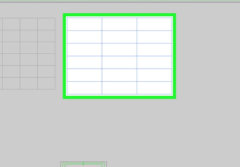
In the toolbar, click and hold the Line Segment Tool group to reveal hidden tools. Choose Rectangular Grid Tool.
If you don’t see it, switch to the Advanced toolbar (Window > Toolbars > Advanced).
Step 2: Create the grid with exact rows/columns
- Select the Rectangular Grid Tool.
- Click once on the artboard (instead of dragging). This opens options where you can type a precise size.
-
Enter your Width and Height, then set:
- Vertical Dividers = number of columns minus 1
- Horizontal Dividers = number of rows minus 1
- Click OK to place the grid.
If you prefer the “feel” method, you can also drag to draw a grid and adjust dividers while dragging (handy when you’re mocking something up quickly).
Step 3: Make it look like a real table (not a cage)
Now style your lines so the table communicates structure:
- Outer border stronger: Duplicate the grid, then give the top copy a thicker stroke and remove inner lines (or draw a separate outer rectangle).
- Header row emphasis: Add a light fill rectangle behind the top row, or use a slightly thicker line under the header.
- Zebra striping: Add alternating row fills using rectangles (keep them behind the grid lines).
Keep your stroke weights consistent. A table with random line thickness looks like it was assembled during a power outage.
Step 4: Keep it editable (the “don’t regret this later” move)
Group the grid (Ctrl/Cmd + G). Turn on Smart Guides (View > Smart Guides) and optionally Snap to Point so elements align cleanly.
If you’ll reuse the table style, save it as a Symbol or create a template file.
Step 5: Add text to the cells
Illustrator text in tables is usually one of two approaches:
- Quick labels: Use the Type Tool and place text in each cell (best for short entries).
- Consistent padding: Create a text frame inside one cell with your preferred padding, then duplicate it across cells using Align/Distribute.
To center text neatly: select your text frame and cell boundary area (or a guide box), then use the Align panel to align horizontally and vertically.
Method 2: Split Into Grid (Best When You Want “Real” Cell Shapes)
This method creates a grid of separate rectanglesbasically actual cell objects. That makes it easier to color individual cells, apply alternating fills,
and select entire rows/columns without wrestling line segments.
Step 1: Draw the outer table boundary
- Select the Rectangle Tool (M).
- Click once on the artboard and enter the exact Width and Height for your table.
- Set a temporary stroke (any visible weight) and no fill (or a light fill if you prefer).
Step 2: Split the rectangle into rows and columns
- Select the rectangle.
- Go to Object > Path > Split Into Grid.
-
Check Preview so you can see changes live. Then set:
- Rows and Columns to match your table
- Gutter (optional) if you want spacing between cells (great for modern “card-table” layouts)
- Add Guides if you want guides generated along the grid edges
- Click OK.
You now have individual rectangles. This is the “I want full control over each cell” methodand it’s especially good for dashboards, pricing tables,
schedules, and forms.
Step 3: Style borders like a pro
When every cell has a stroke, you can accidentally double up line thickness where cells touch. To avoid that:
- Option A (cleanest): Remove strokes from cells, then draw your grid lines once on top (one set of lines, no doubles).
- Option B (fast): Keep strokes, but use a lighter stroke weight and rely on a separate thicker outer border rectangle.
If you’re designing for print, consistency wins. If you’re designing for screen, slightly lighter inner lines often look better.
Step 4: Add zebra striping and header styling in seconds
Since each cell is its own object, styling becomes easier:
- Header row: Select the top row of rectangles and apply a fill color.
- Alternating rows: Select one row, then use consistent selection (Shift-click rows) and apply a light fill.
- Global swatches: Use global colors so one change updates the whole table style.
Step 5: Add text efficiently (without losing your mind)
Here’s a workflow that stays sane:
- Create one text frame sized for a typical cell and set your font, size, leading, and alignment.
- Duplicate that text frame across the row/column (Align/Distribute helps).
- Paste content cell-by-cell (yes, it’s manualIllustrator is not Excel, and it knows it).
If your content started in a spreadsheet, a useful trick is to paste a tab-delimited list into Illustrator and use the Tabs feature in the Paragraph panel
to line up simple columns. It won’t create “true” table cells, but it’s great for quick prototypes or minimalist layouts.
Which Method Should You Use?
Use this cheat sheet:
- Rectangular Grid Tool: Best for fast layout grids and simple tables where the lines matter most.
- Split Into Grid: Best for tables that need cell-by-cell styling (fills, highlights, alternating rows, clickable “card” layouts).
Formatting Tips That Instantly Improve Table Readability
1) Give your text breathing room
Tables look “cheap” when text touches borders. Even 8–12 px of padding (or a consistent internal margin) makes a big difference.
In Illustrator, padding is usually created by placing text frames inside cells with consistent offsets.
2) Use typographic hierarchy
Make headers bolder (or slightly larger), and keep body text consistent. If you’re using numbers, consider tabular lining numerals
(some fonts support this) so columns of figures line up cleanly.
3) Make alignment do the heavy lifting
Left-align text, right-align numbers, and center only short labels. Centering everything is the fastest way to make a table harder to scan.
4) Don’t over-grid it
You don’t always need every single line. Many modern tables use a strong outer border, subtle row separators, and no vertical lines.
Less ink, more clarity.
Troubleshooting: Common Illustrator Table Problems
- “I can’t find the Rectangular Grid Tool.” You’re likely on the Basic toolbarswitch to Advanced.
- “My grid lines look uneven.” Check stroke alignment, turn on Smart Guides, and ensure your table is on whole-pixel coordinates for screen designs.
- “My pasted text won’t line up.” Use consistent text frames, Align panel, and set paragraph alignment before duplicating frames.
- “Guides or grid behavior seems weird on multiple artboards.” Keep your table construction on the target artboard and verify ruler origins and snapping settings.
When Illustrator Isn’t the Best Tool (And That’s Not a Moral Failure)
If your table is content-heavy, changes constantly, or needs true table features (cell padding settings, auto-flow, spanning, sorting),
build it in InDesign or a spreadsheet tool first, then bring it into Illustrator for final styling or integration into a poster/graphic.
Illustrator is a design scalpel, not a data entry job.
Conclusion
Tables in Illustrator are totally doableyou just have to build them the Illustrator way: grids, shapes, alignment, and smart styling.
Use the Rectangular Grid Tool when you want speed and clean lines. Use Split Into Grid when you want real, selectable cells for
fills and formatting. Either way, a little planning (size, hierarchy, spacing) turns “a bunch of boxes” into a table that looks intentional.
Real-World Experience: What Actually Happens When You Build Tables in Illustrator (500+ Words)
After making more Illustrator tables than I care to admit, I learned one big truth: the “table” isn’t the hard partthe edits are.
The first version usually takes five minutes. Then someone changes a label, adds a row, asks for a totals column, and suddenly you’re doing design
origami at 1 a.m. That’s why the best Illustrator table skill isn’t knowing a toolit’s choosing a structure that survives change.
When I’m building a table for a one-off graphic (like a quick social post), I’ll often start with the Rectangular Grid Tool because it’s immediate.
I click once, type the size, pick dividers, and boominstant framework. But I’ve also learned that this method can turn into “line segment wrestling”
if the table needs a lot of cell-specific styling. The moment you need to highlight only three cells, add alternating row fills, or color-code a column,
you start inventing extra rectangles behind the grid and managing stacking order like you’re playing a strategy game.
That’s when Split Into Grid becomes the hero. Real cell objects are easier to select, recolor, and reorganizeespecially when the table turns into a
mini dashboard. In one project, I had a pricing table with three tiers, checkmarks, and feature rows. The client changed the tier order twice.
If I had built it as a “lines-only” grid, I would’ve been slicing and nudging forever. Because it was Split Into Grid, I could select entire columns
of cells and move them as a unit, then realign content quickly. Still annoying, but like… a civilized annoying.
The biggest practical improvement I made was treating table styling like a system. I’ll define:
(1) one stroke style for inner lines,
(2) one heavier stroke for outer borders,
(3) one header fill,
(4) one zebra fill.
Then I reuse those exact swatches and weights everywhere. That consistency makes the table feel “designed,” and it also makes edits faster because you’re
not re-deciding aesthetics every time a cell changes. I’ve also started building a “table starter” Illustrator file with a few common sizes and styles
because repeating the same setup from scratch is a great way to spend your life in dialogs.
Another lesson: text alignment matters more than decorative lines. If you nail alignment (left for text, right for numbers, consistent padding),
you can remove half the grid lines and the table will still look sharp. But if your text is floating randomly, no amount of perfect strokes will save it.
I’ve had tables where simply increasing line spacing slightly and adding more internal padding made the design look twice as expensivewithout changing a single color.
Finally: I stopped trying to force Illustrator to be Excel. For data-heavy tables, I’ll prep the content elsewhere, finalize wording,
then bring it into Illustrator for layout. Illustrator is where the table becomes visualicons, spacing, hierarchy, brand polish.
When you use it that way, you get the best of both worlds: clean data upstream, beautiful design downstream, and fewer “why are we doing this manually?” moments.