Table of Contents >> Show >> Hide
- Who Is Melissa Bombardiere in the Design Conversation?
- What “Vintage-Style Brights” Actually Means
- The Signature Ingredients of Bombardiere’s Aesthetic
- Why This Style Feels So Relevant Right Now
- How to Recreate the Look Without Copying It Piece for Piece
- Room-by-Room Ideas Inspired by Vintage-Style Brights
- Common Mistakes to Avoid
- The Real Magic of Melissa Bombardiere’s Vintage-Style Brights
- A Longer Reflection on the Experience of Living With Vintage-Style Brights
- Conclusion
Some homes whisper. Others politely introduce themselves. And then there are spaces like the world of Melissa Bombardiere, which walk into the room wearing red lipstick, carrying a vintage lamp, and somehow still look incredibly put together. That is the charm of vintage-style brights: a decorating approach that borrows the warmth, memory, and character of older pieces, then wakes everything up with fearless color, playful pattern, and handmade spirit.
Bombardiere’s style feels so compelling because it refuses to choose between tidy modernism and joyful nostalgia. Instead, it blends them. Think retro teak furniture beside bold graphic art. Think black-and-white structure softened by quilts, craft, and bright accessories. Think a home that feels edited, but not uptight; colorful, but not chaotic; vintage, but not stuck in a time capsule. In other words, this is not your grandmother’s parlor unless your grandmother had excellent taste, a sharp eye for composition, and zero fear of yellow flowers near a black front door.
In today’s interiors world, where homeowners are increasingly moving away from sterile minimalism and back toward personality, collected rooms, and color confidence, the appeal of a Bombardiere-inspired look makes perfect sense. It offers something many people want right now: a home with history, humor, and heart.
Who Is Melissa Bombardiere in the Design Conversation?
Melissa Bombardiere is best understood not as a mass-market trend machine, but as a design personality whose work and home reflect a deeply personal visual language. She is associated with graphic and fabric design, and that background matters. It explains why her interiors do not simply “contain color.” They compose color. Bright accents are not random. Patterns are not decorative filler. Objects relate to one another the way shapes and tones relate inside a well-made print.
That is why the phrase “Vintage-Style Brights by Melissa Bombardiere” feels less like a headline and more like a design thesis. Her approach suggests that vintage style should not be sepia-toned, dusty, or overly precious. It can be crisp. It can be funny. It can be modern in structure and old-school in soul. The vintage element gives the room depth, while the bright element gives it velocity.
What “Vintage-Style Brights” Actually Means
At its core, this look rests on a simple but powerful balance: old forms, lively color, and a collected point of view. The vintage side comes from furniture silhouettes, secondhand finds, handmade textiles, retro wood tones, old prints, and the kind of objects that feel discovered instead of ordered with free two-day shipping at 2 a.m. The bright side comes from strategic pops of red, yellow, orange, green, or cobalt that prevent the room from becoming too heavy or overly nostalgic.
This is important because vintage design can easily slide into costume if every piece is from the same era and every color is equally muted. Bombardiere’s approach dodges that trap. Rather than re-creating a perfect 1960s or 1970s room, the style borrows the best qualities of those decadeswarm woods, graphic linework, hand-touched surfaces, expressive art, playful utilityand reassembles them in a fresher way.
The result is a home that feels lived in, not staged. You notice the contrast first, then the harmony. The room says, “Yes, this chair is vintage. Yes, that textile is bold. No, we are not apologizing for either.”
The Signature Ingredients of Bombardiere’s Aesthetic
1. A Strong Structural Base
One of the smartest lessons in this style is that bright color works best when the room has a clear visual framework. In spaces associated with Bombardiere, black-and-white elements create a graphic backbone. That kind of strong base acts like great eyeliner for a room: it defines everything and makes every bright detail look more intentional. Without structure, color can wander. With structure, it performs.
2. Retro Furniture With Honest Personality
Vintage-style brights are not about filling a room with antiques just to prove you own antiques. The furniture needs to earn its place. Midcentury and retro-modern pieces work especially well because their lines are clean enough to play nicely with bold accents. Teak dining sets, old cabinets, modest wood tables, compact shelving, and practical chairs all bring warmth without stealing the whole show.
The best vintage furniture has what modern flat-pack pieces often lack: proportion, patina, and a feeling that it has already survived a few dinner parties. That backstory makes the room more human.
3. Handmade Textiles and Soft Color Relief
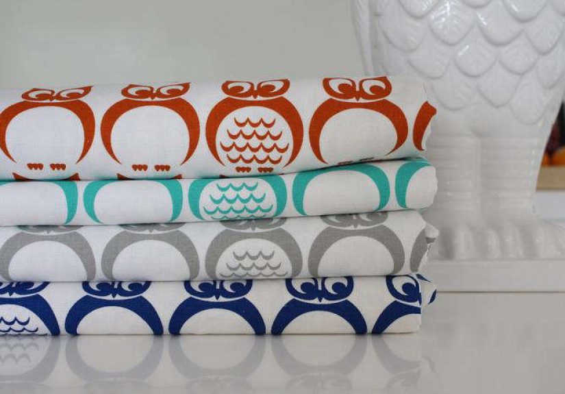
Textiles are where the Bombardiere mood becomes intimate. Quilts, sewn banners, patterned fabrics, and layered soft goods take a room from visually clever to emotionally warm. They also provide a useful decorating service: they break up harder architectural lines and keep dark or graphic backdrops from feeling severe.
This is one reason vintage-style bright interiors often feel more welcoming than aggressively modern ones. A quilt on a sofa, a printed pillow, or a hand-touched fabric panel introduces softness, irregularity, and memory. It tells you a person lives here, not a catalog.
4. Bright Color Used Like Punctuation
The color story is never just “more is more.” The most effective bright interiors use vivid hues the way a great writer uses exclamation marks: sparingly, intentionally, and only where they count. A bowl of oranges on a counter. Red artwork by an entry. Yellow flowers against a dark door. A bright throw breaking up a monochrome space. These moments of color feel sharp because they are selective.
In SEO terms, this is the long-tail keyword of decorating: specificity wins. A room does not need 47 bright objects screaming for attention. It needs a few good ones with strong placement and contrast.
Why This Style Feels So Relevant Right Now
Design has been moving away from cold perfection for a while now. More homeowners want interiors that feel collected, emotionally resonant, and less algorithmically beige. That cultural shift helps explain why vintage bright decor, retro color palettes, and mixed-era interiors are showing up everywhere. People want rooms that tell stories.
Bombardiere’s style lands perfectly in that conversation because it solves three modern decorating problems at once. First, it adds color without looking childish. Second, it introduces vintage furniture without making the home feel like a museum gift shop. Third, it allows personality to show up through art, textiles, and odd little objects that would be banished from stricter design philosophies.
There is also a practical appeal. Vintage-style brights encourage reuse, secondhand sourcing, creative reupholstery, and decorating over time. You do not need to buy everything in one shopping spree. Honestly, you probably should not. Rooms with real charm tend to come together slowly. Fast furniture can fill space, but it rarely creates character.
How to Recreate the Look Without Copying It Piece for Piece
Start With Contrast
If you want this look at home, begin with contrast rather than color. Pair dark and light. Mix old and new. Put a vintage wood sideboard under contemporary art. Add a retro chair beside a cleaner-lined sofa. A bright room works better when opposing elements are already creating tension in a good way.
Choose One Main Bright Color and Two Supporting Tones
Many people mess up colorful vintage interiors by inviting every crayon in the box to the party. Instead, pick one lead huesay red, mustard, coral, or cobaltthen support it with two quieter tones. This gives the room rhythm rather than noise. If your backdrop is mostly white, black, wood, or linen, even one bright accent color can feel deliciously dramatic.
Let Vintage Pieces Breathe
A beautiful vintage object needs visual space around it. Do not crowd it with six other “special” things. One old teak table can look fantastic with a bright ceramic bowl and a modern light fixture. The room becomes more elegant when every item is not elbowing for attention like contestants on a reality show reunion episode.
Use Art and Textiles as Color Delivery Systems
If painting walls in bold shades feels risky, let art, quilts, cushions, throws, and rugs do the heavy lifting. This method keeps the space flexible while still giving you that lively, layered look. It also reflects the handmade sensibility that makes Bombardiere’s style feel so personal.
Mix Whimsy With Restraint
The little jokes matter. A quirky banner. A bird print. A punchy poster. A bright tray. A slightly offbeat object that makes the room feel awake. But the whimsy works best when surrounded by disciplined choices. Think of it as one comedian at a dinner party, not twelve.
Room-by-Room Ideas Inspired by Vintage-Style Brights
Living Room
Start with a neutral or graphic base: white walls, dark trim, wood tones, or a black floor lamp. Add a vintage coffee table or sideboard, then layer in color through a quilt, art print, and one bright upholstered piece. A stack of old books and a ceramic lamp can tie the look together.
Dining Area
A retro teak dining set is basically a cheat code for this style. Pair it with simpler lighting and let fruit, flowers, or colorful table linens bring the brightness. Mismatched chairs can work too, as long as they share scale and a few color cues.
Entryway
If you are going to have a personality, have it at the door. Use bold artwork, a small vintage cabinet, patterned runner, and a pop of floral color. Entryways are perfect for high-impact gestures because they are brief, memorable spaces.
Home Office or Studio
This is where the graphic-designer energy can really shine. Keep the furniture practical, then soften the room with textiles, bright stationery, framed prints, or handmade wall pieces. A black-and-white desk setup with one vivid storage element can look especially sharp.
Common Mistakes to Avoid
Mistake one: making everything vintage. The room becomes too themed. Mix eras instead.
Mistake two: using bright color with no neutral buffer. Saturation needs breathing room.
Mistake three: buying “retro-looking” new items with no texture, story, or soul. A room can spot an imposter from across the hallway.
Mistake four: confusing clutter with layering. Layering has intention. Clutter has receipts.
The Real Magic of Melissa Bombardiere’s Vintage-Style Brights
What makes this aesthetic memorable is not just the furniture, or the color, or the craft. It is the feeling that the home has been assembled by someone paying attention. Someone who knows that a room can be crisp without being cold, nostalgic without being fussy, and bright without being exhausting.
That balance is surprisingly hard to achieve. Yet when it works, it feels effortless. A bright bowl of fruit on a dark counter. A hand-sewn textile in a modern room. A vintage dining set that looks cooler now than it did decades ago. These details create a home that feels relaxed, expressive, and deeply individual.
Vintage-Style Brights by Melissa Bombardiere is ultimately a lesson in visual confidence. You do not need to decorate louder. You need to decorate smarter. Use color with purpose. Use vintage with affection. Use handmade pieces with pride. And maybe keep one delightfully odd object in every room, because perfection is overrated and personality ages much better.
A Longer Reflection on the Experience of Living With Vintage-Style Brights
To understand why this style has lasting appeal, it helps to think beyond photographs and imagine the daily experience of living inside it. In a room shaped by vintage-style brights, the pleasure is rarely loud all at once. It reveals itself in layers. Morning light hits a wood table and suddenly the grain looks richer. A bright quilt tossed over the sofa makes the whole room feel warmer, even before anyone sits down. A red print in the hall catches your eye when you are half-awake and somehow convinces you that being a functional adult might actually be possible before coffee.
That is part of the charm: these interiors are not flat. They change through the day. The black-and-white or neutral framework brings order, while the bright details keep the mood from becoming too serious. In practical terms, that means the home can handle real life. Shoes by the door do not destroy the aesthetic. Kids’ drawings, flowers from the market, a half-finished stack of books, or a mug left on the table often make the room look better, not worse. The style is designed for living, not tiptoeing.
There is also something psychologically comforting about being surrounded by pieces that look found, made, inherited, or slowly collected. A vintage chair with a few dings feels forgiving. A handmade textile feels personal. A retro cabinet with an odd little knob feels like it has survived enough to stop caring whether everything matches perfectly. That quality can be deeply freeing for people tired of homes that look polished online but feel strangely nervous in person.
Color plays a special role in the lived experience too. A lot of contemporary interiors aim for calm by reducing visual stimulation, which can work beautifully, but sometimes calm turns into boredom wearing expensive pants. Vintage-style brights take another route. They create comfort through warmth, memory, and cheerful contrast. The colors are not there merely to decorate. They energize. They redirect attention. They give the eye somewhere happy to land.
Imagine walking into a dining area with a vintage teak table, light bouncing off a ceramic bowl of oranges, and a graphic print nearby in red or cobalt. The room feels awake. It invites conversation. It makes an ordinary Tuesday sandwich feel slightly more cinematic. That may sound dramatic for a piece of furniture, but good interiors often improve daily rituals in very small, very real ways.
Another pleasure of this style is that it ages gracefully. Because it relies on mixed eras, handmade character, and collected objects, it does not collapse when trends change. If a certain color falls out of favor, the room still has bones. If you swap one bright textile for another, the space evolves without losing itself. In that sense, Bombardiere’s design language offers not just a look but a method: build a strong foundation, bring in meaningful pieces, and let color act as joy rather than obligation.
Perhaps that is the biggest takeaway. Living with vintage-style brights is not about trying to impress people with how many “cool finds” you own. It is about creating a home that feels animated, affectionate, and unmistakably yours. A home where old pieces continue their story, bright accents keep the mood buoyant, and every room contains at least one detail that makes you grin a little. For many people, that kind of atmosphere is not just stylish. It is restorative. And in a world of copy-and-paste interiors, restorative might be the brightest idea of all.
Conclusion
Melissa Bombardiere’s take on vintage-style brights shows that the most compelling interiors do not come from choosing between restraint and expression. They come from letting both coexist. A vintage table can live next to bold art. A graphic black-and-white shell can be softened by quilts and color. An older piece can feel new again when it is placed with confidence. That is the lasting beauty of this aesthetic: it turns collected objects into a coherent mood and transforms everyday rooms into places with memory, momentum, and a little bit of mischief.
If you love homes that feel cheerful without being childish, nostalgic without being dusty, and curated without being stiff, this style offers a smart path forward. It proves that vintage decor does not need to be muted to feel timeless. Sometimes the secret is exactly the opposite: honor the past, then brighten it up.