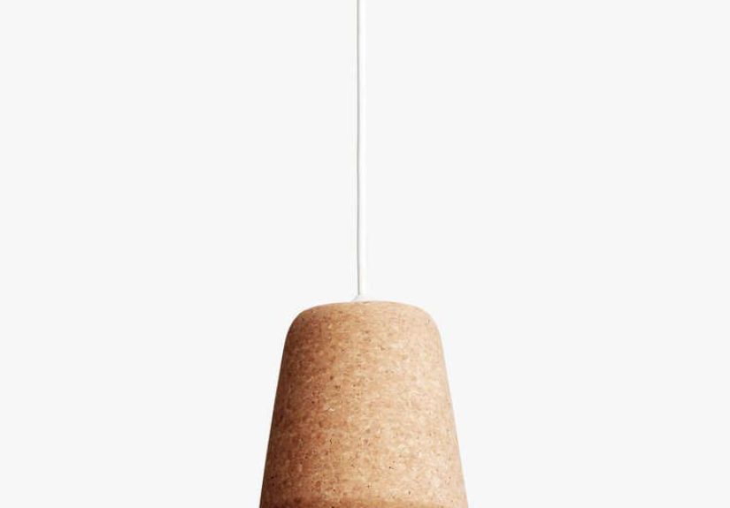
Table of Contents >> Show >> Hide
- What Is a “Material Pendant,” Exactly?
- Why Material Matters More Than You Think
- The Most Popular Material Pendant Types (Pros, Cons, Best Uses)
- How to Choose the Right Material Pendant for Each Room
- Placement Rules That Save You From Regret
- Don’t Ignore Ratings: Dry vs. Damp vs. Wet
- Bulbs Make the Material Look Better (or Worse)
- Care and Cleaning by Material (So It Stays Cute)
- Sustainability Notes (Because Materials Have a Story)
- Bottom Line: Pick the Material That Matches Your Life
- Real-World Experiences With Material Pendants (The Stuff People Learn After Living With Them)
A pendant is basically the jewelry of your ceiling. And just like jewelry, the “material” part isn’t a small detailit’s the whole vibe. A material pendant (usually meaning a pendant light where the shade or body material is the star) can make a kitchen feel crisp and modern, a dining room feel cozy and candlelit, or an entryway feel like you definitely have your life together (even if your mail pile says otherwise).
In this guide, we’ll break down the most popular pendant materialsglass, metal, wood, rattan, fabric, concrete, ceramic, and morethen get practical: how each material affects brightness, glare, cleaning, durability, and the mood of the room. We’ll also cover placement rules (yes, there are rules), plus real-world stories and “wish I knew that sooner” lessons at the end.
What Is a “Material Pendant,” Exactly?
A pendant light is a ceiling fixture that hangs down on a cord, chain, or rod. The phrase material pendant usually refers to choosing a pendant specifically for the material of its shade or bodybecause that material changes both the look and the light.
Think of the material as the fixture’s personality: glass is the extrovert (bright, reflective, shows everything), metal is the reliable friend (durable, focused, rarely dramatic), rattan is the artsy cousin (warm texture, cool shadows), and concrete is the minimalist who owns exactly three shirts and they’re all gray.
Why Material Matters More Than You Think
1) Light Quality: Soft Glow vs. Spotlight Energy
Materials control how light leaves the fixture. Clear glass tends to push more light outward (and can expose the bulb), while opaque metal directs light down. Fabric diffuses light into a warm haze, while ribbed or seeded glass breaks it up with texture. If you’ve ever walked under a bare bulb and immediately regretted having eyeballs, you already understand why diffusion matters.
2) Maintenance: The “Fingerprints vs. Dust vs. Patina” Triangle
Every material has a cleaning “tax.” Clear glass shows fingerprints and smudges quickly, while woven materials can collect dust in the tiny nooks. Some metals naturally age (patina), which can be gorgeousor confusing if you thought “unlacquered brass” meant “always shiny forever.”
3) Durability and Safety
Heavier materials (like concrete, stone, thick ceramic) may require sturdier mounting and careful installation. In moisture-prone spaces, you also need the right fixture rating (dry vs. damp vs. wet). Translation: the cutest pendant in the world is still a bad idea if it isn’t designed for the environment.
The Most Popular Material Pendant Types (Pros, Cons, Best Uses)
Glass Pendants
Best for: kitchens, dining rooms, bars, bathrooms (with the correct rating), and anywhere you want a clean, airy look. Glass can be clear, frosted, smoked, opal, ribbed, seeded, or hand-blowneach one changing how much glare you get and how “soft” the light feels.
- Pros: bright, elegant, visually lightweight; pairs with almost any style.
- Cons: shows fingerprints and dust; clear glass can create glare if the bulb is visible.
- Tip: If you love the look of clear glass but hate harsh light, use a frosted bulb or a diffuser-style LED.
Metal Pendants (Steel, Aluminum, Brass, Copper)
Best for: task lighting over islands, sinks, and workspaces; modern, industrial, farmhouse, and mid-century looks. Metal shades often direct light downward, making them excellent for “I need to see what I’m chopping” situations.
- Pros: durable, usually easier to maintain; great for focused task lighting.
- Cons: can feel visually heavy in small rooms; some finishes show smudges; may create hard shadows if used alone.
- Tip: Pair metal pendants with under-cabinet lighting or recessed lights so the room doesn’t feel like a spotlight interrogation.
Wood Pendants (Oak, Ash, Walnut, Veneer, Slats)
Best for: adding warmth to modern spaces, Scandinavian/Japandi interiors, and rooms with lots of stone or metal that need softening. Wood pendants often look calm and intentionallike you read design books for fun (even if you just scroll at midnight).
- Pros: warm, natural texture; visually soft; great for balancing sleek kitchens.
- Cons: may require gentler cleaning; avoid moisture-heavy areas unless specifically rated and sealed.
- Tip: Wood + metal combinations feel “designer” because they create contrast without chaos.
Rattan, Wicker, and Woven Fiber Pendants
Best for: coastal, boho, farmhouse, and relaxed modern spaces; bedrooms, dining rooms, breakfast nooks, and covered patios (if rated). Woven pendants are texture machines: they add depth even when the light is off.
- Pros: cozy, organic, and forgiving; casts interesting shadow patterns; lightweight look.
- Cons: dust can settle into the weave; can yellow over time in strong sun; not ideal near greasy cooking zones unless you’re committed to upkeep.
- Tip: Use a soft brush attachment on a vacuum for routine cleaningquick, gentle, and weirdly satisfying.
Fabric and Linen Shade Pendants
Best for: bedrooms, dining rooms, living roomsanywhere you want soft, flattering light. Fabric shades are basically the “Instagram filter” of lighting: they make everything look a little nicer.
- Pros: diffused glow; cozy ambiance; reduces glare.
- Cons: more susceptible to stains; can trap dust; not great for humid or splash-prone areas unless designed for it.
- Tip: If your kitchen is open to your living area, a linen pendant over the dining table can visually “soften” the whole space.
Ceramic Pendants
Best for: artisan, farmhouse, Mediterranean, and modern organic styles. Ceramic feels handmade and substantialperfect when you want the fixture to read as décor, not just “a thing that holds a bulb.”
- Pros: unique shapes and glazes; hides dust better than glossy glass; often timeless.
- Cons: can chip if bumped; heavier than it looks; some glazes show hairline crazing (which is normal, but surprises people).
- Tip: Ceramic pendants shine when you repeat their glaze color somewhere else (tile, pottery, textiles) for a cohesive look.
Concrete and Stone Pendants
Best for: modern, industrial, minimalist interiors, and statement moments over islands or dining tables. These materials feel architecturallike your ceiling fixture has opinions about typography.
- Pros: bold presence; matte textures hide smudges; great contrast with warm wood cabinets.
- Cons: heavy; installation must be solid; can be dim if the opening is narrow; may feel too “cold” without warm bulbs and layered lighting.
- Tip: Use warmer color temperatures (often 2700K–3000K) to keep concrete from feeling like a parking garage at dusk.
Acrylic and Plastic Pendants
Best for: playful modern spaces, rentals, kids’ rooms, and budgets that prefer not to cry. Modern acrylic can look surprisingly high-end, especially in sculptural shapes.
- Pros: lightweight; often affordable; can diffuse light well; less breakable than glass.
- Cons: can scratch; may yellow with age (depending on quality and sun exposure).
- Tip: If you’re staging a home or updating fast, acrylic can deliver impact with minimal commitment.
How to Choose the Right Material Pendant for Each Room
Kitchen Island
For kitchens, material should serve function first, fashion secondthen you let them hold hands. Metal (focused), glass (bright), and mixed-material pendants (balanced) are common winners.
- If you cook a lot: consider metal or easy-clean glass.
- If your kitchen is more “coffee and vibes”: rattan or linen can be gorgeousjust know you’ll be cleaning dust and kitchen film.
- If you want a designer look: mix materials (like brass + glass or wood + linen) to add depth without clutter.
Dining Table
Dining is about comfort and conversation. Materials that diffuse lightfabric, opal glass, shaded metalhelp avoid harsh shadows on faces and plates. Clear glass can work too, especially with a softer bulb and a dimmer.
Entryway / Foyer
This is the first impression zone. Choose a material that matches your home’s personality: sleek metal for modern, glass for classic, rattan for relaxed, ceramic for artisan charm. In entryways, clearance mattersno one wants to duck under “the chandelier of doom.”
Bathroom
Bathrooms need the right location rating and materials that won’t hate humidity. Glass and metal are common. Woven and fabric shades usually aren’t ideal unless the fixture is specifically designed and rated for damp environments.
Placement Rules That Save You From Regret
The Kitchen & Dining “30–36 Inches” Guideline
A widely used starting point: hang pendants so the bottom of the fixture sits roughly 30–36 inches above the countertop or dining table surface. This typically preserves sightlines while still giving useful light on the surface.
Spacing Multiple Pendants
If you’re hanging more than one pendant over an island, a common guideline is spacing them about 24–30 inches apart (center-to-center), then keeping the layout visually balanced along the island’s length. You also generally want some breathing room near the ends so fixtures don’t look like they’re about to slide off the edge.
Ceiling Height Adjustments
Higher ceilings often need a slightly longer drop so the fixture doesn’t look like it’s floating in open space. A typical rule of thumb is adding a few inches of hanging height for each extra foot of ceiling height above standard ceilings.
Walkway Clearance
In open areas and walkways, many designers aim for about 7 feet of clearance from the floor to the bottom of the fixture. If the pendant is over furniture (table, island), measure from the surface instead of the floor.
Don’t Ignore Ratings: Dry vs. Damp vs. Wet
This part is less glamorous, but it prevents “why is my fixture rusting?” heartbreak. Lighting is commonly labeled for dry locations (typical indoor spaces), damp locations (humidity/condensation), or wet locations (direct water exposure). Bathrooms, covered patios, and near-sink zones often require at least damp-rated fixtures depending on placement and ventilation. When in doubt, choose the more protective ratingfuture you will be grateful.
Bulbs Make the Material Look Better (or Worse)
Even the prettiest material pendant can look awful with the wrong bulb. Two key terms: color temperature (warm vs. cool light) and CRI (how accurately colors appear).
- Warm (around 2700K–3000K): cozy, flattering, great for dining and living spaces.
- Neutral (around 3000K–3500K): balanced, popular for open-concept main floors.
- Cooler (around 4000K): crisp and task-friendly, but can feel stark if overused.
- High CRI (often 90+): helps finishes, food, and skin tones look more naturalespecially helpful in kitchens and bathrooms.
If your pendant shade is clear glass or open metal, the bulb is basically on stage. Choose one you’d invite to a dinner party. (Translation: avoid cheap, flickery, blue-white bulbs unless you’re lighting a parking lot.)
Care and Cleaning by Material (So It Stays Cute)
Glass
Dust first, then wipe with a soft cloth. Avoid harsh chemicals and abrasive pads. If it’s clear glass, keep a microfiber cloth handythis is a fingerprints-are-a-lifestyle situation.
Metal
Dry dust regularly. For finished metals, use gentle cleaners and avoid abrasives. Some finishes naturally change over time; that aging can be a feature, not a bugjust don’t fight it with harsh cleaners.
Woven Materials
Vacuum carefully with a brush attachment and spot-clean gently. Keep woven pendants away from heavy grease zones unless you’re committed to upkeep.
Wood
Use a soft, slightly damp cloth if needed, then dry. Avoid soaking. If the wood is sealed, it’s more forgiving; if it’s raw or lightly finished, treat it like a nice dining table, not a kitchen sponge.
Sustainability Notes (Because Materials Have a Story)
If sustainability matters to you, focus on: longevity (a classic metal or glass pendant you’ll keep for years beats a trendy disposable option), repairability (standard sockets, replaceable parts), and responsible sourcing (brands that disclose materials and manufacturing practices). Mixed materials can also be great when they’re thoughtfully madelike wood paired with durable metal hardware.
Bottom Line: Pick the Material That Matches Your Life
The best material pendant isn’t the one that looks perfect in a staged photoit’s the one that fits your home’s real habits. If you want bright and clean, go glass or metal. If you want warm and textured, go wood, rattan, or fabric. If you want architectural drama, concrete and ceramic deliver. And if you want the easiest win of all: pick a material you’ll enjoy looking at even when the light is off.
Real-World Experiences With Material Pendants (The Stuff People Learn After Living With Them)
Designers and homeowners tend to have the same “pendant material revelations” once the honeymoon phase ends and daily life begins. The first revelation is that clear glass is gorgeous… and also a tattletale. It shows fingerprints, dust, and that one mysterious smudge that appears the moment company is due to arrive. People who love clear glass usually end up adopting a tiny routine: a quick microfiber wipe every week or two, and a mental note to choose bulbs that look good exposedbecause you will see them. When clear glass feels too harsh, the most common “I fixed it!” moment is switching to a softer bulb or adding a dimmer so the fixture can go from task mode to dinner mode without blasting everyone’s retinas.
Metal pendants often win the “set it and forget it” awardespecially over kitchen islandsbecause they’re durable and easy to dust. The real-life lesson is that metal shades can create strong downward pools of light. That’s amazing when you’re chopping onions, but it can leave the rest of the room feeling slightly moody if you rely on them as your only light source. Homeowners who love their metal pendants long-term usually layer lighting: recessed lights, under-cabinet strips, or a couple of wall sconces so the whole space feels balanced. Another common experience: certain finishes (especially high-gloss or dark tones) show smudges more than you expectso if you have enthusiastic small helpers who touch everything, pick a finish that’s forgiving.
Rattan and woven pendants create that relaxed, “boutique hotel but make it home” feelinguntil the day you look up and notice dust living rent-free in the weave. The good news is that the fix is simple: a soft brush vacuum attachment and a two-minute tidy once in a while. The bigger lesson is placement. People who install woven pendants directly over heavy cooking zones sometimes find that grease and dust team up like a supervillain duo. In those kitchens, woven pendants do better slightly away from the stove area, or in dining nooks and bedrooms where the air is calmer. When woven pendants work, they work hard: they add texture even when they’re off, and they throw beautiful shadow patterns at night that make a room feel layered and intentional.
Wood pendants tend to earn long-term loyalty because they make spaces feel warm, especially in kitchens filled with stone, tile, and stainless steel. The common “aha” moment is that wood’s tone matters. A pale ash or oak can feel airy and modern; a darker walnut reads richer and more dramatic. People also learn to respect moisture: if a wood pendant isn’t designed for humid conditions, it doesn’t belong in a steamy bathroom. In living areas and dining rooms, though, wood is a crowd-pleaserespecially when paired with metal accents that echo cabinet hardware or door handles.
Then there are ceramic, concrete, and stone pendants, which people choose for their sculptural, “design moment” energy. The lived experience is that these materials are heavier than they look. Homeowners who love them long-term usually have them installed properly (often with a pro) and pick bulb brightness thoughtfully. Many heavier pendants have narrower openings that focus light downward, so the smartest setups pair them with other ambient lighting. A surprising win: matte stone or concrete finishes hide everyday smudges really well, so while they’re dramatic, they’re not necessarily high-maintenance. The final lesson is emotional: bold materials age with you. Brass can patina, ceramic can develop character, and stone stays quietly timelessso the pendant becomes part of the home’s story, not just a trend you outgrow in two seasons.