Table of Contents >> Show >> Hide
- Who Are Liddicoat & Goldhill?
- The Big Idea: “Learn by Making” (and Then Make It Beautiful)
- Signature Project #1: The Shadow House (Small Site, Big Presence)
- Signature Project #2: Makers House (A Handmade Laboratory for Domestic Life)
- Adaptive Craft: The Ancient Party Barn (Not Your Typical Barn Conversion)
- Tailored House: Formal on the Outside, Opulent in the Details
- What “Crafted Architecture” Really Means (Beyond the Instagram Caption)
- Why Their Work Matters (Even If You’re Not Building in London)
- Experiences: What It Feels Like to Live With Liddicoat & Goldhill’s Ideas (About )
- Conclusion: The Takeaway From Liddicoat & Goldhill
If architecture had a love language, Liddicoat & Goldhill’s would be texture. Not “texture” like a throw pillow described as “textural” because it has two fringe tassels and an attitude. I mean the real stuff: handmade brick you can practically hear being laid, steel you can read like a sentence, timber that tells you where it came from, and light that’s treated like a building material (not just something you flip on when you lose your keys).
Liddicoat & Goldhill is best known for homes and adaptive projects that feel intensely craftedspaces where the structure and the finishes are not separate worlds, but one continuous story. Their work sits in a sweet spot: modern, but not sterile; bold, but not shouty; theatrical, but still livable (the kind of theatrical where the set is also your kitchen, and the lead actor is a very serious staircase).
Who Are Liddicoat & Goldhill?
Liddicoat & Goldhill is a husband-and-wife architecture and interior design studio founded by David Liddicoat and Sophie Goldhill. The studio has built a reputation for tactile, atmospheric buildings and a hands-on approach that treats “design” and “making” as inseparable. In plain English: they don’t just draw it; they obsess over how it gets built, what it feels like under your hand, and how it holds up when real life happens (kids, dogs, muddy boots, the occasional existential crisis at the kitchen island).
Their portfolio includes compact urban homes, new builds shaped by tight constraints, and ambitious restorations where the old fabric isn’t erasedit’s put into conversation with new interventions. Their award track record is often tied to a few standout projects that became calling cards for their philosophy, including the Shadow House and the Makers House.
The Big Idea: “Learn by Making” (and Then Make It Beautiful)
A lot of firms say they care about craft. Liddicoat & Goldhill’s work suggests they care about it the way a pastry chef cares about butter: it’s not optional, and it’s not a garnish. Their design language leans on:
1) Honest structure you can read
Instead of hiding the skeleton, they often let you see how the building stands up. Exposed frames, visible joists, and layered assemblies make the construction legiblelike a behind-the-scenes tour that doesn’t ruin the magic, but makes you appreciate it more.
2) Atmosphere over “perfect” minimalism
Their spaces tend to have contrastlight and shadow, rough and smooth, warm and cool. The goal isn’t to look like a showroom that nobody is allowed to sit in. The goal is to feel like a place where the air has a mood.
3) Constraint as a design engine
Rights to light, conservation-area rules, awkward plots, fragile historic fabricthese are not deal-breakers in their world. They become design prompts. If the site is difficult, that’s not a problem; that’s the plot twist.
Signature Project #1: The Shadow House (Small Site, Big Presence)
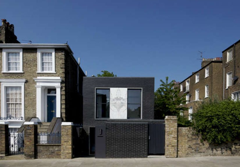
The Shadow House is the kind of project that makes architects lean in closer. It’s a compact new-build home in Camden, North London, wrapped in a black-glazed brick skin that stands out against its lighter neighborsdramatic without being gimmicky. It’s also an early example of the studio’s full-spectrum approach: site, planning, design, construction, and even the manufacture of fittings and furniture were treated as a continuous process rather than separate handoffs.
Inside, the palette often plays with contrastdark brick and shadowy surfaces balanced by lighter materials and carefully placed daylight. In a small footprint, that contrast becomes spatial strategy: shifts in texture, ceiling height, and illumination help the interior feel layered and intentional rather than simply “small.”
The Shadow House received significant recognition, including a RIBA award, and it’s frequently cited as proof that a small house can feel expansive if the architecture is doing more than one job at a time.
What homeowners can steal (politely) from the Shadow House
- Use one strong exterior material. A confident envelope can make a modest house feel iconicespecially when the form is simple and the detailing does the heavy lifting.
- Design “micro-moments” instead of “big rooms.” In tight plans, atmosphere comes from sequences: a threshold, a turn, a view, a pocket of light.
- Make daylight a layout tool. Window placement is not decoration; it’s spatial engineering.
Signature Project #2: Makers House (A Handmade Laboratory for Domestic Life)
If the Shadow House is a sharply tailored black jacket, the Makers House is the full wardrobecustom, durable, and full of surprising pockets. Built as a self-initiated project, the Makers House is a detached family home near Victoria Park in East London. The studio describes it as an exploration into the “ideal texture and atmosphere of domestic architecture,” which is an unusually poetic mission statement for a house that also needs to survive weekday breakfasts.
The story is as compelling as the result: the founders bought the site, secured planning, raised finance, and built the roughly 2,390-square-foot house largely by hand over several yearsacting as main contractor and treating the build as an education in materials, sequencing, and detail. That level of involvement shows up everywhere: the structure reads clearly; the layers are visible; the finishes don’t feel “applied” so much as earned.
Makers House has been widely featured and recognized, including major award shortlists and a RIBA London Award. It also became a public fascination during Open House events, where visitors could experience firsthand how the building’s craft and construction logic translate into lived atmosphere.
Why Makers House resonates beyond architecture nerd circles
Plenty of houses photograph well. Makers House is interesting because it’s conceptually ambitious without being precious. It’s a serious design experiment that still respects the ordinary realities of a home: storage, circulation, light, privacy, and the way a family actually moves through a day. It treats “value” as more than square footageit treats value as spatial intelligence and material longevity.
Adaptive Craft: The Ancient Party Barn (Not Your Typical Barn Conversion)
Barn conversions often follow a predictable script: keep the shell, insert glass, add a sleek kitchen, call it a day. The Ancient Party Barn rejects that formula. The project transforms a cluster of historic agricultural buildings into an atmospheric getaway focused on gathering, reuse, and a carefully curated material palette shaped by reclaimed artifacts collected by the clients.
One of the most memorable aspects is the use of industrial-scale kinetic mechanismsmassive shutters, rotating elements, and large openings that can shift the barn between a closed, protective “brooding” state and an open, landscape-facing retreat. The design balances old and new in a way that feels both grounded and inventive: traditional fabric is preserved, but modern engineering isn’t hidden. It becomes part of the character.
The project also highlights a pragmatic sustainability streak: high-performance systems (like a ground-source heat pump) coexist with reclaimed materials and adapted fixtures, suggesting that low-energy living doesn’t have to look like a tech brochure.
A lesson from the barn: make the building “perform”
What’s powerful here is not just the romance of reclaimed materialsit’s the idea that architecture can change state. Shade, insulation, security, ventilation, view, and delight are treated as variables the building can actively manage. For homeowners, that mindset can be scaled down: operable shading, well-placed vents, layered thresholds, and flexible openings often deliver more comfort than a simple “bigger HVAC” approach.
Tailored House: Formal on the Outside, Opulent in the Details
The Tailored House leans into a metaphor that feels surprisingly accurate: the clients compared their home to a tailored suitrecognizable and elegant as a whole, but revealing individuality and richness in the details. The project sits within a conservation-area context shaped by complicated planning realities (including rights to light), pushing the architects toward a carefully modeled, bevelled form and a layered façade strategy.
The exterior composition is described as layered planesbrick, render, and stone elements that echo the proportions of classic London neighbors while subtly differentiating the house as a contemporary type. Rather than copying history, it speaks the language fluently with a modern accent. And, like a good suit, it’s not loud. It’s precise.
What “Crafted Architecture” Really Means (Beyond the Instagram Caption)
In the age of fast everythingfast furniture, fast flips, fast “luxury” (which is often just the word luxury printed on a sign)Liddicoat & Goldhill’s work argues for slowness in the places that matter. Their approach suggests that craftsmanship in architecture is not only about handmade objects. It’s also about:
- Assembly logic: details that make sense, not just look good.
- Material truth: letting materials age, patinate, and stay honest.
- Spatial sequence: designing how a day unfolds, not just how a room photographs.
- Responsibility: balancing embodied carbon, reuse, and durability with aesthetic ambition.
Why Their Work Matters (Even If You’re Not Building in London)
You don’t need to be in Camden or Hackney to learn from this practice. Their best ideas travel wellespecially for anyone dealing with tight sites, neighborhood rules, historic context, or the desire to build something that doesn’t feel disposable.
If you’re on a small or awkward lot
The Shadow House and Makers House show how to treat constraints as form-givers. Instead of fighting the site, shape the building around the most valuable spatial assets: daylight, privacy, and circulation. In many U.S. citieswhere narrow lots, ADUs, and zoning constraints are everyday realitiesthis design mindset is especially useful.
If you’re renovating something old
The Ancient Party Barn illustrates a key renovation truth: preservation is strongest when it’s paired with a clear contemporary logic. Keeping the old fabric isn’t enough; you need a strategy for how new work behavesstructurally, materially, and atmospherically.
If you want sustainability without beige guilt
Their work suggests sustainability can be a design aesthetic, not a sacrifice. Reclaimed materials, durable assemblies, passive comfort moves, and high-performance systems can coexistand the result can still feel adventurous. Environmental responsibility doesn’t need to look like it was chosen by a committee whose favorite color is “regulation.”
Experiences: What It Feels Like to Live With Liddicoat & Goldhill’s Ideas (About )
To understand Liddicoat & Goldhill, it helps to imagine the experience of moving through one of their spacesbecause their architecture is rarely about a single “wow” moment. It’s about the steady accumulation of sensory cues: the way light lands, the way a material changes under your hand, the way a threshold tightens and then releases.
Picture arriving at a compact urban house where the exterior doesn’t try to charm you with cuteness. It’s calm, confident, and slightly mysteriouslike it knows something you don’t. The brick feels intentional, not trendy. You step inside and realize the building isn’t hiding its workings. Joists are visible, structural lines are readable, and suddenly you feel oriented. Not because there’s a giant “WELCOME!” sign, but because the construction itself gives you clues. It’s the architectural equivalent of a well-organized toolbox.
Now imagine a morning routine in a house built around daylight strategy. The sun doesn’t just “come in”; it arrives in specific places at specific timesdeepening a wall texture here, catching an edge there, making a simple cup of coffee feel like a tiny event. At noon, the house shifts again. The bright zones and shaded zones trade roles, and the space starts to feel cooler and quieter without you touching a thermostat. You notice you’re choosing to sit in different spots throughout the day, the way you’d choose different seats at a great café.
In a project like Makers Housedescribed as a kind of laboratory for domestic texturethe experience becomes even more tactile. You brush past a surface and feel the grain. You grab a handrail and register temperature, weight, and finish. The house doesn’t feel like a blank slate waiting for decor to rescue it. It already has character, built into the bones. And that character is oddly comforting, because it’s not “styling.” It’s evidence: someone thought hard about how this place is made and how it will age.
Then shift to something like the Ancient Party Barn, where the building can literally change state. One moment it’s closed, protective, a little monasticholding warmth and darkness the way old agricultural structures do. Then an opening mechanism swings or lifts, and suddenly the landscape is invited in. The building becomes social. The air changes. Conversations drift outward. Even the act of opening the structure feels like a ritual, the way lighting a fire or setting a long table feels like a ritual. That’s not just engineering showing off; it’s architecture choreographing how people gather.
The most memorable “experience” across these projects is the sense that nothing is accidental. Details don’t feel decorative; they feel earned. And while that level of intention could sound intimidating, it often reads as hospitality: a building that makes your daily life smoother, richer, and a little more interestingwithout requiring you to live like a museum guard patrolling your own living room.
Conclusion: The Takeaway From Liddicoat & Goldhill
Liddicoat & Goldhill’s work makes a strong case for architecture that is both intellectually rigorous and sensually generous. Their projects show how small sites can feel expansive, how historic fabric can become a creative partner instead of a constraint, and how sustainability can be embedded through materials, durability, and performancewithout draining the joy out of the design.
If you’re looking for a simple summary, it’s this: they build buildings that feel made, not manufactured. And in a world full of copy-and-paste houses, that’s a quietly radical thing.