Table of Contents >> Show >> Hide
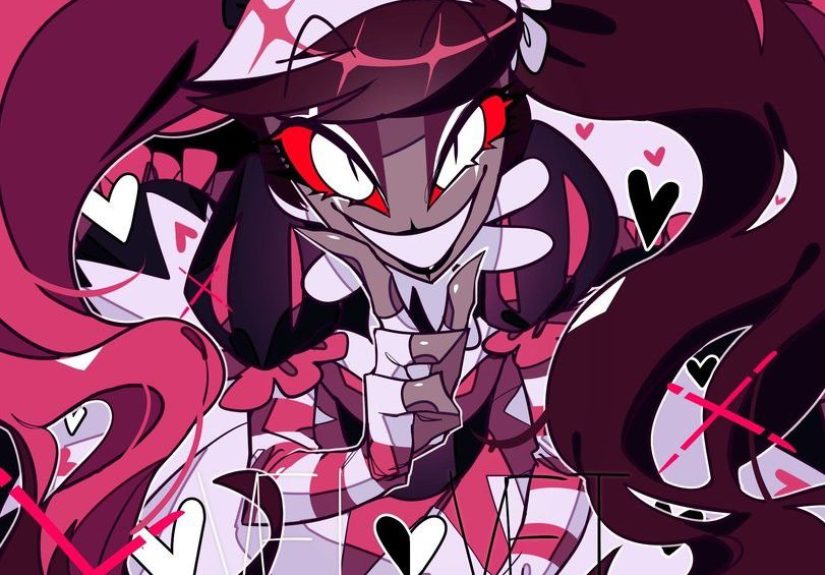
If a show looks like a neon sign got into a fistfight with a Broadway poster and somehow came out looking fabulous, there is a very good chance artists are going to draw it. That is basically the energy of Hazbin Hotel. The series has become such a magnet for fan creativity because it mixes loud color, theatrical character design, dark comedy, musical flair, and enough emotional whiplash to keep your sketchbook permanently open. So yes, I did what many artists do when a fandom grabs them by the collar and yells “create something dramatic”: I made five Hazbin Hotel fan art pieces.
This article is part process diary, part fandom love letter, and part creative breakdown of what made these drawings so fun to make. I am not here to pretend my hand did not cramp halfway through sketch number three. It absolutely did. But the result was worth it. If you are searching for Hazbin Hotel fan art inspiration, curious about how to interpret the show’s visual style, or just want to peek into one artist’s chaotic little brain while drawing demons with excellent tailoring, welcome in.
Why Hazbin Hotel Is Perfect Fan Art Material
Before I talk about the five pieces themselves, it helps to explain why this series is such a gold mine for artists. Hazbin Hotel is built around designs that feel instantly readable. Charlie Morningstar has that polished, optimistic stage-performer energy. Alastor looks like old-time radio learned how to smirk. Angel Dust is all swagger, stretch, and attitude. Vaggie has sharp structure and emotional restraint that reads beautifully in silhouette. Even the background design language encourages fan interpretation: everything feels exaggerated, theatrical, and emotionally loaded.
That matters because good fan art usually starts with strong shapes and clear personality. In other words, artists are not just drawing a character. They are drawing a mood. Hazbin Hotel hands you mood on a silver platter, then adds sparkles, blood-red lighting, and a musical cue for extra flair.
Another reason the show works so well for fan art is contrast. It can be sweet and cynical, glamorous and messy, funny and surprisingly heartfelt. That gives artists room to experiment. You can draw a polished poster-style portrait, a comedy scene, an emotional character study, or an over-the-top fashion illustration and still feel true to the source material. It is basically a buffet for creative people. A cursed buffet, perhaps, but a buffet nonetheless.
The 5 Hazbin Hotel Fan Art Pieces I Made
1) Charlie Morningstar: The “Hope in Hell” Portrait
The first piece I made had to be Charlie. She is the emotional center of the show, and visually she is a dream for anyone who enjoys high-contrast character design. I did not want to make her look soft in a generic way. I wanted the art to capture what makes Charlie interesting: she is hopeful without being naive-looking, upbeat without being empty, and theatrical without losing sincerity.
I drew her standing front-facing with her smile just a little strained, because that tiny tension says more about the character than a perfect grin ever could. Behind her, I used a glowing red-and-gold background inspired by stage curtains and marquee lights. The idea was simple: Charlie always feels like someone trying to perform optimism in a place that keeps daring her to fail. That emotional contradiction became the heart of the piece.
My favorite detail was the lighting around her eyes. I kept it bright enough to make her feel alive, but not so bright that she looked carefree. If you know the show, you know Charlie’s whole mission carries enormous emotional weight. I wanted the fan art to feel like a poster for that burden disguised as charm. Also, drawing her hair took approximately six years, medically speaking.
2) Alastor: Vintage Radio Nightmare Energy
The second fan art piece was Alastor, because of course it was. If you are an artist and you see a character with a retro-broadcast aesthetic, a permanent grin, and the vibe of a jazz record possessed by a fox-shaped thunderstorm, you are going to draw him. It is just science.
For this piece, I leaned into the old-radio identity. I designed the composition like a distorted broadcast poster, with concentric circles, thin geometric frames, and shadowed antler forms stretching behind him. I kept his expression controlled instead of explosive, because I think Alastor becomes more unsettling when he looks calm. Chaos is expected from him. Calm confidence is what really creeps under your skin.
I used a limited palette with crimson, black, muted beige, and tiny pops of electric light to create that feeling of old media meeting infernal energy. His microphone became the anchor of the composition, almost like a relic or a weapon. More than any other piece, this one made me think about how Hazbin Hotel character design supports fan art storytelling. Alastor is not interesting only because he looks cool. He is interesting because every visual element tells you something about power, performance, and control.
3) Angel Dust: Motion, Performance, and Emotional Contrast
The third piece was Angel Dust, and this one was trickier than I expected. It is easy to draw Angel Dust as flashy. The real challenge is drawing him with both style and emotional texture. He is a character built on performance, but that is exactly why the quieter details matter so much.
I decided not to make this a static portrait. Instead, I posed him mid-motion, with one hand lifted dramatically and the body angled like he had just spun into frame. I exaggerated the limbs to emphasize his elasticity and theatricality. The linework was sharper around the face and looser around the body, which helped create a sense of movement. I wanted viewers to feel like the character had not stopped moving just because the drawing did.
The color story mixed hot pinks, icy whites, and saturated magentas, but I added a cooler shadow pass underneath to keep the piece from feeling too one-note. That balance mattered to me. Angel Dust works best in art, in my opinion, when the glamor and the vulnerability are both visible, even if one is hiding behind the other. That was the whole point of this fan art: not just to make him look iconic, but to make the pose feel like a performance with emotional static crackling underneath it.
4) Charlie and Vaggie: A Quiet Scene Instead of a Loud One
By the time I reached piece number four, I realized my set needed a softer moment. Not every drawing has to look like a demon cabaret exploded. So I made a Charlie-and-Vaggie illustration built around stillness, support, and a little emotional breathing room.
I placed them seated close together in the hotel, with the background simplified into warm shapes and dim lighting. Charlie was talking; Vaggie was listening. That was the entire concept. No elaborate action scene. No giant props. No visual screaming contest. Just intimacy and grounding.
This ended up being one of my favorite works in the group because it reminded me that Hazbin Hotel fan art ideas do not always need to be loud to feel accurate. The show may be famous for spectacle, but relationships are part of what give that spectacle meaning. Drawing the two of them in a restrained scene let me focus on posture, expression, and micro-details like eye direction and hand placement. Sometimes a character pair says more through body language than an entire paragraph of dialogue.
Also, as a practical note, drawing a calmer composition after three high-intensity pieces felt like giving my overworked brain a juice box and a nap.
5) Vox-Inspired Poster Art: Glitch, Ego, and Screen-Light Chaos
The fifth and final piece was a Vox-inspired poster composition. I wanted one artwork in the series to feel fully graphic and aggressively modern, and Vox was the obvious choice. His visual language practically begs for sharp edges, screen distortion, and the kind of smug energy that makes you want to both admire the design and throw a shoe at the wall.
I built this piece around a vertical poster layout, with a bright digital-blue glow cutting across a dark background. Instead of drawing every detail naturalistically, I stylized parts of the face and suit into harder shapes so the piece felt more like branded propaganda than a character portrait. I layered glitch textures, angular framing, and subtle static effects to make the whole composition look like it was broadcasting itself into your eyeballs whether you asked for it or not.
This piece taught me the most about visual voice. A fan art drawing becomes stronger when the medium matches the character. Charlie wanted emotional glow. Alastor wanted vintage dread. Angel Dust wanted movement. Vox wanted design that felt invasive, polished, and performatively powerful. Once I accepted that, the piece came together much faster.
What I Learned From Making All Five
After finishing all five Hazbin Hotel fan art pieces, I noticed something interesting: the strongest drawings were not the ones where I copied the show most closely. They were the ones where I translated the show’s core energy into my own visual language. That is an important difference.
Fan art is not at its best when it becomes a photocopy with better brush settings. It shines when it understands what makes the source material tick. For Hazbin Hotel, that meant embracing theatrical shapes, dramatic contrast, emotional tension, and character-first choices. Every time I tried to focus only on surface-level accuracy, the piece felt stiffer. Every time I focused on personality and rhythm, it came alive.
I also learned that this fandom rewards range. You can make polished digital posters, expressive sketches, comic panels, romantic scenes, stylized portraits, or chaotic meme art, and there is still room for all of it. That flexibility is part of why Hazbin Hotel art has become such a fun corner of fan culture. The show gives artists permission to be dramatic, sincere, messy, elegant, and weird all at once. Frankly, that is the dream.
Tips for Creating Your Own Hazbin Hotel Fan Art
Focus on silhouette first
If the shape reads well in black-and-white, the design will usually survive stylization. This series is fantastic for silhouette work, so take advantage of that.
Use color with intention
Do not just grab red and call it a day. Think about which reds feel theatrical, sinister, romantic, or aggressive. The palette can do half the storytelling for you.
Draw the character’s social energy
How does the character “enter” a room? Charlie opens it with warmth. Alastor owns it. Angel Dust performs for it. Vaggie evaluates it. Vox tries to dominate it. That social energy should shape the pose.
Let your fan art have an opinion
The best fandom art usually says something. It can say “this character is sadder than they look,” “this duo feels safest in quiet moments,” or “this villain should look like a corrupted billboard.” Give your piece a point of view.
My Extended Experience Making These 5 Fan Art Pieces
Now for the longer, messier, more personal part of the story.
When I first decided to make five Hazbin Hotel fan art pieces, I thought I had a clean plan. I was going to sketch fast, choose a consistent style, finish everything efficiently, and emerge from the process looking like the kind of organized artist who labels layers properly and drinks water on schedule. That fantasy lasted about nine minutes.
What really happened was much more honest. I started with excitement, immediately got distracted by too many composition ideas, then spent an unreasonable amount of time deciding whether one character’s expression looked “dramatic” or merely “mildly constipated.” This is the less glamorous side of making fan art. From the outside, people see the final image. From the inside, you remember the forty-seven tiny choices that almost sent you into orbit.
Still, that is exactly why the project was so satisfying. Each piece forced me to pay attention in a different way. Charlie pushed me toward emotional clarity. Alastor made me think about graphic design and menace. Angel Dust challenged me to create movement. The Charlie-and-Vaggie piece reminded me to trust quiet moments. Vox pushed me into bolder stylization. Together, the five artworks felt less like isolated drawings and more like a mini creative workshop built inside one fandom.
I also noticed how much the music-and-performance DNA of the series affected my drawing rhythm. Even when I was not literally listening to the soundtrack, I kept composing poses and lighting like I was staging scenes instead of merely illustrating them. That changed the energy of the artwork. The poses became more deliberate. The facial expressions became more readable. The compositions started feeling less like screenshots and more like visual performances.
Emotionally, the project was a great reminder of why fan art matters. Sometimes people talk about it like it is “practice art,” as if it sits below original work. I do not buy that at all. Fan art can be playful, yes, but it can also be serious visual analysis. It asks what you notice, what you value, what emotional truth you want to pull forward. In that sense, making these pieces did not feel derivative. It felt interpretive. It felt alive.
By the end, I had five finished artworks and one very clear conclusion: Hazbin Hotel is one of those rare shows that invites artists to go big without losing heart. You can be stylish, theatrical, sarcastic, romantic, eerie, funny, or all of the above, and the source material still has room for you. That is a gift. And honestly, any fandom that lets you draw a hopeful princess, a radio demon, a spider diva, a protective partner, and a walking nightmare television in one creative sprint is doing something very right.
Would I do another five pieces? Absolutely. Would I pretend I did not reopen at least three files just to tweak one eyebrow by two pixels? Absolutely not. Art has standards. Chaos has standards too.
Final Thoughts
Making these five Hazbin Hotel fan art pieces reminded me that great fandom art is not about chasing perfection. It is about capturing energy. This series gives artists a lot to work with: bold color palettes, musical emotion, memorable silhouettes, and characters who feel larger than life without losing their humanity. Or their demonity. That is probably not a word, but the vibe is correct.
If you have been thinking about making your own Hazbin Hotel fan art, take this as your sign. Start with the character whose energy you understand best. Build the piece around mood instead of pure accuracy. Let the design breathe. Let the emotion show. And if your first draft looks a little cursed, congratulations. You are probably in the right universe.