Table of Contents >> Show >> Hide
- What “Drawing With Dots” Actually Means (And Why It Works So Well)
- Double Exposure: The Dream Layer That Makes Wildlife Feel Mythic
- Why Wild Animals Are the Perfect Match for Dots + Double Exposure
- My Step-by-Step Process: From Blank Page to “Why Did I Choose So Many Dots?”
- Step 1: Pick the Animal (Silhouette First, Details Second)
- Step 2: Choose the Second “Exposure” Layer With Intention
- Step 3: Thumbnail the Composition (Tiny Sketches Save Big Regrets)
- Step 4: Light Pencil Sketch (Just Enough to Guide the Dots)
- Step 5: Establish the Eye and the Darkest Darks
- Step 6: Build Gradients With Dot Density
- Step 7: Add the Double Exposure Layer Without Turning It Into Wallpaper
- Step 8: Clean Up and Finish (Highlights, Edges, and Breathing Room)
- Specific Wildlife Examples (Because Ideas Are Easier Than “Just Be Creative”)
- Common Mistakes (And How I Fix Them Without Crying On the Paper)
- How I Finish, Digitize, and Share These Pieces
- Final Thoughts: Why I Keep Coming Back to Dots and Wild Things
- Extra: of Real-Life Experience From the Dotwork Trenches
There are two kinds of people in this world: the ones who see a majestic wolf and think, “Wow, nature is incredible,” and the ones who see a majestic wolf and think, “Wow, I bet I could spend 14 hours turning that into a million tiny dots.” Hi. I’m the second kind.
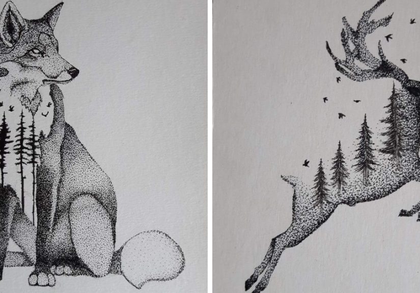
My favorite way to draw wild animals blends dotwork (a.k.a. stippling) with the dreamy visual magic of double exposure. Imagine a bear silhouette filled with a mountain range, or an owl whose feathers fade into a night skyexcept instead of smooth gradients, everything is built from dots, like a star map that got really committed to detail.
In this post, I’ll break down how the technique works, why wildlife is the perfect subject, and how you can create your own dot-and-exposure animal pieceswithout losing your mind, your wrist, or your ability to look at a pepper shaker without feeling judged.
What “Drawing With Dots” Actually Means (And Why It Works So Well)
Dotwork is exactly what it sounds like: you build an image with dots instead of lines. In traditional stippling, the density of dots controls value. Lots of dots close together reads as shadow. Fewer dots spaced out reads as light. No fancy hacksjust patience, planning, and the kind of stubbornness that makes people run marathons “for fun.”
Stippling vs. Pointillism: Cousins, Not Twins
Stippling is most often associated with drawingthink pen-and-ink illustrations where dots create shading and texture. Pointillism is more connected to painting, where colored dots rely on your eye to blend them optically. For this wildlife approach, I borrow the “optical magic” mindset but keep the tools closer to illustration: pens, ink, and paper.
Why Dots Feel Alive on Fur, Feathers, and Scales
Wildlife textures basically beg for dotwork. Fur isn’t one flat tone; it’s layers of light and shadow. Feathers have tiny value shifts. Scales catch highlights in a repeating pattern. Dots let you build those surfaces slowly and intentionallyespecially when you vary:
- Dot spacing (tight for shadow, wide for glow)
- Dot size (micro-dots for smooth gradients, slightly larger dots for texture)
- Dot “clusters” (grouping dots to suggest direction and form)
The result is a surface that looks detailed up close and surprisingly smooth from a distancelike the drawing has two personalities, both of which are very into wildlife documentaries.
Double Exposure: The Dream Layer That Makes Wildlife Feel Mythic
Double exposure started as a photography technique: the same frame is exposed to two different images, creating one blended result. In modern digital workflows, it often means combining images with masks, blending modes, or careful layering so the two scenes feel fused not pasted.
When I translate double exposure into illustration, I’m usually doing one of two things:
- Silhouette fill: The animal shape becomes a “window” into a second scene (forest, mountains, ocean).
- Fade blend: The animal transitions into the second scene through controlled gradients of dots.
The Secret Sauce: Contrast and Hierarchy
Great double exposure isn’t just “two images at once.” It’s one clear subject plus a second layer that supports it. If both layers fight for attention, the viewer’s eye doesn’t know where to landand the piece starts to feel like a visual group chat where everyone is typing at the same time.
I keep it readable by planning:
- A dominant focal point (usually the animal’s eye, muzzle, or head shape)
- One primary texture layer (trees OR clouds OR wavesnot all three)
- Value separation so the silhouette stays legible
Why Wild Animals Are the Perfect Match for Dots + Double Exposure
Wild animals come pre-loaded with symbolism. A wolf suggests instinct and community. An eagle reads as freedom and perspective. A tiger carries power. A sea turtle feels ancient and steady. Double exposure lets you amplify that meaning by pairing the animal with a habitat, a weather pattern, or a texture that supports the story.
Respect Matters: Using References the Right Way
Wildlife art often begins with reference photosand that’s where ethics comes in. Whether you shoot your own references or use licensed images, the goal is the same: don’t harm or harass animals for a “better shot.” If you’re photographing, keep a respectful distance, don’t feed wildlife, and avoid stressing animalsespecially during sensitive times like nesting or raising young.
Even if you’re not behind the camera, you can still be intentional: choose references from photographers who prioritize animal welfare, and be honest about what you used. Art can celebrate wildlife without turning it into a prop.
My Step-by-Step Process: From Blank Page to “Why Did I Choose So Many Dots?”
Step 1: Pick the Animal (Silhouette First, Details Second)
I start with an animal that has a strong, recognizable silhouette. Bears, wolves, foxes, big cats, owls, and elephants are all great choices. If the outline reads clearly in black-and-white, it’s going to work better once you start layering textures inside it.
Step 2: Choose the Second “Exposure” Layer With Intention
The overlay image should feel like it belongs to the animal’s story. I ask myself:
- What habitat does this animal depend on?
- What natural element matches its “vibe” (storm, fog, sunrise, stars)?
- What shapes echo the animal’s form (tree lines, ridges, wave curves)?
If the animal is the headline, the exposure layer is the supporting paragraphhelpful, meaningful, not louder than the headline.
Step 3: Thumbnail the Composition (Tiny Sketches Save Big Regrets)
I do three to five quick thumbnails. This is where I decide where the fade happens, what stays crisp, and where the eye goes. It’s also where I prevent my most common mistake: putting an entire national park inside a fox and then wondering why it looks busy.
Step 4: Light Pencil Sketch (Just Enough to Guide the Dots)
I keep the sketch lightmostly the silhouette, major facial landmarks, and a few “value zones” (darkest shadow, midtone, highlight). Dotwork is unforgiving: if you commit too early, the paper remembers. Forever.
Step 5: Establish the Eye and the Darkest Darks
If the animal has an eye visible, I treat it like the anchor of the whole piece. Then I place the deepest shadows next. This builds a value map so the rest of the dots have a job description.
Step 6: Build Gradients With Dot Density
Here’s my practical rule: don’t chase perfection dot-by-dot. Build in passes. First pass: light structure. Second pass: deepen shadows. Third pass: soften transitions. Fourth pass: micro-adjustments and texture.
This layered approach keeps the drawing cohesive and reduces the “patchy” look that happens when you hyper-focus on one corner for an hour and forget the rest of the animal exists.
Step 7: Add the Double Exposure Layer Without Turning It Into Wallpaper
I introduce the overlay as shapes and value blocks first: a tree line, mountain ridge, coral branches, cloud bands. Then I “translate” those shapes into dots. The key is to simplify. A double exposure layer is not a second full illustration it’s a texture-driven story element.
Step 8: Clean Up and Finish (Highlights, Edges, and Breathing Room)
I preserve highlights by leaving paper white. If I need a bright edge, I simply don’t dot therebecause ink doesn’t believe in undo buttons. I also check edges: sharp edges pull focus, soft edges recede. I use that to keep attention on the face, eye, or key gesture.
Specific Wildlife Examples (Because Ideas Are Easier Than “Just Be Creative”)
1) Wolf + Pine Forest Fade
The wolf’s muzzle and eye stay crisp in dotwork. The neck fades into a pine forest silhouette. I keep the forest darker at the base and lighter toward the top so it feels like mist is rising. The forest is simplifiedtree shapes, not individual needlesso the wolf remains the star.
2) Tiger + Monsoon Clouds
Tigers already have bold rhythm in their stripes, so I use the overlay more subtly: cloud bands that echo the stripe flow. I keep the overlay values mostly midtone, with one or two darker cloud pockets, so the tiger’s face contrast doesn’t get diluted.
3) Sea Turtle + Coral “Window”
The turtle’s shell becomes a window into a coral reef scene. The head and flippers are rendered primarily with dots for texture and depth, while the coral inside the shell is slightly more graphic. This keeps the composition readable: animal first, habitat second.
4) Owl + Night Sky Constellations
Owls and stars are basically best friends in the mythology department. I place the owl’s face in clean high contrast, then fade the wings into a star field. The trick: stars are dots too, so I vary dot size and spacing carefully to avoid the whole piece looking like one uniform “dot soup.”
Common Mistakes (And How I Fix Them Without Crying On the Paper)
Mistake 1: Muddy Double Exposure
If both layers have similar values, everything blends into a gray fog. Fix: increase value separation. Either make the silhouette darker and the overlay lighter, or keep the silhouette clean and push the overlay into a limited value range.
Mistake 2: Over-Texturing the Overlay
Trees, waves, clouds, mountains, AND a moon might sound poetic, but it often reads like clutter. Fix: pick one dominant texture and let everything else whisper.
Mistake 3: Dot Banding (Visible “Rows”)
When dots fall into patterns, gradients look striped. Fix: rotate your paper, change your dot rhythm, and build values in light passes instead of trying to “fill” an area in one direction.
Mistake 4: The “I Can’t Stop” Problem
Dotwork is addictive. The piece can get darker and darker until it loses sparkle. Fix: step back (literally), view it from a distance, and protect highlights like they’re the last cookie at a party.
How I Finish, Digitize, and Share These Pieces
Dotwork and double exposure look fantastic in print and onlineif you digitize them well. I scan at high resolution, clean dust specks, and adjust contrast gently so the dots stay crisp and the whites stay clean. If you photograph instead of scan, even lighting matters: shadows from paper texture can ruin subtle gradients.
When sharing, I include a short caption about the concept (animal + overlay meaning). If the reference came from a photographer, I credit them when licensing allows. If the animal was drawn from a captive setting or a conservation program image, I’m transparent. Trust is part of the craft.
Final Thoughts: Why I Keep Coming Back to Dots and Wild Things
This technique slows me down in the best way. Every dot is a tiny decision, and every overlay is a reminder that animals don’t exist separate from their environments. A wolf without forest is just a cool shape. A turtle without ocean is just a sad commute. Dots and double exposure let me build that connection into the art itself.
If you want to try it, start simple: one animal, one overlay, clear values. Let the piece breathe. And when your hand cramps, remember: you chose the dot life. The dot life did not choose you. (Okay, it probably did.)
Extra: of Real-Life Experience From the Dotwork Trenches
The first time I tried dotwork double exposure, I picked a wolfbecause of course I didand decided to fill it with an entire evergreen forest, a moon, and “just a few” stars. Three hours later, I had a wolf-shaped stress test. The forest looked like static, the moon looked like a coin someone dropped into a puddle, and the stars looked suspiciously like I’d sneezed ink onto the page. That was the moment I learned the most important rule of this style: simplicity is not laziness; it’s clarity.
Over time, the process became less about proving I could do a million dots and more about building a story with restraint. Now, when I plan a piece, I ask what I’m trying to say. If I’m drawing a sea turtle, the “second exposure” isn’t just coral because coral is pretty. It’s coral because it’s home, because it’s fragile, because it’s a whole neighborhood of life. If I’m drawing a bear, sometimes the overlay is a topographic map pattern or a mountain ridge a quiet nod to range, migration, and the fact that wild spaces are not infinite.
I’ve also learned to treat my hand like a teammate, not a disposable tool. Early on, I’d grip the pen like it owed me money. That’s how you end up with a sore wrist and a drawing that looks tense. Now I take breaks, rotate the paper, and change dot pressure to keep the marks fresh. I’ll even switch to a lighter touch for midtones, because heavy dots can turn delicate fur shading into something that reads like asphalt. Not the vibe.
The funniest part is how this technique changes the way you see the world. I can’t look at fog rolling over trees without thinking, “That would fade beautifully into a fox tail.” I can’t see ripples on water without imagining them inside the curve of a whale. Even waiting in line at the grocery store, I catch myself noticing textures: the dot pattern on a paper towel, the grain on cardboard, the tiny speckles on fruit. (Yes, produce can be inspiring. No, I’m not okay.)
And the best experience, honestly, is when someone recognizes the animal firstthen notices the landscape inside it. That’s the moment the double exposure clicks. It feels like a small reveal, like the artwork is inviting the viewer to slow down and look again. In a world that scrolls fast, dotwork forces patienceboth in making and in seeing. Which is probably why I keep coming back to it: wild animals deserve more than a quick glance, and dots refuse to be rushed.