Table of Contents >> Show >> Hide
If you have ever opened a PowerPoint template and thought, “Nice… but why does this font look like it belongs on a 2007 science fair board?” you are not alone. A template is supposed to save time, not send you into an existential spiral over mismatched colors, stubborn logos, and layouts that seem to have been designed by a committee of raccoons. The good news is that editing a PowerPoint template is much easier once you know where the real controls live.
The trick is understanding the difference between changing one slide and changing the system behind the slides. That system lives in Slide Master, where PowerPoint stores the default layouts, placeholders, theme colors, fonts, and recurring design elements that shape the entire presentation. Once you know how to work there, you can update a template quickly, keep everything consistent, and avoid manually fixing the same problem on 42 slides like a person trapped in a very boring time loop.
In this guide, you will learn exactly how to edit a PowerPoint template in 6 steps. We will also cover common mistakes, practical examples, and real-world lessons from people who have learned the hard way that “just moving one text box” can somehow break an entire deck.
Why Editing a PowerPoint Template Matters
A good PowerPoint template does more than make slides look pretty. It creates consistency, speeds up content creation, and helps presentations stay on-brand. When your template is set up well, every new slide already has the right fonts, colors, spacing, placeholders, and visual structure. That means less fiddling, less guessing, and fewer “Wait, why does slide 19 look like it belongs to a different company?” moments.
Editing the template is especially useful if you need to:
- Update company branding, such as logos, fonts, or color palettes
- Change slide layouts for reports, pitches, or training decks
- Fix placeholder styles that make text or images look awkward
- Create reusable slides for teams that need a clean starting point
- Save time when building multiple presentations from the same design system
Whether you are a marketer, teacher, sales rep, consultant, or student trying to make your slides look less like a hostage note, learning to edit a PowerPoint template is one of the most useful presentation skills you can have.
How to Edit a PowerPoint Template: 6 Steps
Step 1: Open the Template and Identify What Needs to Change
Start by opening the PowerPoint file you want to edit. This might be a template file, a deck built from a template, or a company presentation that already contains the design system you want to improve. Before clicking random buttons with heroic confidence, pause and decide what actually needs updating.
Ask yourself:
- Do I need to change fonts, colors, or effects?
- Do I need to update the logo or background graphics?
- Do I need different slide layouts, such as title slides, comparison slides, or image-heavy slides?
- Do I want to edit a single slide, or the entire template?
This step matters because not every change belongs in the same place. If you only need to swap one photo, you can do that on an individual slide. But if you want every title slide to use a new font, every content slide to include a logo, or every section divider to follow a new style, you need to edit the template structure itself.
Think of this like home renovation. Replacing a lamp is one thing. Moving the plumbing is another. PowerPoint works the same way.
Step 2: Go to Slide Master View
Here is where the real magic happens. In PowerPoint, go to the View tab and click Slide Master. This opens the behind-the-scenes framework of the template.
On the left, you will see a large top slide and several smaller layouts underneath it. The top one is the Slide Master. It controls the global design elements that appear across related layouts. The smaller slides below are layout masters, and each one controls a specific slide arrangement, such as Title Slide, Title and Content, Two Content, Section Header, or Picture with Caption.
This is the point where many people whisper, “Ohhh, so that’s where the mystery logo came from.” Exactly.
If something keeps appearing on multiple slides and refuses to behave in Normal view, it is probably built into the Slide Master or one of its layouts. That includes recurring backgrounds, footer styles, shapes, default text formatting, and placeholders.
Step 3: Edit the Master Theme Elements
Now that you are in Slide Master view, start with the big-picture items. These are the design choices that affect the overall look and feel of the template. This includes:
- Theme colors for headings, accents, links, and chart elements
- Theme fonts for titles and body copy
- Background styles and visual effects
- Global graphics such as logos, brand bars, watermarks, or decorative shapes
If your company recently rebranded, this is where you make the deck stop living in the past. For example, if the old template uses navy and gold but the new brand uses charcoal and teal, update the theme colors first. That way, charts, shapes, text accents, and icons will stay consistent throughout the presentation.
You can also set the tone for the deck here. A modern business presentation might use clean sans-serif fonts, generous spacing, and minimal decoration. A classroom template might need brighter colors, larger text, and more visual cues. A pitch deck might need sleek section breaks and image-driven layouts. Same software, wildly different personalities.
Pro tip: do not just manually recolor one shape and call it branding. Use the theme tools so PowerPoint knows what your primary and accent colors are. That gives you a cleaner, smarter template that behaves properly when you add new elements later.
Step 4: Customize the Individual Slide Layouts
Once the overall theme is set, move down to the individual layout masters. This is where you edit how specific types of slides are structured. It is one of the most important parts of editing a PowerPoint template because this is what determines whether your slides are easy to build or annoyingly fragile.
For each layout, you can adjust:
- The position and size of title boxes
- Body text placeholders
- Image placeholders
- Chart or table areas
- Footer elements
- Background shapes or design accents
Let’s say your current “Title and Content” layout places the title too close to the edge, makes body text feel cramped, and leaves no room for visuals. Instead of fixing that slide every time you create one, update the layout once. Then every future slide built from that layout starts correctly.
This is also the perfect time to add layouts you actually need. Many default templates are too generic. If your team often builds case studies, timelines, comparison slides, quote slides, or KPI dashboards, create layouts for them inside the template. Future you will be delighted. So will your coworkers, who may stop committing crimes against alignment.
When editing layouts, keep usability in mind. A template is not art for art’s sake. It is a tool. If your beautiful design leaves no room for real content, it will be ignored, stretched, broken, or quietly hated.
Step 5: Test the Template in Normal View and Reapply Layouts if Needed
After you finish editing the master and layouts, click Close Master View and return to Normal view. Now test the template like an actual user would.
Create a few slides using different layouts. Add a long title, a short title, bullet points, an image, and maybe a chart. See how the template behaves in real life, not just in the abstract fantasy world where every heading is exactly four words and every photo is perfectly cropped.
This step helps you catch problems such as:
- Text placeholders that are too small
- Titles that wrap awkwardly
- Logos that crowd content
- Inconsistent spacing between layouts
- Old slides that do not reflect the updated design
If you already had slides in the deck before editing the template, some may need to be updated manually by using Layout in the Home tab or by reapplying the layout. This is normal. PowerPoint is helpful, but it is not a mind reader. It will not always force existing slides to behave perfectly after a structural change.
Testing saves you from the classic disaster of sending a polished template to your team only to discover that the “image caption” layout turns every pasted photo into a chaotic collage of sadness.
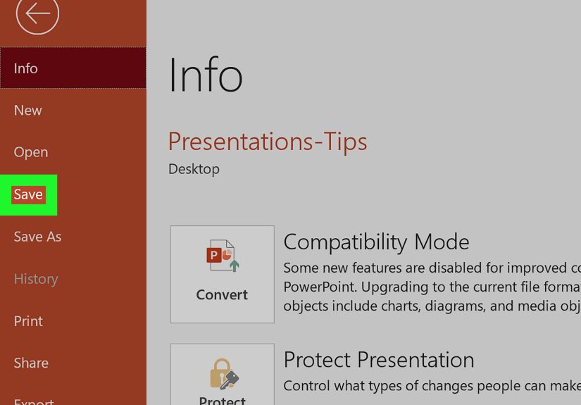
Step 6: Save the Edited File as a Template
Once everything looks right, save your work properly. If you want the edited file to function as a reusable PowerPoint template, save it in template format rather than as a standard presentation.
This gives you a clean starting file for future decks and helps preserve the design system you built. You can also save the theme separately if you mainly changed colors, fonts, and effects and want to apply those settings to other presentations later.
Name the template clearly. Something like Sales Deck Master Template 2026 is a lot more useful than final_v2_real_final_USE_THIS_one.pptx. Be kind to your future self. That person has enough going on.
If you work on a team, store the template in a shared location and give people a short set of usage instructions. Even the best PowerPoint template can be destroyed by someone who decides the title should be in neon green “just to make it pop.”
Best Practices for Editing a PowerPoint Template
Knowing the steps is great. Knowing how to avoid bad design choices is even better. Here are a few best practices that make template editing more effective:
Keep the Design Flexible
Templates should support a range of content, not just one ideal example. Build layouts that can handle short text, long text, images, and data without falling apart.
Use Real Content for Testing
Always test with realistic headlines and body copy. Lorem ipsum is polite, but it does not behave like actual business writing, course material, or client messaging.
Limit Font and Color Choices
A template with too many styles becomes messy fast. Most strong presentations can work with one or two fonts and a disciplined color palette.
Make Room for White Space
Not every inch of a slide needs to be filled. White space improves readability, focus, and overall polish. Your slides do not need to look like a yard sale.
Design for the User, Not Just the Designer
If the template will be used by other people, make it intuitive. Create clear layouts, helpful placeholders, and enough variation to cover common needs.
Common Mistakes to Avoid
When editing a PowerPoint template, a few mistakes show up again and again:
- Editing individual slides instead of the Slide Master
- Using random manual formatting instead of theme settings
- Adding too many decorative elements that compete with content
- Creating layouts that look nice but do not fit real information
- Forgetting to test how old slides respond to the new template
- Saving the file incorrectly and losing the reusable template structure
If you remember one thing, make it this: the more consistent your foundation, the easier every future deck becomes.
Real-World Example: Editing a Team Template
Imagine a marketing team that uses the same PowerPoint template for campaign reviews, quarterly reports, and client pitches. The old template has tiny text, outdated colors, a bulky footer, and no layout for performance dashboards.
By editing the template, the team can:
- Replace old brand colors with the current palette
- Switch to a more readable font pairing
- Create a KPI layout for charts and metrics
- Add a quote layout for testimonials
- Simplify title slides and section dividers
- Standardize logo placement and spacing
The result is not just a prettier presentation. It is a faster workflow, fewer formatting issues, and a stronger brand presence across every deck the team produces.
Experience and Practical Lessons From Editing PowerPoint Templates
One of the most common experiences people have with PowerPoint templates is realizing far too late that they have been “editing the template” by manually fixing slide after slide. At first, it feels productive. You move a title here, resize an image there, nudge a logo into place, and tell yourself you are almost done. Then slide 14 shows up with a different layout, slide 21 has a caption box from another dimension, and slide 28 suddenly uses a font that looks suspiciously like it escaped from a wedding invitation. That is usually the moment when people discover Slide Master and feel equal parts relieved and mildly betrayed.
Another real-world lesson is that templates often fail not because they are ugly, but because they are unrealistic. A beautifully designed sample slide may look excellent with one short headline, three bullets, and a perfectly lit stock photo. But in actual use, people paste in longer titles, messy charts, screenshots, compliance text, and content from six different stakeholders who all believe their paragraph is “non-negotiable.” A good template survives that chaos. A bad one collapses like a lawn chair at a family barbecue.
Many experienced presenters also learn that the best templates are quietly helpful. They do not scream for attention. They guide content into clean, repeatable structures. The title is where you expect it. The spacing feels balanced. The chart slide has room for a chart. Revolutionary stuff. In contrast, overdesigned templates tend to age badly. They lean too hard on trendy graphics, overloaded backgrounds, or clever layouts that become exhausting after the third slide.
There is also a surprisingly emotional side to template editing. When a team finally gets a strong template in place, people feel more confident building presentations. They spend less time fighting formatting and more time shaping the message. That matters. A template is not just a file; it is a working environment. If the environment is confusing, people produce inconsistent work. If it is smart and stable, people move faster and communicate better.
One practical experience almost everyone shares is the importance of testing. What looks perfect in master view can behave very differently when real users start typing, pasting, resizing, and duplicating slides. Testing with realistic content reveals everything: title boxes that are too shallow, image placeholders that crop weirdly, alignment that drifts, or layouts that seem fine until someone adds a subtitle. This is why experienced PowerPoint users do not trust a template until they have tried to break it a little.
And then there is the eternal lesson of restraint. Just because you can add gradients, shadows, icons, ribbons, sidebars, transparency layers, and seven accent colors does not mean your template needs all of them. Most of the time, the best edit is not adding more. It is removing friction. Cleaner structure, better hierarchy, stronger consistency. Less chaos. Fewer design gymnastics. More room for the actual message to do its job.
In the end, editing a PowerPoint template well feels less like decorating and more like building infrastructure. It is a behind-the-scenes task, but it changes everything that comes after. Once the template is right, every future deck becomes easier to build, easier to read, and much harder to accidentally turn into visual soup.
Conclusion
If you want to know how to edit a PowerPoint template, the answer is simple: work from the inside out. Open the file, go to Slide Master, update the theme, refine the layouts, test the results, and save the finished design as a reusable template. Those six steps can transform a clunky presentation into a polished system that saves time and keeps every slide consistent.
And that is the real win. A solid PowerPoint template is not just about aesthetics. It helps people think clearly, present professionally, and stop wasting half their day trying to align one stubborn text box. Honestly, that alone deserves applause.