Table of Contents >> Show >> Hide
- What Are Dip-Dyed or Ombré Tiles from Clé?
- Why Designers Love the Dip-Dyed Wall Trend
- Best Places to Use Ombre Tiles in the Home
- How to Design an Ombre Tile Wall So It Looks Intentional
- Installation Reality Check: Beautiful Tile, Serious Planning
- Common Mistakes to Avoid with Dip-Dyed Walls
- Maintenance and Long-Term Care
- Conclusion
If a plain painted wall is a white T-shirt, a dip-dyed tile wall is a silk robe with excellent lighting. It has mood. It has texture. It has that “Wait… what am I looking at?” effect that makes guests suddenly forget why they walked into your kitchen in the first place.
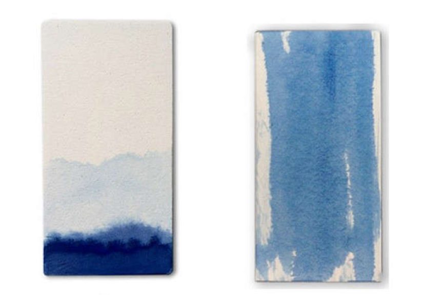
That’s the magic behind dip-dyed walls and ombré tiles from Cléespecially the brand’s Watermark collection, which helped popularize the idea that tile can behave like art, not just a wipeable surface. Instead of uniform color, you get movement: gradients, tide lines, ink-like transitions, and beautifully irregular saturation that feels more like hand-dyed fabric than traditional tile.
In this guide, we’ll break down what makes the look special, where it works best, how to design an ombré tile wall so it looks intentional (not accidental), and what to know before installation. Because yes, this is a showstopperand yes, showstoppers come with logistics.
What Are Dip-Dyed or Ombré Tiles from Clé?
Clé’s ombré look is closely associated with its Watermark collection: artisan tiles with tonal variation created through techniques like dipping, washing, and staining. The result is not a perfectly repeated print. It’s a nuanced, handmade finish where each tile absorbs pigment differently, creating unique shifts in shade, depth, and pattern.
That one-of-a-kind quality is exactly the point. These tiles are designed to feel alive on the wallmore like a composition than a commodity. In Clé’s current Watermark collection, the catalog also reflects how versatile the line is, with options for backsplashes, interior walls, shower walls, fireplace surrounds, and even some exterior wall applications depending on the product type and setting.
Why the look feels so different from regular tile
Most tile installations aim for consistency. Ombre tile installations do the oppositeon purpose. The visual interest comes from variation: darker and lighter transitions, soft edges, and a sense of movement across a surface. It’s the difference between a flat color swatch and a watercolor wash.
And because the finish is artisanal, the wall changes throughout the day. Morning light might emphasize the softer transitions; evening light can make the darker tones feel richer and more dramatic. In other words, your wall gets better lighting than most people on Zoom calls.
Why Designers Love the Dip-Dyed Wall Trend
The appeal of ombré tile walls is simple: they combine the durability of tile with the emotional impact of art. Design publications and tile studios consistently point to handmade tile, visible variation, and layered surfaces as key ingredients in today’s more character-driven interiors. Homeowners want spaces that feel curated, not copied-and-pasted.
Dip-dyed tiles deliver that in a big way. They add color without screaming, pattern without repetition, and texture without heavy visual clutter. Even a neutral ombré can read as bold because the gradient itself becomes the feature.
They work across styles
One reason the Clé ombré aesthetic has staying power is that it doesn’t belong to just one design style. Depending on color and layout, it can feel:
- Organic and rustic in a handmade kitchen
- Modern and gallery-like on a clean, minimal wall
- Coastal and airy in blue-to-white bathroom gradients
- Moody and luxurious in deep indigo or verdigris tones
That flexibility makes it easier to invest in a statement surface without worrying that it’ll look dated in two years.
Best Places to Use Ombre Tiles in the Home
You don’t need a giant wall to make this trend work. In fact, some of the most effective applications are relatively compact areas where the gradient can take center stage.
1) Kitchen backsplash
A backsplash is the classic starting point for dip-dyed tile walls. It gives you enough visual real estate for a gradient to read clearly, but not so much that the material cost becomes overwhelming. A soft tonal rise behind a range or sink can turn an ordinary kitchen wall into the room’s focal point.
2) Bathroom vanity wall
Vanity backsplashes and full-height sink walls are ideal for ombré tile because they’re often viewed straight-on. Blue, gray, green, or neutral gradients can make small bathrooms feel layered and serene without relying on busy patterns.
3) Shower feature wall or niche
If you want drama, put the gradient where the eye naturally lands: the back shower wall or inside a long recessed niche. Clé’s artisan-style finishes can make a shower feel less “builder-basic” and more spa-meets-art-studio.
4) Fireplace surround
A fireplace surround is an underrated place for ombré tile. The vertical surface naturally supports color movement, and the handcrafted feel pairs beautifully with plaster, wood, and stone. It’s a strong choice when you want texture and color but not a loud printed pattern.
5) Powder room accent wall
Powder rooms are where design risks go to thrive. A full ombré tile wall in a small space can feel immersive and memorablelike a tiny jewel box with excellent taste.
How to Design an Ombre Tile Wall So It Looks Intentional
Ombre can look effortless, but a good installation is usually the result of obsessive planning (the fun kind, ideally). Here’s how to get the gradient effect right.
Choose the direction of the fade
Before you pick tile, decide how the color should move:
- Bottom to top fade: grounds the room and feels architectural
- Top to bottom fade: airy and dramatic, especially in bathrooms
- Horizontal fade: great for backsplashes and long walls
- Clustered gradient: more artistic and less linear, ideal for statement moments
Clé’s Watermark-style surfaces often create naturally irregular transitions, so the design can feel more painterly than “perfect stripe.” That’s usually a feature, not a flaw.
Pick a color story that matches the room
HGTV-style color selection advice still applies here: test samples in the actual room and look at them throughout the day as natural light shifts. Tile color can change dramatically between morning and evening, especially with handmade surfaces and reflective finishes nearby.
Good ombré palettes include:
- Indigo to pale mineral for moody kitchens
- Verdigris/turquoise transitions for artistic, old-world character
- Warm neutrals for quiet, tonal drama
- Blue to white for bathrooms with a coastal or spa feel
Plan the gradient before installation
This is the part many people skipand then regret while holding a sponge and staring into the void. Dry-laying tiles before installation is essential, especially with handmade or highly varied materials. It helps you balance tone, avoid awkward clumps of the same shade, and build a gradient that flows across the wall.
Professional installers and tile guides consistently recommend layout planning, reference lines, and dry fitting before anything is permanently set. That matters even more with ombré tiles, where placement is part design and part choreography.
Installation Reality Check: Beautiful Tile, Serious Planning
Let’s say the quiet part out loud: artisan ombré tile is not the best “weekend DIY experiment” for most people. It’s absolutely installablebut it rewards patience, experience, and careful prep.
Measure carefully and order enough tile
Clé’s guidance for artisan tile installations repeatedly emphasizes careful measuring and generous overage. Handmade and small-batch materials can vary, and matching a later add-on order may be difficult. For statement tile walls, running short isn’t just inconvenientit can throw off the gradient and the overall composition.
If you’re using a custom blend or a varied ombré set, ordering enough from the same batch matters even more than usual.
Expect variationand plan grout accordingly
A smooth, modern look doesn’t always mean ultra-tight grout joints. Industry guidance notes that grout-joint sizing is not one-size-fits-all, and rustic or hand-molded tiles may require allowances for variation. In plain English: handmade tile often needs a more thoughtful approach to spacing than perfectly rectified tile.
Grout color is also a big design decision. With ombré tile, grout can either disappear and support the fade, or create a visible grid that changes the look entirely. Test boards are worth the extra effort, especially when the tile has strong tonal shifts.
Substrate prep is not optional
Whether the wall is in a kitchen, bath, or fireplace surround area, the substrate and surface prep affect long-term performance. Clé’s installation education and mainstream installation guides all hammer the same point: surfaces need to be level, clean, and properly prepared before tile goes up. If the foundation is off, the finished wall will tell on you.
Layout details that improve the final look
Small technical choices make a big difference:
- Center the layout around a focal point when appropriate (faucet, range, mirror)
- Use reference lines and dry-lay rows before setting tile
- Plan cuts so tiny slivers don’t end up at the edges
- Maintain perimeter movement/expansion gaps where required
- Check how the top row terminates under cabinets or shelves
This is the unglamorous part of a glamorous wall, but it’s what separates “editorial-worthy” from “why is that last row angry?”
Common Mistakes to Avoid with Dip-Dyed Walls
Over-designing the room
If the wall is the star, let it be the star. Ombre tiles already provide color, pattern, and texture. Pair them with quieter countertops, simpler hardware, or restrained paint colors so the gradient has room to breathe.
Ignoring lighting conditions
Artificial light temperature can completely change how the fade reads. A sophisticated blue-gray ombré can look muddy under the wrong bulbs. Sample tiles and mockups viewed at different times of day will save you from expensive surprises.
Skipping a full layout preview
With ombré tile, the layout is the design. If you install straight from boxes without blending or sequencing, the result can feel patchy instead of intentional.
Choosing grout as an afterthought
Grout can soften the gradient or chop it into a checkerboard. Neither is inherently wrong, but it should be a deliberate choice.
Maintenance and Long-Term Care
Maintenance depends on the exact tile material and finish, so always follow the current product page and manufacturer guidance for the specific Clé tile you’re using. That said, the general rule for artisan tile is simple: use the right cleaners, avoid harsh products unless explicitly approved, and don’t freestyle with sealers.
For porous tile categories (such as certain cement and natural materials), sealing and ongoing maintenance are especially important. For Watermark-style installations, protect the finish by following Clé’s material-specific recommendations, especially in wet areas or high-splash zones.
The upside? A well-installed artisanal tile wall ages beautifully. Minor shifts, patina, and texture often make it look better over time, not worse.
Conclusion
Dip-dyed walls and ombré tiles from Clé are a reminder that tile can do more than “finish a surface.” They can create atmosphere. They can shape how light moves through a room. And they can make a backsplash feel like a piece of art you just happen to wipe down after making pasta sauce.
If you want a space with soul, movement, and handcrafted character, this is one of the most compelling tile directions out there. Just bring a strong plan, a patient installer, and enough sample boards to make your future self proud.
Extended Experience Notes (Approx. )
What does it actually feel like to live with a dip-dyed or ombré tile wall? In real homes, the most common reaction is that the wall feels different depending on the time of dayand people usually mean that as a compliment. In the morning, the lighter portions of the gradient may become more visible and airy, especially near windows. By evening, deeper tones tend to dominate, and the wall can read moodier, richer, and more dramatic. That “shape-shifting” effect is one of the reasons homeowners fall in love with ombré tile after installation, not just before it.
Another common experience is that guests walk closer than expected. A regular painted wall gets a glance. A handcrafted ombré tile wall gets an inspection. People notice the tonal shifts, the edges, the little differences from tile to tile, and the fact that the wall doesn’t look machine-perfect. That tactile quality creates a gallery-like moment in everyday spaces. A kitchen backsplash suddenly becomes a conversation starter. A powder room becomes the room people remember. A small vanity wall can feel custom even if the rest of the bathroom is relatively simple.
On the practical side, homeowners often report that the planning stage took longer than they expectedbut they were glad it did. With gradient tile, laying pieces out and adjusting the transition is part of the design process. It can feel slow while you’re doing it, but it’s usually the difference between a wall that looks intentional and one that feels random. Many people also say grout decisions took more time than tile decisions. That sounds dramatic until you see how grout changes the read of a gradient. A close-match grout can make the wall feel soft and painterly, while higher contrast can emphasize each individual piece and create a more graphic effect.
There’s also a learning curve around expectations. People used to mass-produced tile sometimes worry that natural variation means something is “wrong.” With Clé-style artisanal tile, variation is the feature. Once that clicks, the experience becomes much more enjoyable. Instead of chasing uniformity, you start appreciating the details: one tile that soaked in more pigment, another that stayed pale, a subtle edge that catches light differently than the one beside it. That’s the charm.
Finally, the long-term experience tends to be emotional as much as visual. Homeowners often describe these walls as feeling personal. The installation doesn’t look like a template pulled from a catalog page; it feels composed. Even when inspired by a photo, the final result is shaped by the room’s lighting, the tile blend, the layout choices, and the installer’s touch. In a design world full of repeatable trends, that uniqueness is a big part of the value. A dip-dyed wall doesn’t just cover a surfaceit creates a memory every time you walk by it.