Table of Contents >> Show >> Hide
- Blue Really Does Win the Popularity Contest
- Why Our Brains Are So Chill About Blue
- Is Our Love for Blue Built-In or Learned?
- Blue in Branding, Design, and Everyday Life
- But Don’t Worry If Blue Isn’t Your Favorite
- How to Use Blue Intentionally in Your Life
- Blue Is Probably Your Favorite ColorAnd That Makes Sense
- Real-Life Experiences with Blue: How This Color Shows Up in Everyday Moments
If someone asked you for your favorite color right now, there’s a good chance you’d say “blue” without thinking twice. You’d also be in very good company. From survey data collected across continents to brain and behavior research, scientists keep arriving at the same conclusion: blue reliably rises to the top as the world’s most beloved color.
It’s not just about pretty skies and ocean selfies, either. Blue seems to tap into something deeper in the human mind. It’s tied to feelings of calm and trust, shapes how we respond to brands and spaces, and even changes a bit depending on our age and gender. In other words, if blue is your favorite color, there are real scientific reasons behind that gut choice.
Let’s dive into what the research says about color preferences, why blue is such a strong contender, and how this quietly powerful color shows up in your everyday life.
Blue Really Does Win the Popularity Contest
First, let’s deal with the big question: is blue really the most popular color, or does it just feel that way because Twitter and tech companies are obsessed with it?
Global surveys that keep giving blue the crown
Large-scale surveys suggest the love for blue is very real. In one widely cited international survey conducted in multiple countries, blue came out as the top favorite color in every single nation included. The gap wasn’t tiny, eitherblue often scored several percentage points higher than the runner-up colors like red or green. That’s a rare level of global agreement for anything, let alone something as subjective as color preference.
Other polls and marketing studies tell a similar story. When researchers ask “What’s your favorite color?” across diverse age groups and regions, blue almost always shows up near the top, if not in the number one spot. Even when specific shades are testednavy, sky blue, teal, turquoisesome variation of blue tends to win the popularity vote.
Age, gender, and cultural differences (that still leave blue on top)
Of course, it’s not only about blue. Age and gender do influence color preferences. Some studies find that younger people are more open to bold, high-energy colors like red or neon shades, while older adults sometimes lean toward darker or more muted tones. Men, on average, are more likely to pick blue as a favorite, while women’s preferences are a bit more spread out across several colors.
Culture also plays a role. Certain hues are linked with festivals, national flags, or spiritual symbolism in different parts of the world. Yet, when scientists zoom out and look at overall patterns, blue still keeps popping up as a favorite across regions and cultures. So while not everyone loves blue best, it’s surprisingly close to a global favorite.
Why Our Brains Are So Chill About Blue
So what makes blue so appealing? Neuroscientists and psychologists don’t claim there’s a single “blue gene” that hardwires us to love it, but they do see reliable patterns in how blue affects mood and perception.
The calm factor: sky, ocean, and safety cues
Think about the places where you naturally see blue in the real world: a clear sky on a good day, water that looks clean and safe, distant mountain ranges that turn bluish as they fade into the horizon. These scenes are often associated with stability and safetyno storms, no visible threats, just open space.
Researchers in color psychology suggest that our brains may have learned to associate blue with these reassuring scenes. Over time, that association may contribute to the way blue tends to calm us down. Some studies even suggest that certain environments using blue can lower heart rate or help people feel less anxious, especially when compared with more aggressive colors like intense reds or neon yellows.
Trust, reliability, and the “blue suit effect”
Blue doesn’t just make us feel calmit also seems to boost feelings of trust and reliability. That’s one reason you see so many banks, tech companies, and social media platforms using blue logos and interfaces. Blue sends a subtle “you can count on me” signal.
In controlled experiments, people often rate blue-colored interfaces, packaging, or clothing as more dependable or professional than the exact same items in other colors. That’s the “blue suit effect” in action: the idea that a blue tie, blazer, or website can give off a competent, trustworthy vibe without anyone consciously noticing why.
Creativity and focus without sensory overload
Another point in blue’s favor: it tends to support focus and creativity without shouting for attention. Warm colors like red and orange can be great when you want excitement or urgency. Blue, by contrast, quietly encourages concentration and reflection.
That’s why you’ll see blue show up in offices, productivity apps, and learning environments. It offers a visually comfortable backdrop that doesn’t compete with whatever you’re working on. For many people, that calm clarity is exactly the kind of mental state they appreciateboth at work and at home.
Is Our Love for Blue Built-In or Learned?
Whenever science finds a universal-ish pattern, the question quickly becomes: “Are we born this way, or do we learn it?” When it comes to blue, the answer seems to be “a bit of both, with a lot of learning on top.”
The evolutionary angle (with a giant asterisk)
Some researchers have speculated that humans may have evolved to like certain colors more than others because those colors signaled safety or good resources. For example, a blue sky could mean good weather and better visibility. Clean blue water could mean hydration without disease. From that perspective, preferring blue might have offered an advantage.
But there’s a big catch: color preferences also change over time and vary across individuals, which suggests they’re not entirely hardwired. If everything were fixed by evolution, we’d expect far less variation in what people like.
Culture, language, and the names we give colors
Language and culture clearly influence how we see color. Not all languages even use the same basic color categories. Some languages historically grouped what English speakers call “blue” and “green” into a single word. As societies develop new technologies, fabrics, and dyes, their color vocabularies expandand so do their preferences.
We also learn cultural signals for colors. In some contexts, blue is linked to masculinity; in others, it’s associated with spirituality or mourning. Over time, these cultural meanings get layered onto the more basic emotional responses we have to color. The result is a flexible system, not a rigid one: blue tends to be liked, but the reasons and intensity can shift depending on where and how you grew up.
Blue in Branding, Design, and Everyday Life
Even if you don’t walk around thinking about your “color preferences,” blue is quietly working behind the scenes in your daily lifefrom your phone apps to your bedroom walls.
Why so many logos are blue
Once you notice this, you can’t unsee it: a huge number of major brands use blue. Social networks, financial institutions, software companies, airlines, health systems, insurance providersthe list goes on. For brand designers, blue is a strategic choice. It signals stability, trustworthiness, and professionalism in a single glance.
When researchers test people’s reactions to logos or interfaces of different colors, blue versions are often rated as more secure, more trustworthy, or more calming than red or yellow variants. It’s a simple way for a brand to say, “You can rely on us,” without using a single word.
Interior design: why “blue + neutral” just works
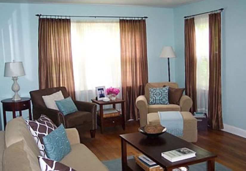
Home decor trends also lean heavily into blue. Designers love blue for bedrooms and living spaces because it feels restful and grounded. Soft, dusty blues can make a room feel larger and lighter, while deep navy adds sophistication and depth.
Pair blue with white, beige, or natural wood, and you get that “calm but not boring” look that so many people want now. It’s a palette that’s easy to live with for years, which is probably why blue keeps showing up in Pinterest boards and design magazines on repeat.
Blue in fashion and personal style
Take a quick look in your closet. Chances are, you own at least one favorite pair of blue jeans, a blue tee, or a navy jacket. Blue is one of the easiest colors to wear because it works on a wide range of skin tones and can be dressed up or down.
Psychologists have noted that wearing blue can influence how people see youoften as calmer, steadier, or more approachable. Many people instinctively reach for blue when they want to look “put together” without feeling like they’re trying too hard.
But Don’t Worry If Blue Isn’t Your Favorite
At this point, if your favorite color is purple, black, or neon chartreuse, you might be wondering if you missed the memo. The good news: color preference is deeply personal, and there’s plenty of room for individuality.
In every survey, there’s a significant minority of people who prefer other colors. Some people love the energy of red, the freshness of green, or the luxury vibe of gold. In certain product categorieslike sports cars, sneakers, or gadgetsbold reds or sleek blacks may outperform blue, because they better match the mood people want from that item.
So while blue often wins on average, that doesn’t mean it must be your favorite. It simply means that if you ask a random crowd to shout out a favorite color, the loudest chorus will probably be saying “blue.”
How to Use Blue Intentionally in Your Life
Knowing that blue tends to calm, reassure, and build trust, you can use it a bit more intentionally in day-to-day life. You don’t have to repaint your entire house or replace your whole wardrobesmall changes can still shift the vibe.
Ideas for bringing more “good blue” into your world
- Create a blue focus zone: Add a blue mouse pad, notebook, or desk organizer to your workspace to set a calmer, more focused tone.
- Calm your bedroom: Consider blue bedding, curtains, or artwork if you want your bedroom to feel cooler and more restful.
- Choose blue for stressful days: On big test days, presentations, or important meetings, a navy shirt or blazer can subtly signal calm and confidence.
- Use blue in digital spaces: Blue wallpapers or interface themes may feel gentler on your eyes than aggressive neon or bright red backgrounds.
These choices won’t magically fix stress or guarantee success, but they can nudge your environment in a direction that supports the mood you want. Think of blue as a low-effort, visual “setting” that quietly helps your brain breathe.
Blue Is Probably Your Favorite ColorAnd That Makes Sense
When you pull all the research together, a clear picture emerges. Blue is widely liked across countries and cultures. It’s strongly associated with calm, trust, and mental clarity. It works beautifully in branding, interior design, and fashion. And while it’s not literally everyone’s favorite, it’s the statistical front-runner by a comfortable margin.
Your personal reasons for loving blue might be simple: your favorite hoodie, the ocean on vacation, or the way the sky looks right before sunset. Underneath those memories, though, science suggests that your brain also responds to deeper cues of safety, stability, and focus that blue tends to evoke.
So if blue is your favorite color, you’re not boring or predictableyou’re part of a surprisingly consistent human pattern. And if it’s not, you now have a better sense of why so many people around you keep picking blue without even thinking about it.
Real-Life Experiences with Blue: How This Color Shows Up in Everyday Moments
To make all of this more concrete, let’s look at how blue quietly shapes real experiences. Once you start paying attention, you’ll see it everywherefrom the way you relax at home to the decisions you make in front of a store shelf.
The “blue sky reset” on stressful days
Imagine a hectic workday when your brain feels scrambled from constant notifications and chat messages. You step outside for a quick break, tilt your head back, and see a wide stretch of clear blue sky. For a few seconds, you don’t think about your inbox or your to-do listyou just breathe.
That small moment is a good example of how blue works on us. The color of the sky isn’t solving your problems, but it signals openness and stability. Many people describe this as a mental reset, almost like clicking “refresh” on your mood. Even a phone wallpaper of a calm blue gradient or a photo of the ocean can mimic that feeling during a long day.
Blue rooms that actually get used
Think about homes you’ve visited. Do you remember the intense red dining room that looked dramatic in photos but felt a little overwhelming in person? Now compare that to a soft blue bedroom or a pale blue living room. People tend to linger longer in the blue spacereading, napping, or chattingbecause it feels restful instead of demanding.
One homeowner might paint their bedroom a muted blue-gray and notice that they fall asleep a bit more easily. Another might add blue throw pillows and a navy area rug to a neutral living room and feel like the space suddenly “makes sense.” Even if they never mention color psychology, they’re experiencing it: the room feels cooler, calmer, and easier to live in.
The navy blazer before a big moment
Picture someone getting ready for an important interview. They try on a black outfit, then a bold red one, and finally land on a navy-blue blazer. When they look in the mirror, they feel a little more groundedprofessional but not stiff, confident without shouting. They walk into the interview with a tiny extra edge of calm.
From the interviewer’s side of the table, the effect is subtle but real. The navy blazer reads as trustworthy and composed, especially in a professional setting where blue is already strongly associated with reliability. This doesn’t mean blue clothing magically wins interviews, but it does line up with how our brains tend to read color cues.
Blue in your digital life without you noticing
Now think about your phone screen. How many of your most-used apps have blue icons or interfaces? Social networks, email apps, banking tools, cloud servicesblue dominates. Designers lean into this color because it feels familiar and non-threatening, which is exactly what you want when you’re asking people to share personal details or financial information.
When you scroll past a row of app icons, blue ones often look “safe” and established, even if you couldn’t explain why. That reaction happens fast and mostly below conscious awareness. It’s a tiny everyday example of how color psychology shows up in technology choices.
Vacations that feel bluer (in the best way)
Finally, think about your favorite vacation photos. Chances are, many of them include some kind of bluesea, pool, sky, distant mountains, or even cityscapes at “blue hour” just after sunset. People often describe these moments as their most relaxed and joyful. The deep, saturated blues of dusk, the bright aqua of a tropical ocean, or the soft hazy blues of a misty morning all become part of the emotional memory of that trip.
When you later set one of those photos as your laptop background or phone lock screen, you’re not just displaying a placeyou’re reactivating the calm and happiness you felt there. Blue plays a starring role in that emotional replay, even if you never say, “I chose this because of the calming properties of short-wavelength light.”
Put all of these experiences togetherthe sky breaks, the cozy blue rooms, the navy blazer moments, the blue-toned vacation photosand you can see why science keeps finding that blue is such a widely loved color. It’s woven into the parts of life where we feel safest, most focused, and most at ease. That doesn’t mean you should abandon your love of bright yellow sneakers or emerald green sweaters. It just means that if blue holds a special place in your heart, your brain and your experiences are quietly backing you up.