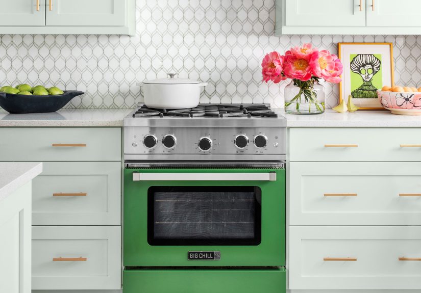
Table of Contents >> Show >> Hide
- Before You Pick a Single Tile: A 60-Second Decision Map
- 75 Beautiful Kitchen Backsplash Ideas
- Style + Budget Cheat Sheet
- Materials 101: What Actually Holds Up in Real Kitchens
- Budget Math: What Moves the Price Up (or Down)
- Pro Tips for Installation and Longevity
- Real-World Backsplash Lessons (Experiences That Make the Next One Better)
A kitchen backsplash is basically your kitchen’s eyeliner: it defines the whole look, hides evidence of last night’s spaghetti
incident, anddone rightmakes everything else look more expensive. The best part? You don’t need a celebrity-renovation budget to
get a backsplash that feels custom, durable, and totally “you.”
This guide rounds up 75 kitchen backsplash ideas spanning classic tile, modern slabs, warm wood looks, and renter-friendly
upgradesplus a practical deep-dive on materials, maintenance, and budget math. Because “pretty” is great, but “pretty and easy to wipe down”
is the real dream.
Before You Pick a Single Tile: A 60-Second Decision Map
- How do you cook? Sauté-every-night kitchens need tougher, easier-to-clean surfaces than “microwave + vibes.”
- Where’s the mess? Prioritize behind the sink and range. That’s Splash City and Grease County.
- How much grout can you tolerate? More grout lines = more scrubbing. (Yes, it’s a scientific law.)
- Are you remodeling or refreshing? A full-height slab is a statement; peel-and-stick is a quick glow-up.
- What’s the hero element? If your countertops are busy, keep the backsplash calmer. If counters are simple, go bold.
75 Beautiful Kitchen Backsplash Ideas
Use these as plug-and-play inspiration. Mix, match, and steal the parts you love. (Designers do it. They just call it “curation.”)
Classic & Timeless (Ideas 1–15)
- Classic white subway tile Clean, bright, and forever in style. The little black dress of backsplash tile.
- White subway with dark grout Graphic contrast + more forgiving on stains. Practical can be pretty.
- Vertical “standing” subway Same tile, fresher energy. Great for making ceilings feel taller.
- Herringbone subway layout Adds movement without adding color chaos.
- Beveled subway tile Tiny shadow lines add dimension even in all-white kitchens.
- Handmade-look off-white ceramic Slight variation gives a cozy, lived-in vibe (without looking messy).
- Soft gray subway A gentle neutral that pairs beautifully with warm wood or crisp white cabinets.
- Brick-look porcelain The texture of brick with easier maintenance than actual brick.
- White penny rounds Classic, playful, and surprisingly elegant with simple cabinetry.
- Neutral hexagon mosaic A subtle geometric moment that works in modern and traditional kitchens.
- 4×4 square tile throwback Lean into the retro charm with a modern grout color.
- Kit Kat (finger) tile in a neutral Sleek vertical lines that read modern but not cold.
- Skinny horizontal stack Long, thin tile makes a small backsplash feel wider.
- Marble-look porcelain Elegant veining with easier care than real marble.
- Mini “countersplash” strip A short band of the same countertop material for a clean, minimal look.
Color & Pattern That Does the Heavy Lifting (Ideas 16–30)
- Checkerboard mosaic Classic pattern, instantly energizing. Keep the rest of the kitchen calm.
- Encaustic-look porcelain Patterned charm with better durability than some true cement tiles.
- Blue-and-white Delft-inspired tiles Cottage, coastal, and timeless (especially with brass hardware).
- Terrazzo backsplash Confetti-but-make-it-grown-up. Works with mid-century or contemporary styles.
- Hand-painted accent “moment” Use a small mural area behind the range or sink as your wow factor.
- Ombré gradient Blend shades from dark to light for an artsy, custom feel.
- Tone-on-tone geometric pattern Pattern that whispers instead of shouts.
- White tile + colored grout grid Let grout become the pattern. Bold, modern, and budget-savvy.
- Wallpaper-look porcelain panels Get the “designer wallpaper” vibe with wipeable, water-friendly material.
- Terracotta-look tile Warm, earthy, and perfect with wood shelves and creamy paint.
- Sage green glossy tile A trendy color that still feels grounded and calming.
- Matte black tile backdrop Makes light cabinets pop and hides cooking splatter better than you’d think.
- Two-tone stacked tile One color on the bottom, one on top. A modern twist that frames the workspace.
- Alternating stripe layout Mix tile sizes in a repeating rhythm for subtle interest.
- “Picture frame” border around the range A defined focal point that looks custom without custom pricing.
Texture, Shape & Shine (Ideas 31–45)
- Fluted or ribbed ceramic tile Texture adds depth in neutral kitchens (and looks expensive).
- 3D wave tile Dramatic shadows that change throughout the day as light shifts.
- Matte + gloss mix Same color, different finish. Subtle but elevated.
- Crackle-glaze tile A vintage feel with loads of charm. Great for farmhouse or cottage kitchens.
- Iridescent glass mosaic Reflects light and adds sparkle in small or darker kitchens.
- Mirror tile accents A little goes a long way. Use sparingly for glam (and more visual space).
- Stainless steel sheet backsplash Pro-kitchen energy and super easy cleanup behind a range.
- Brushed metal tile insets Mix metal accents into a neutral tile field for modern edge.
- Concrete-look porcelain Industrial style without the maintenance drama of real concrete.
- Thin stone veneer (sealed) Rustic texture that pairs well with warm lighting and wood tones.
- River rock mosaic Spa-like texture (best away from heavy grease zones due to all the grout lines).
- Fish-scale scallop tile Soft curves that feel playful and elegant at the same time.
- Arabesque lantern tile A classic shape that reads globally inspired and timeless.
- Diamond layout squares Rotate simple square tiles for a fresh geometry without a special order.
- Mixed material mosaic Blend stone and glass for sparkle + depth (keep colors cohesive).
Stone, Slabs & Seamless Looks (Ideas 46–55)
- Full-height quartz slab Sleek, low-grout maintenance, and visually “expensive” in the best way.
- Full-height marble slab (sealed) The drama of natural veining, especially behind open shelving.
- Veined porcelain slab Big-slab luxury look with less worry about staining and sealing.
- Matching countertop “countersplash” Run the counter material up the wall for a seamless, modern vibe.
- Wrapped side splashes Extend the backsplash around corners for a clean, finished look.
- Bookmatched stone feature Symmetrical veining behind the range = instant showpiece.
- Metal panel behind range + tile elsewhere Best of both worlds: easy cleaning where it counts.
- One-piece back-painted glass panel Minimal seams, tons of color options, and very wipe-friendly.
- Soapstone slab Moody, matte, and classicespecially with brass and warm wood.
- Leathered granite slab Texture hides fingerprints and adds depth without loud patterns.
Warm, Woodsy & Unexpected (Ideas 56–65)
- Painted beadboard panels Charming, budget-friendly, and great for farmhouse or coastal styles.
- PVC beadboard in splash zones Similar look with better moisture resistance for busy kitchens.
- Sealed shiplap behind open shelves Adds texture; keep it protected and cleanable.
- Tongue-and-groove vertical planks A tailored, architectural look that feels intentional.
- Wood-look porcelain planks Warmth of wood, durability of tile. A practical cheat code.
- Tin tile backsplash (painted or raw) Vintage character and a little shimmer. Great with classic cabinetry.
- Microcement finish A smooth, modern plaster-like surface for minimalist kitchens.
- Chalkboard paint section (away from water) Notes, menus, doodlesjust keep it out of constant splash range.
- Framed art behind glass “Gallery wall” energy, protected by a cleanable surface.
- Targeted backsplash placement Tile only where needed (behind sink/range), paint elsewhere for a lighter budget.
Budget-Friendly & DIY-Ready (Ideas 66–75)
- Peel-and-stick vinyl tile Fast upgrade with tons of styles; ideal for rentals or quick refreshes.
- Peel-and-stick composite sheets (heat-rated) Look for products designed for kitchens if going near cooking zones.
- Peel-and-stick wallpaper + a wipeable ledge Use wallpaper above, and protect the splash zone with a small tile band or trim.
- Painted “faux tile” stencil Big pattern payoff for the price of paint (and patience).
- Countertop remnant splash Leftover stone/quartz can become a high-end looking mini backsplash.
- Laminate backsplash panels Large, easy-to-clean sheets that install quickly and cost less than many tiles.
- Acrylic/Plexi sheet (away from high heat) Clear protection that keeps your wall color visible.
- Single-row accent tile One strong line of tile can look intentional and save money.
- DIY stripe mosaic from budget tile Cut affordable square tiles into strips for a custom “designer” look.
- Washable paint + discreet splash guards A clean wall can work if you add protection where splatter happens most.
Style + Budget Cheat Sheet
| Goal | Best Bets | Why It Works |
|---|---|---|
| Lowest maintenance | Slabs (quartz/porcelain), large-format tile | Fewer grout lines to clean |
| Big impact, modest spend | Patterned porcelain, bold grout, special layout | Design drama without luxury materials |
| Warm + cozy | Handmade-look ceramic, terracotta-look, wood-look porcelain | Texture and warmth without fragile finishes |
| Renter-friendly | Peel-and-stick tile, removable wallpaper (protected zones) | Fast upgrades with easier removal |
| Timeless resale | Subway tile, neutrals, marble-look porcelain | Wide appeal and classic styling |
Materials 101: What Actually Holds Up in Real Kitchens
Ceramic & porcelain tile
These are popular for a reason: durable, widely available, and friendly to most budgets. Porcelain is typically denser and often chosen
when you want low maintenance. If you love the look of a higher-maintenance material (like marble), porcelain “look” tiles can get you
80–90% of the vibe with fewer worries.
Natural stone (marble, granite, soapstone)
Stone looks amazing because it’s… well, stone. No two slabs are identical. The trade-off is care: some stones are porous and can stain
if not sealed and cleaned thoughtfully. If you’re a “wipe it tomorrow” person, choose accordingly.
Glass & metal
Glass tile and panels are sleek and easy to wipe, and metal (like stainless steel) is a hero behind the range. The trick is choosing
finishes that won’t show every fingerprint if that kind of thing keeps you up at night.
Wood and wood-look
Real wood needs smart placement and protection, especially near water. For a similar feel with fewer concerns, wood-look porcelain is a
very convincing option that can handle kitchen life.
Peel-and-stick options
Perfect for quick updates, but be honest about location. Moisture and heat are the enemies of many adhesives, so read product specs and
consider keeping peel-and-stick away from the hottest zones unless it’s specifically rated for that use.
Budget Math: What Moves the Price Up (or Down)
Backsplash cost isn’t just about the tile price tag. The layout (simple grid vs. herringbone), the number of cuts (hello outlets),
the size of the area, and labor rates can matter just as much. In general, expect installed costs to range widely:
straightforward ceramic tile tends to land on the lower end, while intricate mosaics and slab installs can climb quickly.
- Want to save? Choose a simple tile shape, run it in a straightforward pattern, and keep the backsplash height standard.
- Want to splurge strategically? Put the expensive tile behind the range as a feature, and use a simpler field tile elsewhere.
- Want fewer “surprise costs”? Plan outlet placement and under-cabinet lighting earlycuts and rework add up.
Pro Tips for Installation and Longevity
Order enough material (and then a little more)
Running out mid-project is how “weekend backsplash” becomes “backsplash: the limited series.” Always budget extra tile for cuts, breakage,
and future repairsespecially with handmade-look or specialty shapes.
Grout: choose your battles
Light grout looks crisp, but it can show stains. Dark grout hides more mess but creates higher contrast. If you want easier upkeep,
consider higher-performance grout options and seal/maintain as recommended for your materials.
Test samples in your actual kitchen lighting
The tile you adored under showroom spotlights may look totally different under your warm under-cabinet LEDs at 9 p.m. with a cup of tea.
Tape up samples, look at them morning and night, and only then commit.
Put performance first behind the range
Areas near heat and grease benefit from smooth, wipeable, heat-appropriate surfaces like tile, metal, or slab materials. If you’re using
an adhesive product, verify it’s designed for kitchen conditions and placement.
Real-World Backsplash Lessons (Experiences That Make the Next One Better)
People rarely regret choosing a backsplash that’s easy to clean. They do, however, regret falling in love with something beautiful that turns into
a weekly scrubbing hobby. One of the most common “wish I’d known” moments is realizing that grout is the real maintenance commitment, not tile.
Tiny mosaics look incredible in photos, but they come with a grid of grout lines that can collect grease mist and cooking residue over timeespecially around
the cooktop. Homeowners who cook frequently often say their happiest backsplash choices are the ones with fewer seams: larger-format tile, slab-style backsplashes,
or layouts that reduce the number of grout joints.
Another repeat lesson: samples save heartbreak. You can think you’re choosing “warm white,” but once it’s next to your countertop and cabinets,
it might read “yellow-ish” or “blue-ish” depending on undertones and lighting. People who do a quick mock-uptaping tile and grout samples to the wall and looking
at them across a full daytend to be far more confident (and less likely to re-tile a year later out of annoyance). This is especially true for glossy finishes:
they reflect light, bounce color, and can look dramatically different at night under warm bulbs than they do in daylight.
Budget-wise, a lot of homeowners learn that complex patterns can cost more than the tile itself. A basic square-foot price doesn’t include the extra
time needed for herringbone, intricate mosaics, or precise alignment across multiple walls and outlets. People who want that designer look without designer labor costs
often do one of two clever things: (1) keep the layout simple but upgrade the tile (like a handmade-look ceramic in a straight stack), or (2) keep the tile affordable
but make it special through layout (like classic subway tile installed vertically with a sharp grout color). Either approach can look intentional without inflating the labor line item.
Real kitchens also teach you where “delicate” is fine and where it’s a trap. Many homeowners say they love artisanal tileszellige-style, crackle glaze, high texture
but they place them strategically: as a feature behind open shelves or as an accent area, rather than everywhere grease and sauce splatter lands. People who go all-in on porous
or high-texture materials typically report the same rhythm: they either seal and maintain consistently, or they eventually switch cleaners and habits to keep the surface looking good.
If you want the look with less upkeep, porcelain look-alikes and smoother finishes can deliver similar style with fewer worries.
Finally, there’s the “future you” test. Homeowners who feel happiest years later often chose a backsplash that matches how they actually live: a surface they can wipe quickly,
a color that doesn’t show every single speck, and a design that still makes them smile even when the dishwasher is full and the kitchen is loud. The most satisfying backsplashes
aren’t always the boldest; they’re the ones that balance beauty, practicality, and your real-life routine. If you can picture yourself cleaning it after taco night
without sighing dramatically, you’ve probably picked the right one.