Table of Contents >> Show >> Hide
- Why Some Paint Colors Suddenly Look Dated
- 1. Cool Gray That Drains the Room
- 2. Stark, Blue-Based White on Every Wall
- 3. Beige-and-Taupe Everywhere, All at Once
- 4. Overplayed Sage Green
- 5. Sugary Pastels and Millennial Pink Hangovers
- 6. Pure Jet Black and Heavy Charcoal Walls
- 7. Loud, Trend-Chasing Reds That Shout Instead of Glow
- What Designers Actually Want to See in 2026
- Real-Life Experiences With These 2026 Paint Shifts
- Conclusion
Paint trends are a little like celebrity diets: wildly persuasive in the moment, a little embarrassing six months later, and somehow always trying to convince you that this time it’s different. But in 2026, designers seem unusually aligned on one thing: homeowners are tired of colors that feel cold, one-note, overexposed, or suspiciously perfect on social media and weirdly gloomy in real life. The mood now is warmer, softer, richer, and more personal.
That does not mean every dramatic color is canceled, every neutral is boring, or your existing walls need an apology tour. It means the trend cycle is shifting. The shades losing favor tend to be the ones that flatten a room, fight the light, or make a house feel staged instead of lived in. Meanwhile, the colors replacing them have more depth, more warmth, and more emotional intelligence. Yes, emotional intelligence. Even paint has to read the room now.
If you are planning a refresh this year, here are the seven paint color trends designers say they are ready to leave behind in 2026, plus what looks fresher instead.
Why Some Paint Colors Suddenly Look Dated
Most outdated paint colors are not actually “bad” colors. They just become victims of overuse, poor lighting, or copy-and-paste design. A shade that once felt fresh can start to look tired when every flipped house, rental listing, and DIY makeover uses the exact same formula. That is exactly what happened with icy grays, clinical whites, and a few ultra-trendy statement shades. They were never universally terrible. They were simply asked to do too much for too long.
In 2026, the strongest interiors are leaning away from anything harsh, flat, or overly literal. Designers are favoring colors that feel grounded, nuanced, and adaptable throughout the day. Think soft brown instead of cold gray. Mushroom instead of muddy greige. Smoky jade instead of basic teal. Warm eucalyptus instead of endless pale sage. In other words, the paint is finally being asked to have a personality without behaving like a chaos goblin.
1. Cool Gray That Drains the Room
For years, cool gray was the default answer to every paint question. Need a modern living room? Gray. Selling your house? Gray. Want your home to resemble a very polite cloud? Also gray. The problem is that a lot of those icy, steely grays now read flat, sterile, and emotionally unavailable.
Designers are increasingly moving away from grays with sharp blue undertones because they can make a room feel colder than it is, especially in spaces that lack strong natural light. In real homes, those shades often suck the warmth out of wood floors, make upholstery look dull, and leave the whole room feeling like it is waiting for a dentist to arrive.
What to try instead
Look for warm taupes, sandy neutrals, mushroom tones, or deeper grays with complexity. If you still love gray, choose one with a little softness, depth, or an earthy undertone. The difference is huge. A gray with warmth can feel tailored and sophisticated. A cold gray can make your sofa look like it pays taxes in despair.
2. Stark, Blue-Based White on Every Wall
White paint is not going away. Designers are not forming a committee to outlaw white trim. But stark, blue-based white walls are losing favor fast. In 2026, many designers see these crisp whites as too clinical, too unforgiving, and too disconnected from how people actually want their homes to feel.
The issue is not brightness. It is temperature. A sharp white can highlight every shadow, emphasize every construction imperfection, and make a comfortable room feel strangely joyless. In family homes especially, it can come across more gallery-like than welcoming. That sounds chic until you realize your cozy den now feels like a place where you are not allowed to touch the furniture.
What to try instead
Choose warm whites, creamy off-whites, barely-there ivories, or soft whites with balanced undertones. These shades still give you brightness and flexibility, but they reflect light in a kinder, more flattering way. They also play beautifully with wood, stone, linen, brass, and the kinds of textures that make a house feel layered rather than scrubbed into submission.
3. Beige-and-Taupe Everywhere, All at Once
This one needs nuance. Warm neutrals are definitely trending in 2026. Designers love khakis, oatmeals, putties, clay-adjacent tans, and sophisticated taupes. What they do not want to see is an entire room, or entire house, washed in the same safe beige from floor to ceiling with no variation, contrast, or pulse.
All-over beige and taupe had a calming appeal for a while, especially after years of cool minimalism. But when every wall, sofa, rug, and curtain lands in the exact same muted family, the space can start to feel sleepy instead of serene. The result is not timeless. It is beige wallpaper for the soul.
Designers now want neutrals that still have life in them. A neutral room should feel textured, layered, and intentional, not like someone selected “default luxury rental” from a menu.
What to try instead
Use warm neutrals with tonal contrast. Mix mushroom with off-white trim. Pair oatmeal walls with chocolate brown accents. Add rust, olive, dusty mauve, or smoky blue-green somewhere in the palette. The goal is not to abandon neutrals. It is to stop treating “neutral” as code for “nobody was brave enough to choose a second color.”
4. Overplayed Sage Green
Sage green had a glorious run. It looked good in kitchens, bedrooms, bathrooms, cabinetry, and approximately every inspirational reel filmed next to a ceramic vase. But by 2026, many designers feel the most common version of sage has hit oversaturation.
The problem is not green itself. In fact, green remains one of the strongest categories in current color forecasts. The problem is predictable sage: that pale, dusty, whisper-soft version used the exact same way in house after house. It has become the paint equivalent of a once-beloved song that got overplayed in every coffee shop until you started resenting the opening note.
Once a trend reaches that point, designers usually do not kill the color family. They deepen it, complicate it, or warm it up. That is exactly what is happening now.
What to try instead
Choose more nuanced greens: warm eucalyptus, smoky jade, olive-leaning greens, deep muted green, or earthy dark green. These shades still connect to nature, but they feel more grounded and less formulaic. They are easier to style with brown woods, vintage pieces, brushed metals, and richer textiles. In short, green is still invited to the party. It just has to stop wearing the same outfit as everyone else.
5. Sugary Pastels and Millennial Pink Hangovers
There is a difference between soft color and sugary color. Designers in 2026 are still interested in muted blush, dusty mauve, soft plum, and gentle yellows. What they are moving away from are the sweeter, chalkier pastels that can make a room feel juvenile, fragile, or stylistically frozen in a previous trend cycle.
Powder blue, bubblegum pink, and some barely-there candy shades often struggle to feel substantial in adult living spaces. Millennial pink, in particular, has slipped from modern and playful into overly sweet and overly familiar. In the wrong light, it can turn a room from chic to cupcake in about nine seconds.
That does not mean softness is out. Actually, 2026 palettes are full of softness. But the softness now has more dust, earth, smoke, and complexity mixed in.
What to try instead
Think clay pink, terracotta blush, mauve, heathered plum, muted apricot, or buttery yellow used with restraint. These colors still feel warm and expressive, but they have enough depth to live with long-term. They do not scream for attention. They just quietly look expensive.
6. Pure Jet Black and Heavy Charcoal Walls
Black walls had a dramatic era, and yes, they can still be stunning in the right space. But designers are increasingly tired of seeing pure black or very heavy charcoal used as a default shortcut to “moody sophistication.” In many homes, it ends up reading less luxurious and more light-swallowing.
This trend became popular because it photographs beautifully. On a screen, black walls can look bold, editorial, and perfectly intentional. In everyday life, though, they often make average-size rooms feel flatter, darker, and more severe than homeowners expect. Without enough natural light, architectural detail, or balancing warmth, the result can feel oppressive rather than elegant.
And overuse has hurt the trend too. Once every accent wall, powder room, and dining room starts relying on the same pitch-black move, the drama stops being dramatic.
What to try instead
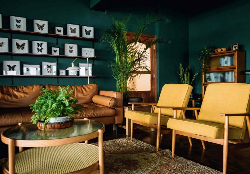
Use espresso brown, inky blue, warm charcoal, aubergine, or a softer black with brown undertones. These shades still bring mood and depth, but they are more livable and more forgiving. They feel collected instead of costume-y, which is exactly the difference designers care about in 2026.
7. Loud, Trend-Chasing Reds That Shout Instead of Glow
Red is one of the trickiest categories this year because 2026 is not anti-red. Rich mahogany, earthy rust, clay red, and browned burgundy all have momentum. What designers do not want to see is the loud, glossy, high-intensity version of red used just because it is having a moment online.
Cherry-heavy reds, screaming maroons, and ultra-saturated statement walls can quickly dominate a room and limit everything around them. They are dramatic, yes, but they can also turn a home into a hostage situation for your furniture. Once that wall is painted, the room starts demanding very specific styling choices, and not always in a fun way.
The 2026 difference is subtle but important. Designers are responding better to reds that feel grounded, earthy, and livable rather than theatrical for the sake of trend content.
What to try instead
Choose red-browns, muted oxbloods, warm mahogany, terracotta-rust, or earthy reds with softness to them. These tones have richness without aggression. They can wrap a room in warmth instead of turning it into a Valentine from a villain.
What Designers Actually Want to See in 2026
The big picture is clear: designers want paint colors that feel human. Warmer neutrals. Deeper browns. Smarter greens. Softly moody hues. Colors that change beautifully with the light. Shades that support a room’s architecture instead of hijacking it. Paint is becoming less about trend performance and more about emotional usability.
That is why so many current favorites share the same traits. They are layered, not flat. Calm, not cold. Distinctive, not gimmicky. They work with natural materials, vintage pieces, and homes that are allowed to look lived in. And most importantly, they feel like they could still look great after the internet moves on to the next obsession.
So if you are painting in 2026, do not ask only whether a color is trendy. Ask whether it has staying power. Ask whether it likes your light. Ask whether it makes your furniture look better. Ask whether you will still enjoy it after the fifth rainy day in a row. A good paint color is not just pretty. It is a roommate. Choose one you can live with.
Real-Life Experiences With These 2026 Paint Shifts
Anyone who has lived through a full-room paint makeover knows the gap between “that looks great on my phone” and “why does my dining room feel like a submarine?” can be uncomfortably small. That is part of why these 2026 paint color trends matter. Designers are not rejecting certain shades just to be dramatic. They are reacting to how these colors behave in actual homes, with real lighting, real furniture, and real people leaving chargers on countertops.
Take cool gray, for example. In a freshly painted empty room, it can look clean and modern. Then evening hits, the lamp turns on, the flooring suddenly looks orange, and the whole space feels like it is recovering from bad news. Homeowners often realize too late that a gray chosen from a tiny swatch looked far warmer in the store than it ever does on four full walls. By contrast, the warmer neutrals designers are favoring now tend to be more forgiving. They soften shadows, flatter natural materials, and make a room feel finished even when life inside it is gloriously imperfect.
Stark white creates a similar surprise. People often choose it because they think it will make a room feel bigger, fresher, and more expensive. Sometimes it does. But just as often, it highlights every uneven patch of drywall, makes trim look dingy by comparison, and creates a strange, sterile brightness that feels more rental refresh than dream home. Warmer whites and ivories do not fight the room nearly as much. They still feel airy, but they also feel like somebody actually plans to sit down and enjoy the place.
The same lived-in truth applies to overused sage. For a while, pale green felt like a guaranteed win. It looked relaxing, photogenic, and easy to style. But when homeowners started using it in kitchens, bathrooms, bedrooms, cabinets, and entryways all at once, the charm wore off. What felt calming started to feel repetitive. Designers noticed that rooms with richer greens, smoky jades, or deeper eucalyptus tones had more staying power because they offered both comfort and character. They felt intentional instead of copied.
Then there are the dramatic shades people love in theory: jet black, intense burgundy, primary red, and other statement colors that promise instant sophistication. They can work, but they ask a lot from a room. They need the right light, the right scale, the right finishes, and usually a healthy tolerance for commitment. Many homeowners discover that what looked moody and glamorous online feels heavy and bossy in daily life. A softer charcoal, brown-black, mahogany, or earthy red often delivers the same mood without sucking all the oxygen out of the space.
That is really the lesson of 2026. The best paint colors are not necessarily the loudest or safest. They are the ones that continue to look good on Monday morning, on cloudy afternoons, and during the eleventh month after the project when the novelty has worn off and only livability remains. Designers are pushing back on tired paint trends because homes are being used harder and more honestly now. People want rooms that feel warm, grounded, expressive, and easy to live in. And frankly, that is a much better goal than painting your entire house the color of a trend report and hoping for the best.
Conclusion
The paint color trends designers do not want to see in 2026 all share one problem: they either feel overdone or they fail the real-life test. Cool grays feel cold. Stark whites feel clinical. One-note sage feels overplayed. Sugary pastels feel thin. Heavy black feels oppressive. Beige overload feels sleepy. Loud trend-reds can feel exhausting. What is replacing them is far more interesting: warm whites, khakis, mushrooms, earthy reds, smoky jades, deep greens, soft browns, and layered neutrals with actual soul.
If there is one takeaway, it is this: the best paint colors for 2026 are not trying too hard. They are nuanced, grounded, and comfortable in their own undertones. Which, honestly, is more than can be said for half the internet.