Table of Contents >> Show >> Hide
- The London Studio Behind the Look
- Why Subtle Imperfections Feel So Right Right Now
- What Screen-Printed Ceramic Tiles Actually Bring to a Room
- Best Places to Use Small-Batch Screen-Printed Tile
- How to Style These Tiles Without Overdoing It
- What to Know Before You Buy Handmade Ceramic Tile
- Why a Small-Batch London Company Still Stands Out
- The Experience of Living With Subtle Imperfections
- Conclusion
There are two kinds of tile people in this world. The first group wants every edge crisp, every line obedient, every surface so uniform it could pass a geometry exam. The second group looks at a slightly offbeat glaze, a soft wobble in a pattern, or a tiny shift in tone and says, “Ah, now we’re getting somewhere.” This article is for the second group.
At the center of this story is a small-batch London company built around the idea that ceramic tile should not look like it rolled off an assembly line wearing a corporate name tag. Instead, its screen-printed ceramic tiles celebrate human touch, quiet irregularity, and the kind of visual rhythm that feels collected rather than manufactured. The result is a collection of patterned surfaces that read less like hard building material and more like art you can spill espresso near.
What makes these tiles especially compelling is their balance. They are graphic without being shouty, modern without being cold, and imperfect without looking sloppy. That is a hard trick to pull off. In a design world that can sometimes feel overfiltered and overcoordinated, these small-batch ceramic tiles offer something rarer: charm with backbone.
The London Studio Behind the Look
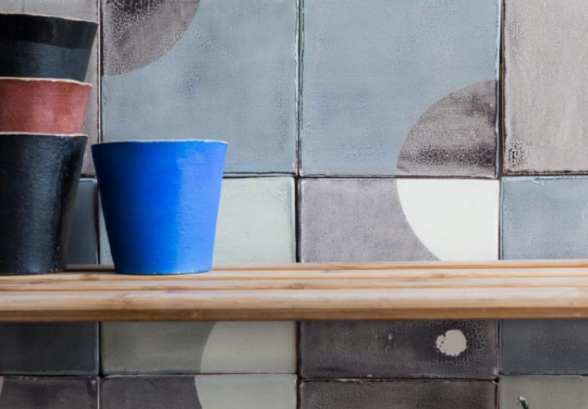
The title points to the world of designer Marianne Smink, whose London-based tile studio became known for screen-printed ceramic tiles with muted color, geometric pattern, and an unmistakably handmade soul. Her work helped bring a softer, more artful point of view to patterned tile. Instead of chasing glossy perfection, the studio leaned into visual nuance: the tiny shifts that happen when a pattern is screen-printed by hand, fired, and transformed into something slightly different from tile to tile.
That difference matters. In fact, it is the entire point. These are not tiles that apologize for variation. They use it. The screen-printing process introduces subtle disruptions in line and fill. Firing deepens that individuality. From a distance, the installation reads as cohesive and calm. Up close, it becomes lively and layered. You notice the human hand. You notice the gentle irregularity. You notice that the wall is not just covered; it is composed.
Some of the studio’s most memorable designs play with geometry in a way that feels both architectural and playful. Think triangles, repeated squares, modular blocks, and abstract motifs that can be configured in multiple ways. One pattern may feel like a textile translated into clay. Another may hint at maps, transport grids, or vintage floor graphics. The appeal is not just the motif itself, but the tension between order and looseness. That push and pull is what gives the work its quiet magic.
Why Subtle Imperfections Feel So Right Right Now
Perfection can be weirdly exhausting
Design perfection sounds great until you live with it. Spaces that are too polished can feel fragile, like one dropped spoon might emotionally damage the room. Handmade tile offers a more relaxed kind of beauty. Slight variation in color, texture, and edge softens the overall look and makes a space feel lived-in from day one. You do not have to “break in” a room that already understands real life.
Imperfection adds warmth
Screen-printed ceramic tiles are especially good at this because the pattern itself carries evidence of process. A tiny blur, a faint shift in density, a barely uneven edge in the print: these details create visual warmth. They also help patterned tile feel more sophisticated. Instead of looking flat or overly crisp, the surface gains depth. It catches light differently. It reveals more the longer you look.
Pattern gets easier to live with
There is also a practical design reason subtle imperfection works so well. Strong pattern can overwhelm a room when it is too rigid. But when that pattern is softened by handmade variation, it becomes more forgiving. The surface still has personality, yet it does not scream for attention every second of the day. It behaves more like a favorite woven fabric or an old painted floor: expressive, but not theatrical.
What Screen-Printed Ceramic Tiles Actually Bring to a Room
Let’s be honest: tile has a job to do. It needs to handle water, splashes, steam, fingerprints, the occasional tomato-sauce incident, and the emotional chaos of a Monday morning kitchen. Ceramic tile earns its keep because it is durable, relatively low-maintenance, and well-suited to wet zones when installed properly. But screen-printed ceramic tile adds something extra. It gives function a personality.
In a kitchen backsplash, these tiles can act almost like framed art stretched across the wall. In a bathroom, they can turn a sink wall into the visual anchor of the room. In a mudroom or powder room, they make a small space memorable without requiring an expensive full renovation. Even one modest area, done well, can shift the mood of the whole house.
That is why designers keep returning to handmade and patterned surfaces. They introduce movement, texture, and story. A wall of plain white tile may be clean and classic, but a wall of thoughtfully screen-printed tile has a point of view. It says the homeowner did not just pick a finish. They picked a feeling.
Best Places to Use Small-Batch Screen-Printed Tile
Kitchen backsplashes
This is the obvious star application, and for good reason. A backsplash is a relatively compact surface, which means you can invest in something artisanal without tiling the gross domestic product of a small nation. Screen-printed ceramic tiles work beautifully here because they add depth and pattern while still being easy to wipe down. A muted geometric print behind open shelves or around a range can make even a simple kitchen look tailored and collected.
Bathroom sink walls and vanity areas
Bathrooms benefit from handcrafted tile because the material naturally plays well with water, light, mirrors, and shadow. A subtle print can soften a hard, functional room and make it feel more intimate. If your bathroom is small, this kind of tile can add character without demanding a complete overhaul. It is the design equivalent of good earrings: compact, strategic, and surprisingly transformative.
Shower feature walls
Used selectively, patterned ceramic tile can create a focal wall inside a shower without turning the entire enclosure into a visual puzzle. This works especially well when the palette is soft and the surrounding finishes are restrained. Pair it with simple fixtures and quiet stone or plain ceramic around it, and the result feels elevated instead of busy.
Entryways, fireplace surrounds, and powder rooms
If you want maximum impact in a smaller footprint, these are excellent places to experiment. An entryway wall clad in screen-printed tile immediately sets a tone. A fireplace surround gains texture and rhythm. A powder room becomes that room guests keep mentioning long after dessert. Small spaces are where brave tile decisions often pay off the most.
How to Style These Tiles Without Overdoing It
The secret is contrast. Because screen-printed ceramic tiles already bring pattern and movement, the best supporting cast is usually simple: plaster walls, painted cabinetry, natural wood, linen, unlacquered brass, matte black metal, or quiet stone. Let the tile do the interesting part of the conversation while the rest of the room nods supportively.
Muted palettes work especially well. Dusty blue, chalky white, clay, soft green, smoke, charcoal, and warm neutrals all play nicely with handmade tile because they let the variation show without competing with it. You can go bolder, of course, but bold tile plus bold cabinets plus bold counters is how kitchens end up looking like they are trying to win an argument.
Scale matters, too. If the pattern is intricate, keep surrounding materials calm. If the print is larger and more graphic, repeat one of its tones elsewhere in the room so it feels intentional. And do not underestimate grout. The grout color can either sharpen the design or soften it. Matching grout creates a more blended, textile-like effect; contrast grout gives the geometry a louder voice.
What to Know Before You Buy Handmade Ceramic Tile
Order samples first
Photos are helpful, but tile is tactile. You want to see how the glaze reads in daylight, how the print behaves up close, and how the tones interact with your cabinets, counters, paint, and flooring. Handmade tile is not a product you should choose while half-watching television and pretending your laptop screen is an objective source of truth.
Expect variation, not defects
With small-batch ceramic tile, some variation in color, finish, print intensity, and surface character is normal. In fact, it is often part of the appeal. The best installations embrace that variation by blending tiles during layout rather than installing them straight out of the box in strict sequence.
Work with an installer who understands handmade material
This matters more than people think. Handmade tiles can vary slightly in size and thickness, and patterned tiles demand careful layout. A skilled installer will know how to dry-lay sections, manage grout joints, and balance the pattern so the final result looks intentional rather than improvised at the last minute with a rising sense of panic.
Follow the maker’s care guidance
Glazed ceramic tile is generally straightforward to maintain, but you still want the right cleaner and the right expectations. Skip harsh, abrasive products unless the manufacturer explicitly recommends them. Gentle routine cleaning and proper installation go a long way toward keeping an artisanal surface looking great for years.
Why a Small-Batch London Company Still Stands Out
Because it is offering more than a finish. It is offering a design philosophy. In an age of fast interiors and copy-paste trend cycles, a small-batch studio making screen-printed ceramic tiles feels refreshingly stubborn in the best way. It values process. It values restraint. It values the beauty of something that is not identical to itself one hundred times over.
That philosophy resonates because people are hungry for homes that feel personal. Not algorithmic. Not showroom-flat. Not suspiciously perfect. A handcrafted tile wall does not feel like a trend report. It feels like a choice. And a good choice tends to age better than a fashionable one.
There is also something deeply satisfying about using an old process in a contemporary way. Screen printing has roots in textiles, paper, posters, and art. Bringing that process onto ceramic gives the tiles a cross-disciplinary energy. They feel decorative, but not precious. Graphic, but not sterile. Handmade, but still modern enough for a clean-lined kitchen in London, New York, Los Angeles, or just about anywhere else where people appreciate a room with a pulse.
The Experience of Living With Subtle Imperfections
What does it actually feel like to live with screen-printed ceramic tiles from a small-batch company like this? It feels calmer than you might expect. People often assume patterned tile is loud, but subtle, handmade pattern tends to behave differently in real life than it does in a close-up photo. It settles into the room. In the morning, when light hits the surface at an angle, the print seems softer in some places and deeper in others. By evening, it becomes moodier, more atmospheric, almost like a wall-sized sketchbook page that changes personality with the hour.
The experience starts before installation. You notice it while handling samples, turning them over in your hands, comparing one piece to the next. At first, you may find yourself looking for total consistency. Then something clicks. You realize the slight differences are not mistakes to be corrected, but qualities to be enjoyed. One tile has a denser patch of color. Another has a softer edge. A third feels like the print landed just a whisper off center. Together, they are more interesting than any perfectly repeated pattern could ever be.
Once the tiles are on the wall, the room changes in a way paint rarely manages. The surface gains a quiet energy. It becomes something you notice without consciously staring at it. Guests run their eyes across it and pause. Not because it is flashy, but because it feels considered. It has that elusive “Where did you find this?” quality. The room suddenly seems more complete, as if it finally found the right sentence after mumbling around the point for years.
There is also a practical emotional bonus: handmade tile is surprisingly forgiving to live with. In a busy kitchen or bath, small marks of daily life do not feel catastrophic. The surface already contains nuance, so the room does not collapse into tragedy because somebody splashed water, dropped a spoon, or leaned a wooden cutting board against the wall. That is one of the great gifts of subtle imperfection. It gives a room dignity without making it fragile.
And then there is the long-term experience. Months later, the tiles still reward attention. You notice new relationships between shapes. You catch the way the pattern lines up near a corner or how the grout quietly frames the print. The wall keeps giving. That may be the clearest sign of good design: it does not exhaust itself in the first five minutes. It lingers. It deepens. It becomes part of how the home feels, not just how it photographs.
In that sense, these screen-printed ceramic tiles are not simply decorative products. They are companions to daily life. They hold light, shadow, steam, sound, and routine. They turn ordinary walls into surfaces with memory and presence. And in a world full of hard-edged perfection, that gentle, human quality can feel like luxury in its most convincing form.
Conclusion
“Subtle imperfections” is not just a catchy phrase for this style of tile; it is the reason the work matters. Small-batch screen-printed ceramic tiles from a London company like Marianne Smink’s studio prove that the most memorable interiors are often built from nuance rather than spectacle. These tiles bring pattern, craftsmanship, and practical performance together in a way that feels intimate, intelligent, and lasting.
If you want a room that looks polished but not overproduced, artistic but still usable, these tiles make a strong case for themselves. They are not trying to be flawless. They are trying to be beautiful. And honestly, that is usually the better strategy.