Table of Contents >> Show >> Hide
- What Are Portuguese Azulejos?
- Why Tile Designs from Portugal Is Worth Reading
- The History Behind Portugal’s Tile Obsession
- Key Characteristics of Portuguese Tile Designs
- Famous Places to See Portuguese Tile Design
- How to Use Portuguese Tile Designs in Modern Interiors
- Choosing Colors: Beyond Blue and White
- Pattern Mixing Without Panic
- Authentic, Reproduction, or Inspired?
- Why Portuguese Tile Designs Still Feel Fresh
- Design Lessons From Portuguese Tiles
- Experience Notes: Living With the Look of Portuguese Tile
- Conclusion
- SEO Tags
Some design books politely sit on a coffee table and wait to be admired. Tile Designs from Portugal practically jumps up, grabs your sleeve, and says, “Look at this pattern. Now look at this one. Now imagine your kitchen backsplash having a better personality than most dinner guests.” Portuguese tile design, especially the beloved azulejo, is one of those rare decorative traditions that feels both museum-worthy and completely livable. It belongs in palaces, train stations, churches, cafés, garden walls, and yes, the tiny powder room you keep meaning to make less beige.
The phrase “required reading” fits because Portuguese tiles are not just pretty squares. They are history, architecture, craftsmanship, storytelling, weatherproofing, and graphic design all baked into glazed ceramic. A single tile may carry a Moorish geometric rhythm, a Baroque flourish, a cobalt blue scene, or a botanical motif that looks like it wandered in from a very well-dressed garden party.
This guide explores what makes tile designs from Portugal so enduring, why the book Tile Designs from Portugal remains such a useful visual reference, and how homeowners, designers, artists, and pattern lovers can bring the spirit of azulejos into modern interiors without turning the house into a souvenir shop with plumbing.
What Are Portuguese Azulejos?
Portuguese azulejos are glazed ceramic tiles used as architectural decoration on walls, floors, façades, fountains, staircases, churches, palaces, and public spaces. The word azulejo is commonly traced to the Arabic al-zulayj, often translated as “little polished stone” or “small stone.” That origin matters because Portuguese tile design grew from centuries of cultural exchange across the Iberian Peninsula, North Africa, Italy, the Netherlands, and Portugal’s own craft traditions.
Early azulejos were deeply influenced by Islamic and Hispano-Moorish design, which favored geometry, repetition, symmetry, and interlocking patterns. Because figurative religious imagery was restricted in many Islamic artistic traditions, pattern became a powerful visual language. Stars, knots, diamonds, and repeating grids could create movement, order, and a sense of infinity. In other words, medieval designers were doing mesmerizing optical rhythm long before anyone invented wallpaper samples or Pinterest boards.
By the 15th and 16th centuries, Portuguese patrons began importing tiles from Spain, especially Seville. Later, Portuguese workshops developed their own production methods and visual vocabulary. The result was not a single style but a rich design ecosystem: geometric panels, narrative scenes, floral repeats, devotional images, hunting scenes, maritime references, and grand blue-and-white compositions that could turn a wall into a ceramic novel.
Why Tile Designs from Portugal Is Worth Reading
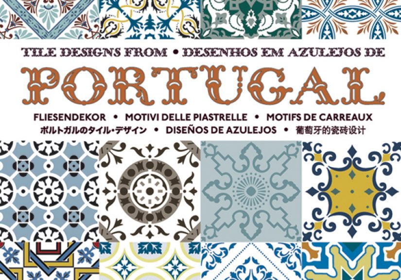
Tile Designs from Portugal, published by Pepin Press and associated with D. Hurtado de Mendoza, is a compact but visually generous reference for anyone who loves traditional Portuguese tile patterns. The book is known for presenting more than 100 traditional designs, many connected to 17th- and 18th-century Portuguese tilework. Its appeal is simple: it treats tiles not as background decoration but as graphic art.
The designs in the book are especially useful because they reveal how much intelligence is packed into a single repeat. A four-tile arrangement may produce a medallion. A diagonal vine may become a lattice. A small corner flourish may suddenly bloom when multiplied across a wall. Portuguese tile design is a master class in “small unit, big impact.” It is also a gentle warning to anyone choosing plain white subway tile for the eighth renovation in a row: there are other options, and some of them have been fabulous for 300 years.
For designers, the book works as a pattern library. For artists, it offers studies in balance and ornament. For homeowners, it provides inspiration for backsplashes, fireplace surrounds, stair risers, bathrooms, and accent walls. For travelers, it is the next best thing to wandering through Lisbon or Porto with your neck tilted toward every building façade like a very stylish pigeon.
The History Behind Portugal’s Tile Obsession
Moorish Geometry and Early Influence
The earliest roots of Portuguese tile design are tied to Moorish artistic traditions in Spain and Portugal. Geometric arrangements, interlacing shapes, and repeating symmetry became a foundation for later Portuguese tilework. These designs were not merely decorative; they created a sense of order and rhythm in architecture. A tiled wall could cool a space, protect plaster, reflect light, and communicate refinement all at once.
The Italian Majolica Effect
During the Renaissance, Italian majolica techniques influenced tile production across Europe. Tin-glazed ceramics allowed painters to work with brighter colors and more detailed imagery on a white surface. This helped Portuguese tiles move beyond purely geometric pattern into pictorial storytelling. Suddenly, tiles could show religious scenes, landscapes, ships, animals, flowers, and fashionable people doing fashionable old-world things, such as hunting dramatically and wearing hats that required confidence.
The Blue-and-White Era
One of the most recognizable Portuguese tile styles is blue-and-white azulejo. This look became especially popular in the 17th and 18th centuries, influenced in part by Dutch Delftware and Chinese porcelain. Cobalt blue on a pale ground gave tile panels crisp contrast, elegance, and a timeless quality. Blue-and-white scenes still feel fresh today because they can be ornate without feeling loud. They whisper “heritage” instead of shouting “theme restaurant.”
In Portugal, blue-and-white tiles were used for grand narrative panels in churches, convents, palaces, gardens, and civic spaces. Some panels function almost like murals, depicting battles, biblical stories, landscapes, city views, and allegorical scenes. The National Tile Museum in Lisbon preserves this evolution beautifully, showing how azulejos became one of Portugal’s most distinctive artistic expressions.
Key Characteristics of Portuguese Tile Designs
1. Repetition With Purpose
Portuguese tiles often use repetition to create visual harmony. A single motif may seem modest on its own, but when repeated across a wall, it becomes immersive. This is why tile samples can be deceptive. One tile may say, “I’m cute.” Twenty tiles say, “I own this room now.”
2. Symmetry and Geometry
Many traditional azulejo patterns rely on symmetry. Stars, quatrefoils, diamonds, circles, and interlocking lines create structure. These patterns work especially well in modern interiors because geometry bridges old and new. A centuries-old motif can look surprisingly contemporary when paired with clean cabinetry, simple fixtures, and natural materials.
3. Botanical and Floral Motifs
Portuguese tiles frequently feature vines, flowers, leaves, and stylized blossoms. These motifs soften the strictness of geometry and introduce movement. Floral tilework can feel romantic, rustic, coastal, or formal depending on color and scale. Blue floral repeats are classic, while green, ocher, and manganese tones create a warmer antique mood.
4. Narrative Panels
Some of Portugal’s most impressive tile installations are pictorial panels. These are not simple repeats but large compositions made from many tiles. They may show religious figures, ships, landscapes, hunting scenes, or historical events. In public architecture, narrative azulejos helped tell stories in a durable, monumental format.
5. A Practical Relationship With Architecture
Azulejos are beautiful, but they are also practical. Glazed tile resists moisture, reflects light, and protects surfaces. On Portuguese façades, tiles help buildings endure sun, rain, salt air, and urban wear. That practical function partly explains why tile became so common in Portugal. Beauty is easier to justify when it also keeps your walls from sulking in the weather.
Famous Places to See Portuguese Tile Design
To understand Portuguese tiles, it helps to see them in context. Lisbon and Porto are full of tiled façades, but several landmarks show the tradition especially well.
National Tile Museum, Lisbon
The National Tile Museum, housed in the former Convent of Madre de Deus, traces the history of Portuguese tile from early examples to modern interpretations. It is one of the best places to see how azulejos evolved from geometric surfaces into elaborate narrative art.
São Bento Railway Station, Porto
São Bento Station is famous for its dramatic blue-and-white tile panels. The scenes depict moments from Portuguese history and rural life, turning a transportation hub into a ceramic theater. It is proof that catching a train can be culturally enriching, even if your suitcase wheel is misbehaving.
Chapel of Souls, Porto
The Chapel of Souls is known for its striking exterior covered in blue-and-white azulejos. The tiles wrap the building with devotional imagery, making the chapel one of Porto’s most photographed landmarks.
Fronteira Palace, Lisbon
Fronteira Palace offers another remarkable example, with tilework integrated into gardens, walls, and architectural spaces. It shows how azulejos can create atmosphere outdoors as well as inside.
How to Use Portuguese Tile Designs in Modern Interiors
Start Small With a Backsplash
A kitchen backsplash is one of the easiest places to introduce Portuguese tile designs. Blue-and-white patterns look crisp with white cabinets, warm wood, brass hardware, or soapstone counters. For a more eclectic kitchen, mix patterned tiles with open shelving, terracotta, and handmade ceramics. The key is balance. If the tile is busy, let nearby surfaces breathe. Your backsplash should be the lead singer, not the entire marching band.
Create a Powder Room Moment
Powder rooms are ideal for bold tile because they are small, self-contained, and allowed to have a little drama. A Portuguese-inspired tile wainscot, vanity wall, or floor can transform a basic half bath into a jewel box. Since guests only spend a few minutes there, you can be braver than you might be in a main living space.
Use Tiles on Stair Risers
Tile stair risers are a classic Mediterranean design move that works beautifully with Portuguese patterns. You can use one repeated motif for a clean look or mix related patterns for a collected effect. Keep the stair treads simple so the risers shine without turning every step into a visual negotiation.
Frame Tiles as Art
If a full installation feels too permanent, frame a small group of tiles. Antique or reproduction azulejos can become wall art in a hallway, kitchen, or reading nook. This approach is especially useful for renters or anyone who loves tile but fears grout commitment.
Design a Fireplace Surround
A fireplace surround gives patterned tile a natural focal point. Portuguese designs can make a plain fireplace feel historic, handcrafted, and intentional. Blue-and-white tiles bring brightness, while green, yellow, and earthy tones create a warmer old-world effect.
Choosing Colors: Beyond Blue and White
Blue-and-white azulejos may be the celebrity couple of Portuguese tile design, but they are not the whole story. Traditional tiles also include greens, yellows, ochers, manganese purples, soft browns, and rich polychrome palettes. Earlier Hispano-Moorish styles often used complex color combinations, while later periods developed softer architectural palettes.
For modern homes, color choice should depend on the mood you want. Blue and white feels crisp, coastal, and classic. Green and white feels garden-like and fresh. Yellow and blue adds warmth and energy. Sepia or muted earth tones create an antique mood. Polychrome patterns can be joyful, but they need surrounding restraint. Think plaster walls, wood floors, linen curtains, and furniture that does not insist on competing for the microphone.
Pattern Mixing Without Panic
Portuguese tile design often encourages mixing, but there is an art to doing it well. The safest strategy is to keep one unifying element. That element might be color, scale, historical style, or shape. For example, you can mix several blue-and-white patterns if they share a similar intensity. Or you can combine floral and geometric tiles if the palette stays consistent.
Avoid mixing too many dominant patterns in one small area. Pattern needs rhythm, but it also needs pauses. In a kitchen, pair patterned tile with plain counters. In a bathroom, let the tile occupy either the floor or the walls, not necessarily every surface. Unless your goal is “Portuguese maximalist spa inside a kaleidoscope,” restraint is your friend.
Authentic, Reproduction, or Inspired?
When shopping for Portuguese tiles, you will find three broad categories: antique tiles, faithful reproductions, and contemporary designs inspired by azulejos. Each has a place.
Antique tiles carry age, patina, and historical value, but buyers should be careful. Portugal has faced problems with tile theft and illegal removal from historic buildings. Ethical sourcing matters. Avoid suspicious loose antique tiles from questionable markets or sellers. When in doubt, choose reputable dealers, documented salvage, or new handmade reproductions.
Faithful reproductions are often the best choice for home projects. They preserve the look of historic patterns while avoiding the ethical and practical challenges of using fragile antiques. Contemporary interpretations, meanwhile, can be wonderful for modern interiors. Designers today reinterpret azulejo geometry and color in fresh ways, using porcelain, ceramic, cement, or printed surfaces.
Why Portuguese Tile Designs Still Feel Fresh
Portuguese tile designs endure because they solve a design problem that never goes away: how to make surfaces feel alive. Paint can add color. Wallpaper can add pattern. Stone can add texture. But tile adds color, pattern, texture, shine, durability, and architectural identity all at once. That is a lot of work for a square object that usually measures only a few inches across.
Azulejos also feel fresh because they combine discipline and joy. The grid provides order. The pattern provides movement. The glaze catches light. The motifs carry history. Together, they create rooms that feel layered rather than decorated in a single shopping trip. In a world full of fast design trends, Portuguese tile has the confidence of something that has already survived several centuries and does not need your algorithm’s approval.
Design Lessons From Portuguese Tiles
Lesson 1: Small Details Can Shape Big Spaces
A single tile is modest. A wall of tiles is architecture. Portuguese design teaches us that small repeated elements can define an entire room or façade.
Lesson 2: Ornament Can Be Intelligent
Modern design sometimes treats ornament as extra. Azulejos prove that ornament can carry structure, symbolism, function, and cultural memory.
Lesson 3: Blue Is Practically a Neutral
Portuguese blue-and-white tile works with wood, stone, plaster, brass, black metal, and greenery. It behaves like a neutral with better stories.
Lesson 4: Craft Makes Spaces Feel Human
Hand-painted or handmade tile has tiny variations. Those variations bring warmth. Perfectly flat, identical surfaces can feel sterile; Portuguese tiles remind us that a little human irregularity is often the thing that makes a room lovable.
Experience Notes: Living With the Look of Portuguese Tile
The first time you really notice Portuguese tile, it can feel like your eyes have discovered a secret setting. One moment you are walking down an ordinary street; the next, an entire building façade is covered in blue vines, yellow flourishes, or repeating diamonds that look like they were arranged by someone with patience, taste, and possibly excellent coffee. That is the experience Portuguese tile gives: it turns daily surfaces into small events.
In a home, the experience is similar but more intimate. A Portuguese-inspired backsplash changes the way a kitchen feels in the morning. The glossy surface catches early light, and suddenly making toast seems slightly more cultured. A tiled bathroom wall adds a sense of travel even when the farthest you are going is the linen closet. Stair risers with patterned tiles make an ordinary staircase feel intentional, like the house has decided to dress for dinner.
One of the best things about Portuguese tile designs is that they reward slow looking. At first, you see the color. Then you see the repeat. Then you notice the tiny flower tucked into the corner, the way four tiles form a circle, or how a simple blue line creates movement across the wall. This makes the design feel alive over time. Unlike trendy décor that gives everything away in one glance, azulejo-inspired patterns keep offering small discoveries.
There is also a practical pleasure in tile. It is durable, wipeable, and unfussy. A patterned tile floor can forgive crumbs better than a plain one. A tiled wall behind a sink can handle splashes without behaving like it has suffered a personal insult. Portuguese tile design is beautiful, yes, but it is not fragile in spirit. It was made for real buildings, real weather, real people, and real life.
The biggest lesson from living with this style is to let it breathe. Portuguese tiles are expressive, so they do not need to be surrounded by too much visual noise. Pair them with honest materials: wood, plaster, linen, stone, iron, clay, or simple painted cabinetry. Add plants if you want the colors to feel even more alive. Keep lighting warm enough to flatter the glaze. And do not be afraid of a little imperfection. Slight variation is part of the charm.
For anyone who loves design books, Tile Designs from Portugal offers more than pattern inspiration. It encourages a different way of seeing surfaces. A wall is not just a wall. A floor is not just a floor. A tile is not just something you argue about during a renovation. It can be a piece of history, a graphic motif, a craft object, and a mood-maker all at once. That is why Portuguese tile designs remain required reading: they teach the eye to expect more beauty from everyday places.
Conclusion
Required Reading: Tile Designs from Portugal is more than a nod to a beautiful design book. It is an invitation to understand one of Europe’s richest decorative traditions. Portuguese azulejos combine Moorish geometry, Renaissance painting techniques, Dutch-influenced blue-and-white palettes, local craftsmanship, and centuries of architectural imagination. They are practical, poetic, durable, and endlessly adaptable.
Whether you are designing a kitchen, refreshing a bathroom, collecting pattern references, or simply dreaming about tiled streets in Lisbon and Porto, Portuguese tile design offers a rare mix of history and usability. It can be grand or humble, antique or modern, quiet or exuberant. Most importantly, it reminds us that surfaces deserve attention. A well-chosen tile does not just cover a wall; it gives the wall a voice. And if that voice happens to speak in cobalt blue with a floral accent, all the better.
Note: This article is an original synthesis based on real historical, museum, architectural, and interior design information about Portuguese azulejos and traditional tile design.