Table of Contents >> Show >> Hide
- Why Microsoft Word Works for Simple Banner Design
- Before You Start
- Method 1: Create a Banner in Word with a Template
- Method 2: Make a Banner from Scratch in Word
- Banner Design Tips That Make Word Banners Look Better Fast
- Common Mistakes to Avoid
- Which Method Should You Use?
- Can You Print a Large Banner Across Multiple Pages?
- Final Thoughts
- Real-World Lessons and Experiences From Making Banners in Microsoft Word
If you have Microsoft Word, a deadline, and exactly zero interest in learning a full-blown design app before lunch, good news: you can absolutely make a clean, attractive banner in Word. No, it is not the fanciest banner studio on Earth. But for classroom signs, party banners, church events, yard-sale headers, office celebrations, welcome signs, and simple promotional displays, Word is more capable than people give it credit for.
The trick is knowing which route to take. If speed is your top priority, start with a template and customize it. If you want more control, build the banner from scratch with WordArt, text boxes, shapes, and images. Those are the two easiest methods, and once you know them, you can crank out a banner faster than someone in the next cubicle can say, “Shouldn’t we just use PowerPoint?”
In this guide, you will learn both methods step by step, plus the design tips, printing advice, and real-world lessons that help your banner look intentional instead of “last-minute printer panic.”
Why Microsoft Word Works for Simple Banner Design
Word is built for documents first, but it includes enough layout tools to handle straightforward banner projects. You can change page orientation, adjust margins, insert WordArt for big headlines, place text inside text boxes and shapes, add images or logos, and save the final file as a PDF for cleaner printing. That makes Word especially useful when you want a practical banner without switching programs.
It is also familiar. Most people already know where the font tools are, how to insert a picture, and how to drag things around the page. That alone makes Word a winner for quick jobs. If your banner needs to say “Welcome Back Students,” “Happy Birthday, Maya!,” or “50% Off This Weekend,” Word can get the job done without drama.
That said, keep your expectations reasonable. Word is excellent for simple and medium-complexity banner work. If you need giant trade-show graphics, precision bleed settings, or advanced print production, that is when a dedicated design program or print shop becomes the grown-up choice.
Before You Start
Before you open a blank document and start choosing fonts like a kid loose in a candy store, decide three things:
- Your banner size: Standard letter paper, legal paper, tabloid paper, or a custom size.
- Your message: Keep it short, clear, and readable from the intended distance.
- Your output: Home printer, office printer, or a professional print shop.
Also gather any images, logos, or brand colors you want to use. If you do not have strong visuals, do not panic. A bold headline on a clean background often works better than a banner stuffed with random clip art from 2007.
Method 1: Create a Banner in Word with a Template
This is the fastest method, and for many people it is the best one. Templates save you from building the layout from scratch, which means less fiddling and fewer opportunities to accidentally send your headline flying to page two.
Step 1: Open Word and Search for a Template
Launch Microsoft Word and look at the template gallery. Search for terms like banner, flyer, poster, event sign, or celebration. Even if Word does not show a template labeled exactly “banner,” flyer and poster templates often work beautifully once you resize and simplify them.
This method is especially handy for welcome banners, classroom signs, holiday displays, and small business promotions. Instead of designing from a blank page, you begin with a layout that already has decent spacing, font hierarchy, and visual balance.
Step 2: Pick a Template That Matches Your Goal
Choose a design that fits your audience. For example, a school event banner can use brighter colors and friendlier fonts, while a retail sale banner should be bolder and more direct. A church welcome sign or office event banner may need something cleaner and calmer.
Look for these qualities:
- A large main headline area
- Strong contrast between text and background
- Enough white space so the design does not feel cramped
- Easy-to-swap images and colors
If the template looks cute but the text is tiny, skip it. A banner is not a novel. Nobody should need binoculars to read “Open House Tonight.”
Step 3: Replace the Placeholder Text
Click into the headline and body text areas and replace the sample copy with your own message. Keep the wording short. A banner works best when it delivers one clear idea quickly.
Good examples:
- Grand Opening This Saturday
- Welcome Home, Alex!
- Science Fair Registration Today
- Spring Sale Up to 40% Off
Bad example: a six-line paragraph explaining your event history, sponsorship structure, snack policy, and emotional journey. Save that for the newsletter.
Step 4: Customize Fonts, Colors, and Images
Once the text is in place, adjust the design so it feels like yours. Change the font to match the tone of the banner. A playful birthday banner can handle something rounded and cheerful. A business banner should usually lean toward clean sans-serif fonts with strong readability.
Replace the stock image if needed, add your logo, and update the colors to match your school, team, or brand. If your background gets busy, tone it down. The headline should always win the staring contest.
Step 5: Resize the Page if Necessary
Templates do not always open in the exact banner dimensions you want. Go to the layout settings and adjust the page size, orientation, and margins. Landscape orientation is often the better choice for banners because it naturally supports a wide headline layout.
If your printer allows custom sizes, you can design for that size. If not, you can still create a smaller banner on standard paper or save the file as a PDF and send it to a print shop for larger output.
Step 6: Print a Test Copy
Before you print ten copies or send the file to a shop, print one test page. Check alignment, readability, color contrast, and image quality. If the text looks smaller than expected, it probably is smaller than expected. Banners almost always benefit from bigger text and less clutter.
Method 2: Make a Banner from Scratch in Word
If templates feel too restrictive or too “someone else already made all the fun decisions,” building from scratch is the better option. This method gives you more control while still staying beginner-friendly.
Step 1: Set the Page Size and Orientation
Open a blank Word document. Then go to the layout controls and choose the paper size and orientation. For a simple banner, landscape is usually the safest starting point. You can also reduce the margins so the design has more room to breathe.
Think about where the banner will be used. A hallway sign might work on standard paper. A table display might need legal or tabloid size. A large event banner may be designed in Word and then professionally printed at a bigger size.
Step 2: Add a Bold Headline with WordArt
Now bring in the star of the show: the headline. Go to Insert and choose WordArt. Pick a style, then type your main message. This is one of the quickest ways to make banner text look more dynamic without doing any advanced design work.
Resize the WordArt until it is clearly readable. Keep it simple. A huge clean headline beats a fancy unreadable one every single time. Decorative effects can be fun, but if the text starts looking like it escaped from a haunted karaoke machine, pull it back.
Step 3: Add Supporting Text with Text Boxes
If your banner needs a subtitle, date, location, or short call to action, insert a text box. This lets you position the secondary text exactly where you want it without disrupting the headline. You can remove the text box outline if you want a cleaner look, or keep it if it helps frame the information.
Examples of useful supporting text include:
- Saturday, April 18
- Gymnasium Entrance
- Starts at 10:00 AM
- Register Now
Make the secondary text smaller than the headline, but still readable. Your layout should show clear hierarchy: headline first, details second.
Step 4: Use Shapes for Background Blocks and Highlights
Shapes are one of Word’s most underrated banner tools. Add a rectangle behind your headline to create a color block. Use circles or ribbons to highlight a sale amount or event date. Add arrows if you need directional signage.
Shapes are also useful when your background image makes the text hard to read. A semi-transparent shape behind the headline can instantly improve contrast and legibility.
Step 5: Insert Images or a Logo
If you want to include a school mascot, product image, business logo, or photo, insert it carefully. Keep in mind that banners are not scrapbooks. One strong image is usually better than five tiny ones competing for attention.
Place the image where it supports the message rather than fights it. If your logo is important, keep it visible but not oversized. If your photo is dramatic, let it breathe and avoid covering it with too much text.
Step 6: Align and Tidy Everything Up
Once all your elements are on the page, zoom out and inspect the layout. Is the headline centered? Is the spacing even? Are the edges balanced? Does the most important message jump out in two seconds or less?
This is where a good banner becomes a strong one. Small adjustments matter. Shift objects, resize elements, and simplify anything that feels crowded. Word lets you nudge your design into place, and that final cleanup does a lot of the heavy lifting.
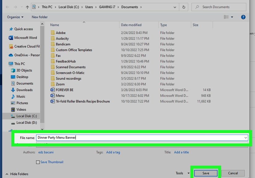
Step 7: Save as PDF Before Final Printing
When the banner looks right, save a copy as a PDF. This can help preserve your layout and reduce printing surprises, especially if you are sending the file to someone else or using a print shop. It is a simple move, but it often saves you from the classic “Why did everything shift?” moment.
Banner Design Tips That Make Word Banners Look Better Fast
Keep the Message Short
A banner should be understood quickly. Focus on one main message, one supporting detail, and one action if needed. Think headline, not essay.
Use High Contrast
Dark text on a light background or light text on a dark background usually works best. Low contrast may look stylish on a trendy Instagram post, but on a banner it often just looks faint and regrettable.
Choose Readable Fonts
Use one strong display font for the headline and one simple font for the supporting text. Two fonts are usually enough. More than that and your banner starts acting like it cannot commit.
Leave White Space
Empty space is not wasted space. It helps the eye focus on what matters and makes your banner feel polished instead of crowded.
Scale for Distance
If people will read the banner from across a room, go larger than you think you need. Text that looks huge on your laptop screen often shrinks emotionally the moment it hits paper.
Match the Printer Settings to the Project
If you are using thicker paper or cardstock, check the media type in your print settings. If you are working with a custom size, confirm that the page size in Word matches the printer settings. A mismatch here is one of the easiest ways to ruin an otherwise nice banner.
Common Mistakes to Avoid
- Too much text: Banners are for quick reading, not deep reflection.
- Tiny fonts: If the headline whispers, the banner fails.
- Too many colors: Pick a simple palette and stick to it.
- Busy backgrounds: If the text disappears, the background is doing too much.
- No test print: Never trust the screen completely. Paper loves surprises.
- Wrong page settings: Always confirm orientation, size, margins, and scaling before final print.
Which Method Should You Use?
Use a template if you need speed, want an easy starting point, or are not especially excited about designing from scratch.
Build it manually if you want more control, need a very specific layout, or enjoy fine-tuning the look of the banner yourself.
There is no wrong choice here. The better method is the one that gets you a readable, attractive result without burning half your day.
Can You Print a Large Banner Across Multiple Pages?
Yes, but with an important asterisk. Word can help you design the banner, but printing it across multiple sheets depends heavily on your printer and driver options. Some printers offer poster, tiling, scaling, or fit-to-paper features. Others act like this is an outrageous request.
If you need a really large banner, two practical options work best:
- Design it in Word, save it as a PDF, and send it to a print shop.
- Design it in sections on standard-size pages and assemble it manually.
For home printing, do a test first. For professional results, do not be shy about outsourcing the final print. Word can create the design; your printer does not have to become a hero if it is clearly not prepared for the role.
Final Thoughts
Creating a banner in Microsoft Word is easier than most people think. The fastest route is using a template and customizing it. The more flexible route is building the banner yourself with WordArt, text boxes, shapes, and images. Both methods work, and both can produce surprisingly polished results when you focus on readability, contrast, spacing, and strong headline hierarchy.
At the end of the day, a good banner is not about showing off every tool Word offers. It is about getting your message noticed quickly and clearly. Keep it simple, keep it bold, and keep it readable. Your banner does not need to win a design award. It just needs to do its job without making people squint.
Real-World Lessons and Experiences From Making Banners in Microsoft Word
One of the funniest things about making banners in Word is how often people start with total confidence and end up in a philosophical debate with a text box. I have seen this happen with school event signs, family birthday banners, church welcome posters, garage sale notices, and office celebration displays. The good news is that the learning curve is short. The better news is that most banner problems in Word are not really “design problems.” They are usually sizing, spacing, or readability problems wearing fake mustaches.
A common experience is starting with a beautiful idea and a very bad font choice. On screen, an extra-fancy script font can look elegant. Printed on paper and taped to a wall, it can suddenly become unreadable spaghetti. That is why one of the biggest lessons from making banners in Word is this: readability beats style every time. A boring readable banner still works. A gorgeous unreadable banner is just decorative confusion.
Another real-world lesson is that white space saves lives. Or at least saves banners. Beginners often try to “use all the space” because a blank area feels unfinished. But once you have made a few banners, you realize empty space is what gives the message power. The banner looks cleaner, the headline feels bigger, and the whole design becomes easier to absorb from a distance.
Printing teaches its own lessons too. Colors look different on paper. Images that seemed sharp on screen can print softer than expected. Text that looked giant in Word can somehow appear modest and polite once it is physically hanging across a room. That is why experienced users almost always test print first. It is not paranoia. It is wisdom earned through mild suffering.
There is also a practical joy in discovering how flexible Word can be. Once you learn how to combine WordArt, shapes, and text boxes, you stop seeing Word as “just a typing program.” It becomes a quick sign-making tool for real-life needs: bake sale signs, classroom headers, retirement party banners, welcome-home messages, volunteer event signage, even simple storefront promotions. No, it will not replace professional design software for every project. But for fast, useful, attractive banner work, it is surprisingly reliable.
Perhaps the most valuable experience-related takeaway is this: simple wins. The best Word banners are usually the ones with the fewest moving parts. One big headline. One strong color choice. One supporting detail. One image, maybe. When people stop trying to make Word do seventeen dramatic things at once, the results get much better. In other words, the secret to great banners in Word is not wizardry. It is restraint, clarity, and just enough formatting confidence to make the message look intentional.