Table of Contents >> Show >> Hide
- What Makes the Skulls Collection So Distinctive?
- The Story Behind Beware the Moon
- Why Skulls Work in Interior Design Without Looking Juvenile
- Best Rooms for Skulls Collection Wallpaper
- How to Style It Without Turning Your Home Into October 31
- Practical Things to Know Before Buying
- Is the Skulls Collection Actually Worth It?
- The Experience of Living With Statement Skull Wallpaper
- Final Thoughts
Some wallpapers whisper. This one smirks.
The Skulls Collection Wallpaper by Beware the Moon is the kind of wallcovering that makes a room feel like it has a private joke. From a distance, it reads as richly textured, moody, and glamorous. Up close, the pattern reveals itself: skulls, repeated with just enough variation to feel clever rather than gimmicky. It is dramatic without becoming cartoonish, gothic without descending into haunted-house chaos, and luxurious in a way that feels more fashion-editorial than costume party.
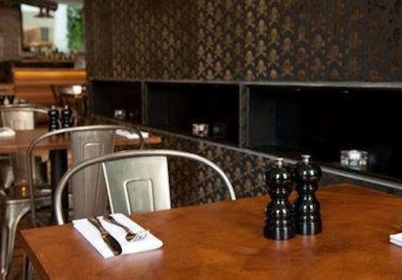
That balance is exactly why this wallpaper has continued to fascinate design lovers. The pattern first caught wider attention through a Design Sleuth feature spotlighting its appearance at St. Ali Cafe in Clerkenwell, where the shimmering flocked finish proved impossible to ignore. Years later, the appeal still holds. In a decorating world that swings between bare-minimum minimalism and full-throttle maximalism, Beware the Moon’s skull wallpaper lands in a sweet spot: bold, witty, tactile, and unapologetically memorable.
If your walls have been feeling a little too polite, this may be the wallpaper equivalent of handing them an espresso and telling them to get a personality.
What Makes the Skulls Collection So Distinctive?
The easiest way to explain the charm of the Beware the Moon wallpaper is this: it is not just about skulls. It is about texture, light, craftsmanship, and mood. The skull motif happens to be the hook, but the real power lies in how the paper changes as you move through a room.
Several colorways in the collection lean into reflective or flocked finishes. The well-known Black on Gunmetal version pairs a jet-black velvet skull motif with a reflective gray base, creating a shifting effect that moves through black, silver, and graphite depending on the light. The even more theatrical Bronze on Oil Slick variation layers bronze velvet skulls over an iridescent surface that flips through red, green, black, and gold tones as the viewer walks past. In other words, this is not flat wallpaper. It performs.
And that sense of performance is important. Great wallpaper does not merely fill wall space; it changes the emotional temperature of a room. The Skulls Collection has a cinematic quality. It can feel mysterious in a dim hallway, decadent in a powder room, sophisticated in a lounge, and surprisingly soft in lighter versions like Ice Cream Skulls, which swaps overt drama for a creamy, tactile calm. Same bones, different attitude.
Even the repeat pattern shows restraint. The skulls are noticeable, but they are not screaming for attention like an overcaffeinated Halloween aisle. The motifs are refined, scaled with care, and varied subtly enough to avoid that dreaded wallpaper problem: the endless robotic clone effect.
The Story Behind Beware the Moon
Part of the fascination around this designer wallpaper comes from the brand itself. Beware the Moon was founded by father-and-daughter duo John and Louise Wakefield, whose work is rooted in traditional British wallpaper craft. The company has described the brand as beginning with a single velvet skull wallpaper idea in 2008 before growing into a larger pattern collection. That origin story matters because the Skulls design does not feel mass-produced in spirit, even when sold broadly. It feels authored.
The brand has emphasized small-batch production, traditional print methods, and a deep love of unusual pigments and tactile finishes. On its current site, Beware the Moon also notes that it has been winding down its design studio after 17 years and streamlining the line to bestselling papers. That gives the surviving skull designs a little extra cachet. They are not just bold wallpapers; they feel like pieces from a niche design house that has always preferred cult status over broad-market blandness.
There is also something refreshing about a wallpaper brand that does not behave like it is trying to please everybody. The Skulls Collection is not chasing beige approval. It is confidently specific. That confidence is a design asset.
Why Skulls Work in Interior Design Without Looking Juvenile
Let’s address the bony elephant in the room: skulls can go wrong very quickly.
Use them badly, and a room starts looking like a party store had a clearance sale. Use them well, and they can evoke symbolism, fashion, rebellion, art history, rock-and-roll glamour, Victorian curiosity, and a little bit of mischief. The Skulls Collection works because it treats the motif as pattern, not prop.
That distinction changes everything. In interior design, repeated motifs become texture. A skull printed once on a poster is a statement. A skull repeated elegantly across a velvet flock wallpaper becomes atmosphere. It taps into the same design principle that makes leopards, snakes, or ravens work in interiors: a little darkness can be incredibly chic when it is stylized, scaled, and layered properly.
Recent design coverage across major U.S. home publications has shown a clear appetite for moody interiors, dark walls, statement wallpaper, and the return of maximalist layering. That broader shift helps explain why a wallpaper like this still feels relevant. Designers are once again embracing rooms with personality, depth, visual storytelling, and a touch of eccentricity. Translation: the age of whisper-soft walls is not the only game in town anymore.
Best Rooms for Skulls Collection Wallpaper
1. Powder Rooms
If there is one place to go bold without apologizing, it is the powder room. Small bathrooms are practically begging for dramatic wallpaper because they function like jewel boxes: compact, memorable, and separate from the visual rhythm of the rest of the home. A skull wallpaper in a powder room feels intentional, witty, and deliciously theatrical. Add warm brass, a moody mirror, and low lighting, and suddenly handwashing becomes a whole scene.
2. Dining Rooms
A dining room is another ideal setting because it already invites atmosphere. Candlelight, reflective glassware, dark-painted trim, and textured wallpaper are natural partners. The Black on Gunmetal version, especially, can make a dining room feel intimate and slightly decadent, like the room knows how to host a dinner party with better music than your neighbors.
3. Bars, Lounges, and Snugs
This wallpaper shines in rooms meant for mood. Home bars, cocktail corners, library lounges, and snug sitting rooms benefit from visual richness. The iridescent finishes become especially effective at night, when lamplight and shadow let the pattern shift and flicker.
4. Bedrooms as Accent Walls
For people who love drama but do not want to sleep inside a full gothic novella, an accent wall is the smart move. Behind a bed, the Skulls Collection can create a strong focal point without overwhelming the room. This approach also aligns with popular wallpaper advice from American interiors publications: bold wallcoverings often work best when given one strong stage rather than being forced to monologue from every surface.
5. Creative Studios and Boutique Spaces
For shops, salons, studios, and creative workspaces, the wallpaper can double as branding. It says the space values imagination, detail, and a little edge. It is memorable, which is half the battle in commercial interiors.
How to Style It Without Turning Your Home Into October 31
The trick with gothic wallpaper is not to over-explain it. If you pair skull wallpaper with fake cobwebs, plastic ravens, and enough black lace to qualify as stage costume inventory, the room collapses into parody. But if you treat it like a luxurious patterned surface, it becomes sophisticated.
Start with texture. Velvet, leather, linen, smoked glass, aged brass, dark wood, and matte ceramics all play beautifully with a paper like this. The contrast between soft flocking and harder materials gives the room dimension. Next, use a disciplined color palette. Charcoal, bronze, cream, tobacco, oxblood, forest green, and muted gold are all strong companions. Warm woods are especially useful because they keep dark wallpaper from feeling icy or one-note.
Lighting matters too. A statement wallpaper deserves layered lighting: sconces, table lamps, dimmers, and directional glow that can catch reflective pigments without flattening them. Overhead lighting alone is the design equivalent of reading Shakespeare through a megaphone. Technically possible, deeply unhelpful.
Finally, let the wallpaper be the star. You do not need ten competing patterns nearby. In fact, the room often looks better when the furnishings are edited and the wallpaper carries most of the visual complexity.
Practical Things to Know Before Buying
Style gets the attention, but practicality earns the long-term respect. Beware the Moon describes its wallpapers as paste-the-wall products and recommends experienced installers, primed and lined walls, and using rolls from the same batch for consistency. Those details matter because textured and specialty wallcoverings do not forgive sloppy prep.
The brand has also highlighted recent material changes, including a move toward non-woven papers using plant-derived fibers and more recyclable or compostable packaging. For buyers who care about craftsmanship and sustainability, that is a welcome detail. It also signals that the company’s appeal is not purely aesthetic; there is thought behind the substrate as well as the surface.
Another practical note: not every colorway is equally available. Some versions have been marked as discontinued or shifted to custom-print status, while the company has said it is reducing the collection to bestsellers during its wind-down phase. So if a particular finish makes your heart skip a beat, “I’ll think about it next year” may not be the strongest purchasing strategy.
Is the Skulls Collection Actually Worth It?
For the right room and the right homeowner, yes.
This is not a wallpaper for people who want invisible walls. It is for people who understand that interiors can be expressive, a little cheeky, and emotionally textured. It is for those who like tradition with a twist: craftsmanship, yes, but with a sly grin. It is also for anyone who has grown tired of spaces that look algorithm-approved but humanly forgettable.
The Skulls Collection Wallpaper by Beware the Moon succeeds because it manages to be beautiful, strange, and usable all at once. That is harder than it sounds. Plenty of wallpapers are pretty. Plenty are quirky. Very few are both while still feeling livable.
This one has that rare quality of making a room feel composed and rebellious at the same time. It does not shout for attention. It lures you in, lets the texture do some flirting, then casually reveals that your elegant new wallpaper has been full of skulls the whole time. Honestly, that kind of confidence deserves a round of applause.
The Experience of Living With Statement Skull Wallpaper
What is it actually like to live with a wallpaper like this day to day? That is where the conversation gets more interesting than simple product specs.
At first, most people expect skull wallpaper to feel aggressive. They imagine it will dominate a room, hijack every conversation, and somehow make brunch feel illegal. But in practice, the experience is usually more nuanced. A well-made skull wallpaper does not read as “skulls!” every second of the day. It reads first as rhythm, depth, and texture. The motif reveals itself gradually, and that slow reveal is part of the pleasure.
Morning light tends to soften the design. In gentler hours, especially with a colorway that includes shimmer or tonal contrast, the wallpaper can feel almost velvety and atmospheric rather than edgy. In afternoon light, the reflective base starts doing more work, showing off changes in tone as you move around the room. By evening, particularly under lamps and sconces, the paper becomes moodier and more theatrical. It is one of those rare surfaces that rewards different times of day, which helps explain why owners of statement wallpaper often grow more attached to it over time rather than less.
There is also the social experience. Guests notice it. Not always immediately, which is even better, but eventually. Someone leans in. Someone says, “Wait, are those skulls?” And suddenly the room has produced a conversation starter without needing a neon sign or a novelty bar cart shaped like a flamingo. Good design often creates layers of discovery, and this wallpaper does exactly that.
Emotionally, the effect can be surprisingly cozy. That may sound odd for a skull motif, but rooms wrapped in dark, textured wallpaper often feel intimate and protected rather than harsh. The tactile surface absorbs some of the visual flatness that plain painted walls can have. In a powder room, it creates a jewel-box effect. In a lounge, it adds cocooning warmth. In a bedroom, especially as an accent wall, it can feel dramatic in the best possible way: not frantic, but enveloping.
Another part of the experience is confidence. Decorating with a wallpaper like this means choosing a point of view. You are not trying to offend anyone, but you are also not begging for universal approval. That is liberating. Homes become more interesting when they reflect specific taste instead of generic “nice.” The Skulls Collection works because it helps create that specificity without sacrificing elegance. It gives a room identity.
There are practical emotional benefits too. Spaces with memorable surfaces often need less filler. When the walls already have character, you can be more selective with art, styling, and accessories. The room does not demand endless decorating to feel complete. In a funny way, a bold wallpaper can save a space from clutter because it has already done the heavy lifting.
And then there is the long-term effect: familiarity without boredom. Many trendy finishes look exciting for three weeks and then become visual wallpaper in the bad sense of the phrase. The Skulls Collection tends to age better because its appeal is layered. It is graphic, yes, but also tactile, symbolic, moody, and materially rich. There is enough going on to keep the eye engaged.
Living with it is less like owning a novelty and more like sharing a room with a charming eccentric. It is polished, a little dark, unexpectedly funny, and always better in person. Which, frankly, is more than can be said for a lot of wallpaper and a fair number of dinner guests.
Final Thoughts
The Design Sleuth: Skulls Collection Wallpaper by Beware the Moon story is ultimately about more than a single wallcovering. It is about what happens when old-school craft meets fearless visual identity. The result is a wallpaper that feels tactile, witty, atmospheric, and strangely timeless.
For homeowners, designers, and anyone bored by safe surfaces, this collection offers proof that a wall can be elegant and mischievous at the same time. It invites personality back into the room. It shows that pattern can be dark without being dreary, luxurious without being stuffy, and thematic without becoming costume. In a world full of forgettable walls, that is no small achievement.