Table of Contents >> Show >> Hide
- Quick Profile: What Calm OC-22 Actually Is
- Understanding LRV: Why Calm Feels Bright (But Not Harsh)
- Undertones: The “Secret Ingredient” That Makes Calm, Calm
- Calm OC-22 in Real Rooms: What to Expect by Lighting
- Where Benjamin Moore Calm OC-22 Works Best
- What to Pair With Calm OC-22
- Calm OC-22 vs. Similar Benjamin Moore Colors
- Picking the Right Finish for Calm OC-22
- How to Sample Calm Like You Mean It
- Common “Oops” Moments (and How to Avoid Them)
- Real-World Experiences With Benjamin Moore Calm OC-22 (About )
- Conclusion
Picking a white paint should be easy, right? It’s… white. Like paper. Like clouds. Like the inside of a marshmallow. And then you meet Benjamin Moore Calm OC-22, and suddenly you’re standing in your hallway at 9:47 PM whispering, “Is that… lavender?” to a wall like it’s going to answer back.
Calm OC-22 is the kind of “white” that actually has a personality. It’s soft, airy, and not even remotely interested in being a harsh, sterile box of drywall sadness. If you want a light neutral that reads like a shaded whitequietly elegant, slightly complex, and surprisingly forgivingthis is your paint.
Quick Profile: What Calm OC-22 Actually Is
Benjamin Moore Calm OC-22 lives in the brand’s Off White Collection (yep, an entire collection devoted to the art of “not quite white”). The official description calls it a soothing white with the barest hint of lavender-gray. Translation: it’s not a “bright white,” and it’s not a “gray,” but it absolutely knows both of those people socially.
- Color family: off-white / very light gray-leaning neutral
- Overall vibe: calm, clean, slightly cool-leaning softness (without feeling icy)
- Light Reflectance Value (LRV): 75.83 (bright, but not blinding)
- Why designers like it: it adds depth without looking “painted”
If you’ve been hunting for a wall color that reads fresh and light, but you’re terrified of “stark hospital white,” Calm is basically your emotional support off-white.
Understanding LRV: Why Calm Feels Bright (But Not Harsh)
LRV measures how much light a color reflects on a 0–100 scale. With an LRV of 75.83, Calm bounces a lot of light around the roomwhich is why it can make spaces feel bigger, airier, and more open. It’s bright enough for small rooms and hallways, but nuanced enough to avoid that “everything is fluorescent forever” look.
Practical takeaway: Calm is a strong choice when you want an off-white paint color that still behaves like a light-reflecting neutral, especially if your space needs a visual lift.
Undertones: The “Secret Ingredient” That Makes Calm, Calm
Calm OC-22 is famous for being subtle… and also for occasionally being a total drama queen depending on the lighting. The official description points to lavender-gray as the distinguishing note. Many color reviewers also observe a soft violet/purple whisper that can tilt slightly pink in warm afternoon sun.
Here’s the important part: you’re not painting your room purple. You’re painting your room an off-white that has enough undertone to keep it from feeling flat.
When the undertone shows up most
- North-facing rooms: undertones can read cooler and a touch more “gray-lavender.”
- Late-day western light: can bring out a softer rosy-violet warmth.
- Cool LED lighting (high Kelvin): may emphasize the gray side and make it feel crisper.
- Warm bulbs: can gently pull the color toward a cozier, slightly blush-tinted neutral.
If you love clean, quiet walls but hate surprise undertones, Calm can still workyou just have to test it like an adult. (Yes, I know. It’s inconvenient. So is repainting.)
Calm OC-22 in Real Rooms: What to Expect by Lighting
In bright, sun-filled rooms (south-facing)
Calm tends to look like a soft, shaded white with gentle depth. It won’t scream “gray,” but it also won’t disappear into pure white trim. The room will feel bright and airy, with a polished softness instead of a sterile glare.
In medium light (east-facing or balanced exposure)
This is where Calm often earns its name. It reads neutral, serene, and cleanlike a quiet background that makes art, wood tones, and textiles look more intentional. If you’re aiming for “relaxed but elevated,” this is the sweet spot.
In low light or very cool light (north-facing, shaded rooms)
Calm can shift cooler and show more of its gray-lavender identity. Some people love this because it feels modern and softly crisp. Others want more warmth and prefer a creamier off-white. This is the moment where sampling saves money and prevents relationship arguments.
Where Benjamin Moore Calm OC-22 Works Best
Because Calm lives in that “almost-white” zone, it’s flexible. It can behave like a white wall color, but it has just enough pigment to hide minor wall imperfections better than a stark bright white.
Bedrooms
Calm is a strong bedroom choice because it creates a soft backdrop that pairs beautifully with layered bedding, warm woods, and muted colors (sage, dusty blue, oatmeal, clay). It looks clean in the day and cozy at nightespecially with warm lamps.
Bathrooms
Want “spa-like” without feeling cold? Calm can do that. Pair it with white tile, stone, brushed nickel, or matte black for a crisp, modern look. Add warm wood or brass if you want it to feel more organic.
Living rooms and open-concept spaces
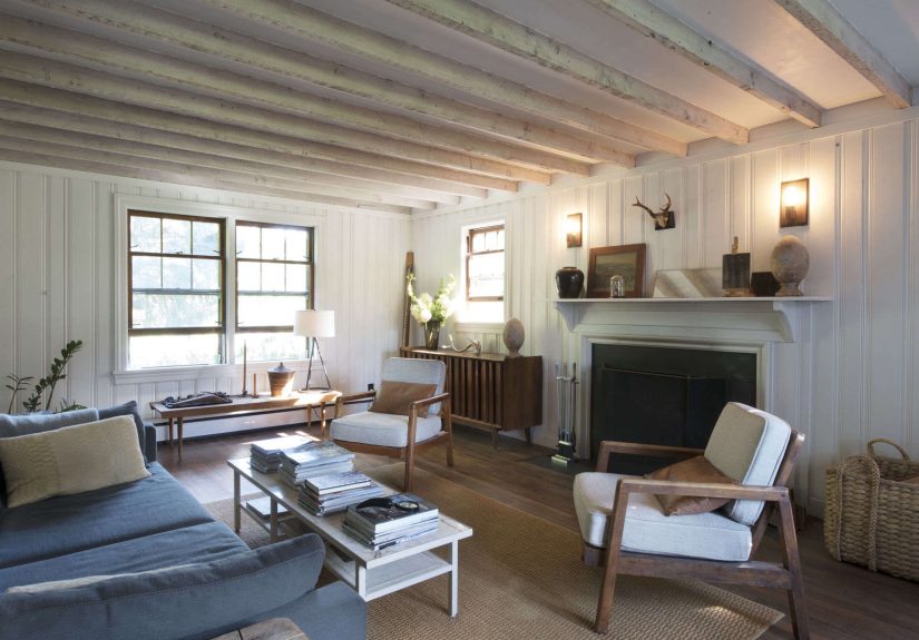
Calm OC-22 is excellent when you want continuity. It’s light enough to keep an open plan feeling expansive, yet it has enough nuance to avoid looking like primer. It also plays well with both modern and traditional decorkind of like a good blazer: it works with jeans, it works with dress pants, and nobody questions it.
Kitchens (walls or cabinets)
Calm can work in kitchens, but this is where lighting and surrounding materials matter most. With warm wood floors or creamy countertops, the undertones can shift. If you want cabinets that read “clean white,” you might prefer a brighter, purer white for cabinets and use Calm on walls for softness. If you want cabinets that feel quieter and slightly shaded, Calm may be exactly rightjust test it next to your counters and backsplash first.
What to Pair With Calm OC-22
The goal is to either (1) harmonize with Calm’s subtle undertones, or (2) create intentional contrast so Calm looks purposefully soft rather than accidentally “not-white.”
Trim and ceiling colors
Calm is often paired with classic trim whites. A soft white trim can keep the look cohesive, while a crisper white can sharpen the edges and make Calm read more like a wall color (not “the same white everywhere”).
- For gentle contrast: Benjamin Moore White Dove (warm, classic, designer favorite)
- For a crisp, modern contrast: a brighter white like Chantilly Lace can make Calm look more shaded
- For an all-over soft look: use Calm on walls and a slightly brighter off-white on trim
Designer-approved coordinating colors (straight from Benjamin Moore)
Benjamin Moore’s own coordinating suggestions for Calm include:
- Opulence OC-69: a fresh white softened by the slightest pink tone
- Nightingale AF-670: a sophisticated medium gray with a hint of violet
- Porcelain 2113-60: a dusty lilac with understated warmth
- Newburyport Blue HC-155: a deep, classic blue with an understated quality
These pairings aren’t randomthey echo Calm’s quiet, slightly violet-leaning character, so the palette feels intentional instead of “I grabbed whatever pillow was on sale.”
Materials that look especially good with Calm
- White marble or light quartz: enhances the clean, airy side
- Natural oak and warm woods: adds warmth and keeps things grounded
- Brass and champagne bronze: soft glam without the glitter panic
- Black accents: makes Calm look more tailored and modern
- Soft textiles: linen, boucle, woolanything cozy makes Calm feel even calmer
Calm OC-22 vs. Similar Benjamin Moore Colors
If you’re stuck between a few “almost whites,” comparing them is the fastest way to see undertones. Here are the common matchups people debate at the paint counter:
Calm OC-22 vs. Classic Gray OC-23
Both are light, but Classic Gray tends to read warmer/greiger overall, while Calm can read cooler because of its subtle violet-leaning undertone. If your room is already cool (north light, lots of gray tile), Classic Gray may feel safer. If you want a fresher, slightly crisper softness, Calm often wins.
Calm OC-22 vs. White Dove OC-17
White Dove is lighter and more traditionally “white.” Next to Calm, White Dove can look warmer and a bit more creamy, while Calm looks more shaded and nuanced. If you want your walls to read “white,” White Dove might be your pick; if you want your walls to read “soft off-white with depth,” Calm is the move.
Calm OC-22 vs. Paper White OC-55 / Silver Satin OC-26
Paper White and Silver Satin can lean cooler overall. Calm’s advantage is that it often feels a touch more neutral and livable across different roomsespecially if you’re mixing warm and cool finishes throughout the house.
Picking the Right Finish for Calm OC-22
The sheen you choose changes how Calm looks. Higher sheen reflects more light, which can make the color appear brighter and sometimes emphasize wall texture. Lower sheen feels softer and more forgiving.
- Flat / Matte: best for ceilings or low-traffic rooms where you want velvety calm
- Eggshell: a go-to for walls (soft look, easier to clean)
- Satin: great for kids’ rooms, hallways, or bathrooms where wipeability matters
- Semi-gloss: trim and doors (adds contrast and durability)
If you’re aiming for the “Calm” part of Calm, eggshell on walls is the happy medium for most homes.
How to Sample Calm Like You Mean It
The biggest mistake people make with off-whites is testing them once, at noon, on one wall, then committing forever. Calm is subtlebut it’s also responsive to lighting and surrounding finishes.
A peel-and-stick sample can help you move the color around the room, wrap corners, and see it next to flooring, tile, cabinets, and your actual lighting. Test it:
- on multiple walls (especially the darkest and brightest walls)
- next to trim (so you can see the contrast)
- in daylight and at night (because your house lives 24 hours, not just brunch hours)
Common “Oops” Moments (and How to Avoid Them)
Oops #1: Expecting Calm to be a bright, pure white
Calm is a shaded white/off-white. If you want a crisp, bright gallery white, Calm might feel too soft or too complex.
Oops #2: Pairing it with super-warm finishes without testing
Warm woods and creams can make undertones shift. Sometimes that’s gorgeous; sometimes you notice the violet note more. Sample next to countertops, backsplash tile, and fabrics you’ll actually keep.
Oops #3: Ignoring bulbs
Lightbulb temperature matters. If your lighting is very cool, Calm can feel crisper and grayer. If your lighting is warm, Calm may look softer and slightly rosier. Decide what mood you want, then choose bulbs accordingly.
Real-World Experiences With Benjamin Moore Calm OC-22 (About )
Let’s talk about what it’s like to live with Calm OC-22because paint swatches are tiny liars, and walls are giant truth-tellers.
1) The North-Facing Hallway Glow-Up
Picture a narrow hallway with zero direct sun and a permanent “why do we even have this space?” vibe. Calm OC-22 is one of those colors that can make a hallway feel bigger without turning it into a glowing white tunnel. In a north-facing area, it usually reads more like a gentle light gray-white than a warm cream. The trick is contrast: pair it with clean trim and you’ll get crisp edges that keep the space feeling intentional. Add a runner rug and warm lighting, and suddenly the hallway isn’t a sad corridorit’s a soft transition space that feels curated. (Your hallway will never thank you out loud, but you’ll know.)
2) The Bathroom That Accidentally Became a Spa
Calm loves bathrooms because it plays nicely with tile, stone, and shiny fixtures. If you’ve got bright white subway tile, Calm can keep the room from feeling too stark while still looking clean. Homeowners often notice that it looks “fresh” in the morning light and “cozy” at night under warm sconceslike the wall color is helping you unwind. Pair it with fluffy towels, a wood stool, and a plant you’re trying not to kill, and you’ll get that spa vibe without needing spa prices. Just remember: bathrooms are humid and reflective. A slightly higher sheen can help with durability, but test it so you don’t accidentally amplify every bump in your drywall.
3) The Trim Debate: Soft Contrast vs. Crisp Contrast
One of the most common Calm OC-22 “experiences” is the trim decision spiral. If you choose a softer trim (like a gentle warm white), Calm can look creamy-adjacent and very cohesiveperfect for traditional or transitional homes. If you choose a crisper, brighter trim, Calm suddenly reads more like a refined wall color. This is where people either feel brilliant (“Wow, the edges look so tailored!”) or mildly betrayed (“Why do my walls look gray now?”). The solution is simple: compare Calm next to your trim sample in the room’s actual lighting. If you want Calm to read closer to white, don’t choose a trim that’s dramatically brighter.
4) The Open-Concept “Please Don’t Let This Look Like Builder Beige” Test
In open layouts, Calm is often chosen because it doesn’t feel yellow, and it doesn’t feel cold. It can bridge warm wood floors and cooler stone or metal finishes without picking a side. The lived-in experience is that Calm becomes a backdrop that makes furniture and art feel more “picked” rather than “placed.” It’s especially good if you like changing decor seasonallyCalm won’t fight your terracotta fall pillows or your summer navy stripes. The only caution: big open spaces show color shifts more dramatically, so sampling in multiple zones (kitchen, living area, hallway) is the difference between “effortlessly cohesive” and “why does this wall look different from that wall?” (Answer: light. It’s always light.)
Conclusion
Benjamin Moore Calm OC-22 is a smart choice if you want an off-white that feels soft, modern, and quietly elevatedwithout going full stark-white or drifting into heavy gray. Its high LRV keeps rooms bright, while its subtle lavender-gray undertone adds just enough depth to feel designed. Sample it carefully, pay attention to lighting, and pair it with trim and accents that support the look you wantcozy and cohesive, or crisp and tailored.