Table of Contents >> Show >> Hide
- What Are Analogous Colors?
- How to Find Analogous Colors on the Color Wheel
- Key Design Principles for Using Analogous Colors at Home
- Room-by-Room Ideas for Analogous Color Schemes
- Analogous Colors and Today’s Paint Trends
- Common Mistakes with Analogous Colors (and How to Avoid Them)
- Real-Life Experiences with Analogous Colors at Home
- Conclusion: Let the Color Wheel Do the Heavy Lifting
If picking paint colors makes you feel like you’re defusing a bomb instead of decorating a house, it’s time to meet the most forgiving trick on the color wheel: analogous colors. These are the colors that sit right next to each other on the wheelbuilt-in best friends that almost always get along. When you use them well, your rooms look effortlessly pulled together, like you just “have an eye for color” (no one has to know you simply followed a formula).
In this guide, we’ll break down what analogous colors are, how to find them, and smart ways to use them in every room of your home. We’ll also talk about how they pair with today’s favorite neutrals and earthy, nature-inspired palettes, and I’ll share some real-life decorating “lessons learned” at the end so you can skip a few mistakes I’ve already made for you.
What Are Analogous Colors?
In color theory, analogous colors are three (sometimes up to five) colors that sit side by side on a standard 12-part color wheel. Think yellow–yellow-orange–orange or blue–blue-green–green. Because they share a common base hue, they naturally blend and create a harmonious, cohesive look.
Designers love analogous schemes because they feel:
- Calm and unified – the eye can move around the room without hitting jarring contrasts.
- Easy to live with – perfect for bedrooms, living rooms, and open-concept spaces you see all day long.
- Beginner-friendly – it’s hard to “totally ruin” a room when all your main colors are cousins rather than enemies.
A classic analogous combo might be:
- Warm set: red, red-orange, orange (cozy and energetic)
- Cool set: blue, blue-green, green (fresh and serene)
This same idea shows up everywhere in nature: a sunset sky that moves from pink to orange to golden yellow, or a forest with layers of deep pine, moss, and sage. That’s why analogous color schemes tend to “feel right” to us even if we can’t explain why.
How to Find Analogous Colors on the Color Wheel
You don’t need an art degree to build an analogous scheme; you just need a basic color wheel (or a quick Google image search of one).
- Pick a starting hue. This is your “anchor” colorthe one you’re most drawn to or already have in the room. Let’s say you love soft blue.
- Grab the hues on either side. On the wheel, find the colors just to the left and right of your anchor. For soft blue, that might be blue-green on one side and blue-violet on the other.
- Decide on three main colors. Most home palettes work best with three analogous hues: a dominant, a supporting, and an accent color.
- Add neutrals as needed. Whites, creams, grays, beiges, and soft blacks aren’t part of the analogous group, but they keep things from looking like a crayon party.
Many designers also talk about warm analogous vs. cool analogous palettes:
- Warm analogous: red–orange–yellow feels cozy, social, and energizinggreat for dining rooms and family rooms.
- Cool analogous: blue–green–teal feels calm and spa-likeideal for bedrooms, bathrooms, and offices.
Key Design Principles for Using Analogous Colors at Home
1. Use the 60–30–10 Rule with a Twist
The classic decorating guideline still works beautifully with analogous colors:
- 60% – Dominant color: walls, large rugs, big furniture pieces.
- 30% – Secondary color: curtains, accent chairs, bedding.
- 10% – Accent color: pillows, art, lamps, small decor.
With an analogous scheme, those three slices all come from the same side of the wheel. For example:
Living room palette: 60% muted green walls, 30% blue-green sofa and drapes, 10% navy accents in pillows and artwork.
2. Let One Color Be the Star
Even though your colors are friendly neighbors, you still need a lead character. If everything shouts, the room feels loud. Choose one hue as the star (usually the wall or largest piece of furniture), then let the other colors play supporting roles. Designers often suggest one “ruling color” with the others introduced more subtly.
3. Soften with Neutrals
The secret ingredient in most gorgeous rooms online is not actually the colorit’s the neutrals around it. Today’s most-loved neutrals include warm whites, soft beiges (“greige” especially), and gentle browns that pair perfectly with nature-inspired palettes.
Try these moves:
- Pair a green–blue–teal scheme with creamy off-white walls and light oak furniture.
- Use a terracotta–rust–camel palette with warm white trim and a natural jute rug.
- Add black or charcoal in very small doses (frames, hardware) to keep the palette from feeling too “soft.”
4. Pay Attention to Light
Natural and artificial light can dramatically change how analogous colors read:
- North-facing rooms lean cooler; warm analogous schemes (yellows, oranges, warm greens) can keep them from feeling chilly.
- South-facing rooms get lots of warmth; cool palettes (blue–green–teal) keep them fresh and airy.
Always test large paint swatches on different walls and check them at morning, afternoon, and night. That “perfect sage” can turn into “mysterious pea soup” if the light isn’t on your side.
Room-by-Room Ideas for Analogous Color Schemes
Living Room: Relaxed but Polished
The living room is where an analogous palette can really shine, especially if it connects to nearby spaces like a dining area or entryway. Many paint brands encourage creating a whole-house palette that flows from room to room, and analogous colors are a simple way to do that.
Try this:
- Walls in soft blue-gray, a sectional in blue-green, and accent pillows in deeper navy.
- Anchor the space with a natural wood coffee table, woven baskets, and off-white curtains to keep it from feeling too “cold.”
- Pull the darkest color (navy) into art frames or a single accent chair for a little depth.
Bedroom: Spa-Like Calm
Bedrooms are prime real estate for cool analogous schemes. Think of the colors you see at the beach: seafoam, aqua, soft blue, and sandy neutrals.
Sample palette: sea-glass green, aqua, and soft blue.
- Use the palest shade on the walls so the room feels light and airy.
- Layer deeper shades in the bedding and throw blankets.
- Add warm wood nightstands and a beige or oatmeal headboard to prevent the room from feeling icy.
Kitchen and Dining: Cozy, Social Energy
Kitchens benefit from slightly more energy, but you may still want a look that feels cohesive with nearby spaces. Here, a warm analogous scheme can work wonders.
Try: golden yellow walls, yellow-orange barstools, and rust textiles (napkins, a table runner). Pair them with off-white cabinets and warm metal hardware for balance.
If you’re not ready to commit to colorful cabinets, keep them neutral and use your analogous hues in:
- Barstool upholstery
- Ceramic dishes displayed on open shelving
- Window treatments and seat cushions
Bathroom and Small Spaces: Low Risk, High Reward
Bathrooms, entryways, and laundry rooms are great places to experiment. Because they’re smaller, you can go bolder without overwhelming the whole house.
For example, a tiny powder room might feature a moody teal wall color, a blue-green vanity, and deep navy accents in the mirror frame and towels. With white fixtures and a light floor, the room feels dramatic but not like you’re trapped in an aquarium.
Analogous Colors and Today’s Paint Trends
Recent paint collections from major brands lean heavily into earthy greens, warm browns, and complex neutralsall of which play beautifully with analogous schemes.
Here’s how to combine them:
- Earthy greens: Pair sage, olive, and forest green together for a nature-inspired analogous palette, then add a warm beige or greige on trim or ceilings.
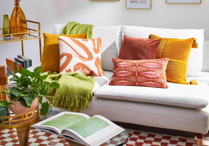
- Sunset tones: Use terracotta, soft coral, and camel tones for a warm, grounded look in living or dining rooms. Balance them with creamy off-whites or taupes.
- Neutral analogues: Even neutrals can behave like analogous colors if they share undertonesthink a spectrum of warm white, light greige, and deeper mushroom brown.
Common Mistakes with Analogous Colors (and How to Avoid Them)
1. Using Too Many Saturated Colors
Just because colors are neighbors doesn’t mean they should all be screaming. If you pick three highly saturated hueslike bright lime, intense teal, and bold royal bluethe room can start to feel busy and childlike.
Fix: Choose one shade that’s richer and let the others be softer or grayer. Most pro palettes mix muted colors with only one or two “juicy” shades.
2. Forgetting About Contrast
Analogous schemes are naturally low-contrast, which is part of their charmbut if everything is midtone, the space can feel flat.
Fix: Add contrast with:
- Light walls and darker furniture
- Dark accent wall and pale textiles
- Pops of white, black, or metal finishes (brass, blackened steel, chrome)
3. Ignoring the Rest of the House
One room in an analogous scheme looks lovely; three uncoordinated rooms look chaotic. Paint experts often emphasize whole-house color flow for this reason.
Fix: Pick one overarching hue family (cool blues and greens, warm terracottas and golds, soft wooded neutrals). Each room can use a different combination, but they should all “belong to the same tribe.”
Real-Life Experiences with Analogous Colors at Home
Theory is great, but here’s how analogous colors actually behave in real homesmessy kids, random furniture, and all.
The first time I tried an analogous scheme, I went all in on blues and greens in a small apartment living room. I painted the walls a light blue-gray, picked a teal sofa that I was sure I’d love forever, and threw in every blue pillow I could find. The result? Cozy, yesbut it also looked a little like a furniture showroom that only sold turquoise.
The turning point came when I did two things:
- Added a new neutral. Swapping a patterned blue rug for a simple natural jute rug instantly grounded the room. Suddenly the blues and greens felt intentional instead of overwhelming.
- Varied the textures. I mixed chunky knit throws, velvet pillows, smooth ceramic vases, and a woven lampshade. Even though everything was in a similar color family, the room felt layered, not flat.
In another spacea guest roomI used a warm analogous palette built around coral. The walls were a soft blush-peach, the quilt leaned coral, and the throw pillows picked up deeper rust and soft terracotta tones. I worried it would feel too “pink,” but adding warm wood nightstands and a white duvet cover kept things sophisticated instead of sugary.
What surprised me most was how guests described the room. They didn’t say, “Wow, so much pink.” They said it felt welcoming, warm, and “like a boutique hotel.” That’s the magic of analogous colors: when done right, people experience the mood more than the individual shades.
I’ve also seen analogous schemes rescue tricky open-concept homes. One homeowner had a long sightline from the front door straight through the living room and dining area into the kitchen. Originally, each zone had its own random color: gray living room, blue dining room, and off-white kitchen. The house felt chopped up.
We chose a cool analogous palette anchored in soft green. The entry got a pale gray-green, the living room leaned more blue-green, and the dining area picked up a deeper teal on a single accent wall. The kitchen stayed light but gained green-gray cabinetry. The overall effect was subtle but powerfullike watching a gradient of color gently flow from space to space.
Of course, there were missteps along the way. One bathroom started with a dreamy plan: seafoam walls, teal vanity, navy accents. On the wall, the chosen seafoam read less “coastal spa” and more “mint toothpaste.” The fix wasn’t changing the whole palette; it was simply finding a more muted version of the same huesomething with a bit more gray. That’s another underrated perk of analogous schemes: when a color feels off, you usually just need to tweak the saturation or value, not rethink the entire concept.
Over time, I’ve learned a few “experience-based” rules for analogous colors:
- Start with what you already own. A favorite rug or piece of art often contains an ready-made analogous palette.
- Don’t match everything perfectly. A little variation in undertone and intensity keeps the look from feeling like a catalog page.
- Test color in context. Paint swatches near your floors, couch, and wood tones. Analogous colors are harmonious, but undertone clashes are still very real.
- Remember the mood. Ask yourself, “Should this room wake me up or calm me down?” Then choose warm or cool analogous colors accordingly.
The bottom line: analogous colors are one of the easiest, most forgiving ways to make a home look cohesive and designed-on-purpose. Once you get comfortable reading the color wheel like a map, you’ll start seeing opportunities for harmonious palettes everywherefrom your closet to your kitchen cabinets.
Conclusion: Let the Color Wheel Do the Heavy Lifting
You don’t need to memorize every rule of color theory to decorate beautifully. By sticking with analogous colorsthose friendly neighbors on the color wheelyou can create rooms that feel calm, connected, and surprisingly sophisticated. Choose one dominant hue, support it with nearby shades, lean on great neutrals, and pay attention to light. Whether you’re refreshing a single room or planning a whole-house palette, analogous schemes give you structure without stifling your creativity.
The next time you’re tempted to stand in the paint aisle for an hour debating between 47 almost-identical swatches, grab a simple color wheel instead. Pick your favorite hue, invite its neighbors, and let the color relationships that already exist in nature guide you to a home that actually feels like you.