Table of Contents >> Show >> Hide
Choosing a wall color should not feel like solving a crime scene with 97 beige suspects taped to the wall. Yet anyone who has ever held five “almost white” paint chips under bedroom feel like a deep breath, a living room feel softer, and a home office feel less like a spreadsheet dungeon.
Interior designers often reach for calming paint colors because walls set the mood before the furniture even gets a chance to introduce itself. Soft blues can remind us of open sky and water. Sage greens bring in a quiet connection to nature. Warm whites, greiges, taupes, and creams create a clean background without feeling cold. Deeper shades, when chosen carefully, can make a room feel cocooned instead of cramped.
The key is not simply picking “blue” or “green.” It is choosing the right undertone, depth, finish, and placement for your light, furniture, flooring, and lifestyle. A pale blue that looks spa-like in a sunny room may look icy in a north-facing one. A warm white that feels creamy in the morning can turn yellow beside the wrong trim. Paint has personality. Sometimes it has drama. Occasionally, it lies.
Below are 12 calming colors to paint your walls, inspired by current interior design advice, paint-brand color guidance, and designer-favorite palettes across American homes.
Why Calming Wall Colors Work
Calming interior paint colors usually share three traits: they are muted, balanced, and easy on the eyes. Instead of shouting, they hum politely in the background. Designers tend to favor colors with gray, beige, brown, or softened undertones because those tones reduce visual sharpness. That is why a dusty blue feels calmer than electric blue, and sage green feels more livable than lime green.
Nature-inspired colors also play a major role. Think sky, fog, sand, clay, stone, leaves, driftwood, rain clouds, and linen. These shades feel familiar because we see them outside, where nobody has painted an accent wall in neon orange and called it “energizing.”
12 Calming Colors to Paint Your Walls
1. Soft Sky Blue
Soft sky blue is one of the most classic calming wall colors because it instantly suggests air, water, and open space. Designers often use it in bedrooms, bathrooms, nurseries, and reading corners where the goal is to slow the room down. The trick is to choose a blue with a little gray or softness in it, not a candy-bright blue that belongs on a beach toy.
Look for shades similar to Farrow & Ball Borrowed Light, Benjamin Moore Windy Sky, or gentle powder blues from major paint lines. These colors work beautifully with white trim, pale oak, woven baskets, linen bedding, and brushed nickel or unlacquered brass accents.
Best rooms: bedrooms, bathrooms, meditation spaces, laundry rooms, and small sunny offices.
2. Dusty Blue-Gray
Dusty blue-gray is the grown-up cousin of sky blue. It has enough blue to feel peaceful and enough gray to feel sophisticated. This shade is especially useful when you want calm without making the room feel overly sweet or coastal. Designers love it because it can move between traditional, modern, farmhouse, and transitional interiors without needing a personality transplant.
Colors like Benjamin Moore Smoke, Quiet Moments, or similar blue-gray shades create a soft, misty effect. In a bedroom, dusty blue-gray pairs well with crisp white bedding and warm wood. In a bathroom, it turns basic tile into something that feels closer to a boutique hotel and less like “the place where everyone loses the toothpaste cap.”
Best rooms: primary bedrooms, guest rooms, bathrooms, and calm living rooms.
3. Sea-Glass Blue-Green
Sea-glass blue-green sits between blue and green, which is exactly why it feels so relaxing. It gives you the coolness of blue and the natural freshness of green. The result is a color that feels clean but not sterile, peaceful but not boring.
Designers often recommend blue-green shades for spaces where people want a retreat-like mood. Sherwin-Williams Sea Salt, Benjamin Moore Palladian Blue, and Clare Headspace are popular examples of this family. These colors can shift noticeably depending on the lighting, so sampling is not optional unless you enjoy surprise plot twists.
Pair sea-glass walls with white oak, creamy trim, jute rugs, glass lamps, soft gray upholstery, or sandy beige textiles. The room will feel breezy without requiring a seashell collection.
Best rooms: bathrooms, bedrooms, sunrooms, kitchens, and coastal-inspired living areas.
4. Sage Green
Sage green may be the unofficial mascot of calming paint colors. It is earthy, muted, and flexible enough to behave like a neutral. Unlike brighter greens, sage has gray or beige undertones that make it feel settled. Designers often use it to create a nature-inspired room that still feels polished.
Soft sage works beautifully with warm whites, natural wood, stone, rattan, linen, and matte black accents. It can make a bedroom feel restful, a kitchen feel fresh, and a home office feel grounded. If your home has plants, sage green also makes them look intentional instead of like you are slowly becoming a greenhouse.
Look for shades similar to Benjamin Moore October Mist, Sherwin-Williams Evergreen Fog, or Behr’s muted green families. For a softer effect, choose a sage with more gray. For warmth, choose one with olive or beige undertones.
Best rooms: bedrooms, kitchens, living rooms, offices, and entryways.
5. Muted Olive Green
Muted olive green is deeper than sage and a little moodier, but it can still feel extremely calming when used with the right materials. Designers like olive because it feels organic and grounded, especially in rooms with wood furniture, leather, stone, aged brass, or vintage pieces.
This color is ideal if you want calm with character. It is not a whisper; it is more like a low, confident voice. Olive green can make a dining room feel intimate, a study feel thoughtful, or a bedroom feel tucked away from the world.
To keep olive from feeling heavy, balance it with cream trim, natural-fiber rugs, pale bedding, or warm lighting. Avoid pairing it with too many cold grays, which can make the room feel muddy.
Best rooms: studies, dining rooms, bedrooms, powder rooms, and cozy living areas.
6. Warm White
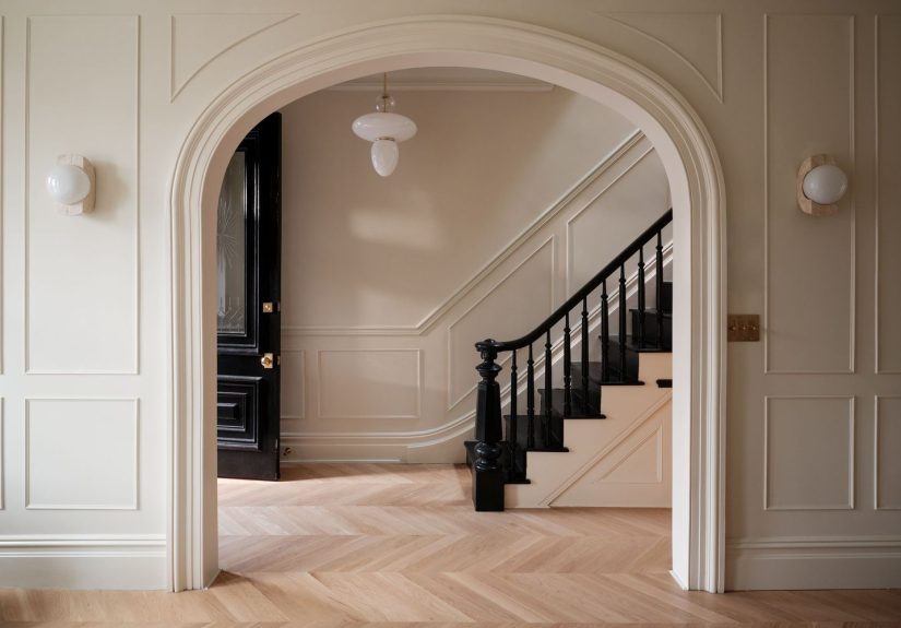
Warm white is the color people choose when they want calm, brightness, and flexibility without living inside a laboratory. Unlike stark white, warm white has creamy, beige, or subtle yellow undertones that make a space feel softer. Designers often use it for whole-home palettes because it connects rooms without calling attention to itself.
Popular warm white families include shades similar to Benjamin Moore Swiss Coffee, Sherwin-Williams Greek Villa, Sherwin-Williams Alabaster, and Behr Off White. These whites are especially helpful in homes with warm wood floors, traditional furniture, woven textures, or natural stone.
Warm white is also a smart choice for small spaces because it reflects light while still feeling cozy. It lets art, furniture, and textiles do the talking. In other words, it is the friend who brings snacks and does not dominate the group chat.
Best rooms: open floor plans, living rooms, hallways, kitchens, bedrooms, and rental-friendly refreshes.
7. Cream
Cream is warmer and richer than white, which makes it a beautiful calming wall color for homes that need softness. It works especially well in rooms where pure white looks too harsh. Interior designers often turn to cream when they want elegance without fuss.
Cream walls pair beautifully with antique wood, brass fixtures, traditional rugs, boucle chairs, linen curtains, and stone fireplaces. It can feel classic, cottage-inspired, European, or modern depending on the styling. The danger is choosing a cream that is too yellow, which can make the room feel like melted butter under a spotlight. Delicious? Yes. Ideal for walls? Not always.
Test cream shades next to your trim, cabinets, and flooring before committing. A cream with a slight beige or neutral undertone is usually more versatile than one with strong yellow.
Best rooms: bedrooms, living rooms, dining rooms, nurseries, and traditional kitchens.
8. Pale Greige
Greige, a blend of gray and beige, remains popular because it solves a common design problem: gray can feel too cool, while beige can feel too warm. Pale greige sits comfortably in the middle. It creates a quiet backdrop that works with many furniture styles and finishes.
Designers often recommend pale greige for homeowners who want a calm neutral that will not clash with everything they own. It works with black hardware, white trim, oak floors, walnut furniture, marble counters, and soft textiles. It is also a helpful bridge color when one room leans warm and another leans cool.
Look for shades similar to Benjamin Moore Pale Oak, Sherwin-Williams Agreeable Gray, or other light greige tones. The best versions have softness and depth, not flatness.
Best rooms: living rooms, bedrooms, hallways, open layouts, and resale-friendly updates.
9. Mushroom Taupe
Mushroom taupe is one of the most designer-loved “new neutrals.” It is earthy, quiet, and a little moody, with a mix of beige, gray, and brown. This color feels more layered than standard beige and warmer than standard gray, making it perfect for calm interiors with depth.
Use mushroom taupe when you want a room to feel grounded and expensive without screaming, “I watched one luxury hotel tour and now I have opinions.” It looks especially beautiful with plaster-like finishes, aged wood, vintage rugs, creamy upholstery, and stone accessories.
Because mushroom tones can change dramatically with light, sample them on at least two walls. In cool light, they may show more gray. In warm light, they may lean beige or brown.
Best rooms: bedrooms, living rooms, dining rooms, offices, and quiet luxury-inspired spaces.
10. Soft Blush Beige
Soft blush beige is calming because it adds warmth without becoming sugary. This is not bubblegum pink. It is a dusty, barely-there pink-beige that can make a space feel flattering, gentle, and quietly elegant. Designers often use blush neutrals in bedrooms, dressing rooms, powder rooms, and cozy sitting areas.
Blush beige pairs well with cream, taupe, warm white, walnut, brass, soft gray, and deep green. It can look modern with clean-lined furniture or romantic with vintage accents. The secret is restraint. Choose a muted blush with beige, brown, or clay undertones so the room feels grown-up.
This color is also wonderful in spaces where skin tones matter, such as bedrooms and bathrooms, because it creates warmth without the harshness of bright peach or coral.
Best rooms: bedrooms, bathrooms, powder rooms, nurseries, and dressing areas.
11. Lavender-Gray
Lavender-gray is a quiet alternative to blue and green. It has the softness of purple but the maturity of gray, making it calming without feeling childish. Designers like muted lavender and mauve-gray shades for bedrooms because they can feel restful, romantic, and slightly unexpected.
The best lavender-gray paints are subtle. If the purple is too strong, the room may start leaning toward candy shop. If the gray is too heavy, it can feel dull. A balanced lavender-gray looks beautiful with warm white trim, silver accents, soft taupe bedding, pale wood, or charcoal details.
This color is especially useful in rooms that need softness but already have too many beige or white surfaces. It adds personality while staying gentle.
Best rooms: bedrooms, guest rooms, reading nooks, and calm creative spaces.
12. Deep Blue-Charcoal
Not every calming color has to be pale. Deep blue-charcoal can create a cocoon effect that feels safe, quiet, and sophisticated. Designers often use dark blues, smoky navies, and blue-charcoal tones in bedrooms, libraries, media rooms, and powder rooms because these spaces benefit from intimacy.
A deep blue-charcoal wall color works best when it has softness rather than sharpness. Look for shades similar to Sherwin-Williams Charcoal Blue, Benjamin Moore Hale Navy, or other gray-influenced navy tones. Pair them with warm lighting, creamy textiles, wood furniture, and metallic accents to prevent the room from feeling cold.
This is a brave choice, but not a chaotic one. Used well, deep blue-charcoal feels like the design equivalent of closing your laptop, making tea, and pretending notifications do not exist.
Best rooms: bedrooms, libraries, offices, media rooms, and powder rooms.
How Interior Designers Choose the Right Calming Paint Color
They Test Paint in Real Light
Designers rarely choose a paint color from a tiny chip alone. They test large samples on the wall and look at them morning, afternoon, and evening. Natural light changes everything. South-facing rooms often make colors look warmer and brighter. North-facing rooms can make colors look cooler and grayer. East-facing rooms glow in the morning, while west-facing rooms can become warmer late in the day.
They Consider Undertones
Undertone is the hidden color inside the color. A white may have yellow, pink, gray, or green undertones. A beige may lean peach, gold, or taupe. A gray may lean blue, purple, or green. Undertones matter because they decide whether your wall color gets along with your floors, cabinets, countertops, and furnitureor starts a quiet feud.
They Match Mood to Room Function
A calming bedroom color should encourage rest. A calming kitchen color should feel fresh and livable. A calming office color should help focus without making the room feel sleepy. Designers choose color based on how the room is used, not just how the paint chip looks under fluorescent store lighting.
They Use Finish Strategically
Matte and eggshell finishes tend to soften walls and hide minor imperfections. Satin and semi-gloss finishes reflect more light and are often used on trim, doors, bathrooms, and high-traffic areas. For calming walls, many designers prefer matte or eggshell because the lower sheen keeps the surface visually quiet.
Best Calming Color Combinations
Soft blue + warm white: Fresh, airy, and classic. Ideal for bedrooms and bathrooms.
Sage green + cream: Natural, relaxed, and timeless. Great for kitchens, bedrooms, and living rooms.
Mushroom taupe + walnut: Grounded, cozy, and quietly luxurious. Perfect for living rooms and studies.
Blush beige + brass: Soft, warm, and elegant. Lovely in powder rooms and bedrooms.
Deep blue-charcoal + linen: Moody but calm. Excellent for bedrooms, libraries, and media rooms.
Common Mistakes to Avoid When Choosing Calming Paint Colors
One common mistake is assuming all light colors are calming. A bright icy white can feel harsher than a medium taupe if the room has cool light. Another mistake is ignoring existing fixed elements, such as flooring, tile, stone, and cabinets. Your wall color has to live with these features, not just pose beside them for five minutes.
Many homeowners also choose a color that is too saturated. A blue-green that looks charming on a swatch may feel loud across four walls. When in doubt, move one step grayer, dustier, or softer. Calm colors usually have a little restraint built in.
Finally, do not forget the ceiling and trim. A calming wall color can look awkward beside trim that is too stark or too creamy. Designers often coordinate trim intentionally, sometimes using the same color in a different finish for a seamless, cocooning effect.
Extra Experience: What It Feels Like to Live With Calming Wall Colors
There is a funny moment that happens after painting a room a truly calming color. At first, you stare at it like a suspicious detective. Is it too green? Too gray? Too beige? Did you just spend a weekend creating “wet cardboard chic”? Then the furniture comes back in, the curtains go up, the lamp turns on, and suddenly the room exhales.
In real homes, calming paint colors are less about perfection and more about how the space supports daily life. A soft blue bedroom can make bedtime feel less abrupt, especially when paired with warm lamps and simple bedding. You walk in and your brain gets the hint: we are not doing taxes in here. A sage green kitchen can make morning coffee feel slower and more pleasant, even if someone left one spoon in the sink like a tiny metal accusation.
Warm whites and creams are especially practical for busy households. They make rooms feel brighter and cleaner without demanding that every pillow, vase, and chair match a strict color story. If your style changes often, warm white is forgiving. It lets you swap navy pillows for rust ones, add wood furniture, hang colorful art, or change rugs without repainting the entire room because your wall color had commitment issues.
Mushroom taupe and pale greige are excellent for people who want calm but still need real-life durability. These colors hide minor scuffs better than bright white and give rooms a settled feeling. They are especially helpful in living rooms where everyone gathers, snacks happen, pets nap, and throw blankets mysteriously multiply. A greige living room can feel polished without being precious.
Deep blue-charcoal is a different experience. It is not light and airy; it is restful in a heavier, cozier way. In a bedroom or media room, it can make the space feel tucked away from the rest of the house. Add warm bulbs, soft curtains, and layered bedding, and the room becomes a cavebut the stylish kind, not the “where did we put the flashlight?” kind.
The biggest lesson from living with calming colors is that paint alone does not do all the work. Lighting, texture, clutter, furniture scale, and even sound affect how peaceful a room feels. A sage green room with harsh overhead lighting and twelve tangled charging cords will not feel calm for long. But that same sage with a linen shade lamp, a woven basket, and a cleared surface can feel like a reset button.
Another experience worth mentioning: calming colors often look better after a few days. Your eyes need time to adjust, especially if you are moving away from stark white or bold color. Before panicking, live with the sample. Watch it during breakfast, late afternoon, and evening. Paint is not a first-date decision. Give it a few conversations.
For renters or cautious decorators, start small. Paint one bedroom, one bathroom, or even one wall behind a desk. Try a soft blue-gray in a bathroom, cream in a bedroom, or sage in a small office. Once you understand how calming color changes your mood, you can decide whether to extend the palette through the rest of the home.
Ultimately, the best calming wall color is the one that makes your shoulders drop when you enter the room. It should work with your light, your furniture, your routines, and your version of peace. Some people relax with warm whites and pale greige. Others need enveloping navy or olive green. There is no universal answer, which is excellent news for anyone who has ever had a strong opinion about beige.
Conclusion
The most calming colors to paint your walls are not random trendy shades; they are colors that create balance. Soft blues, blue-greens, sage, olive, warm white, cream, greige, mushroom taupe, blush beige, lavender-gray, and deep blue-charcoal all have a place in designer-approved interiors because they help rooms feel softer, more grounded, and more personal.
Before choosing, sample generously, study the undertones, and look at the color in your actual room. Paint is one of the easiest ways to change a home’s mood, but the best results come from patience. Your walls do not need to shout. Sometimes the quietest color in the fan deck is the one that makes the whole house feel better.
Note: Always test paint samples on your own walls before buying gallons. Lighting, flooring, trim, furniture, and surrounding colors can dramatically change how a calming shade appears in real life.