Table of Contents >> Show >> Hide
- What Is Pantone’s 2026 Color of the Year?
- Why Did People Call Cloud Dancer “Racist”?
- Where Does Sydney Sweeney Fit Into This?
- What Pantone Says Cloud Dancer Really Means
- Why This Became an Online Meltdown
- Is the Backlash Fair?
- What Brands Can Learn From the Cloud Dancer Drama
- Cloud Dancer in Fashion, Interiors, and Everyday Design
- The Bigger Cultural Meaning of a White Color of the Year
- Personal Experiences and Real-World Reflections on the Cloud Dancer Debate
- Conclusion: A Quiet Color With a Very Loud Comment Section
- SEO Tags
Editor’s Note: This article uses the word “racist” as part of the public criticism and online debate surrounding Pantone’s 2026 Color of the Year. It does not state that Pantone, Sydney Sweeney, or any related brand intended racist messaging.
Pantone wanted calm. The internet chose chaos.
When Pantone announced PANTONE 11-4201 Cloud Dancer as its 2026 Color of the Year, the company described it as a soft, airy white meant to symbolize clarity, quiet reflection, and a collective craving for stillness. In Pantone language, Cloud Dancer is basically a clean breath after a very noisy year. In internet language, however, it instantly became “wait… white?”
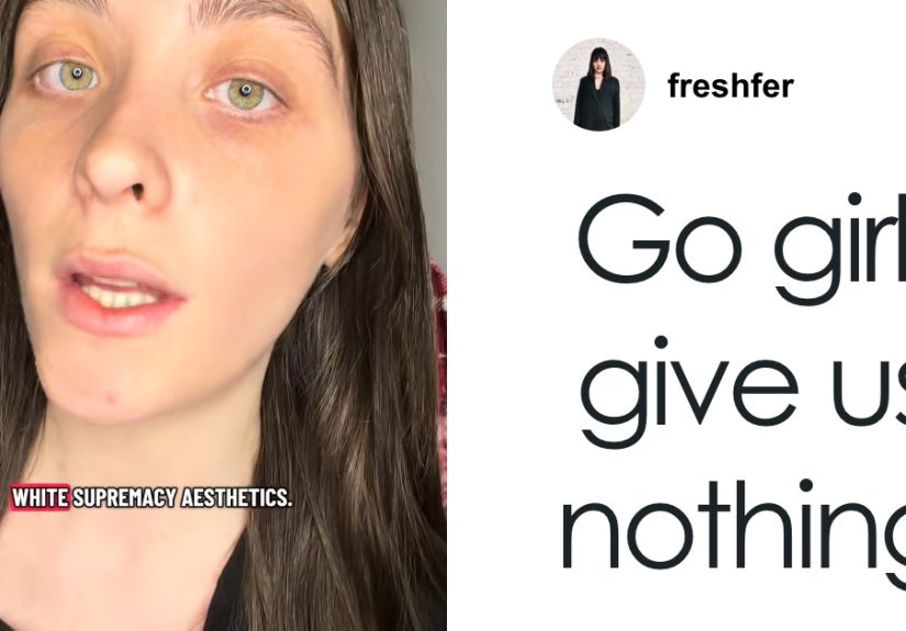
Within hours, social media users began roasting the selection as bland, tone-deaf, dystopian, andmost explosivelyracially insensitive. The phrase “It’s giving Sydney Sweeney” started circulating as commenters linked Pantone’s white shade to the earlier controversy around Sydney Sweeney’s American Eagle “great jeans” campaign, which critics argued played awkwardly with “genes,” whiteness, and beauty standards. Suddenly, a paint-chip-adjacent announcement was no longer just about design. It was about race, branding, politics, exhaustion, and the internet’s Olympic-level ability to turn a neutral color into a national group project.
So, is Pantone’s Cloud Dancer actually controversial, or did the internet simply discover a new white rectangle to yell at? The answer, like the shade itself, is not pure white or pure black. It lives somewhere in the messy middle.
What Is Pantone’s 2026 Color of the Year?
Pantone’s 2026 Color of the Year is Cloud Dancer, officially listed as PANTONE 11-4201. It is a soft white, not a cold hospital white, not a blinding printer-paper white, and not the suspiciously sterile white of a rental apartment that has definitely seen things. Pantone describes it as a lofty, balanced white that suggests peace, calm, renewal, and a return to simplicity.
The Color of the Year program began in 1999 and has become one of the design world’s most recognizable annual trend signals. Each year, Pantone’s color experts analyze fashion, interiors, technology, entertainment, art, travel, lifestyle shifts, and broader cultural moods before choosing one shade that they believe captures the spirit of the moment.
Recent selections have leaned emotional and comforting. Viva Magenta in 2023 felt bold and energetic. Peach Fuzz in 2024 was soft and nurturing. Mocha Mousse in 2025 brought warmth and indulgence. Then came Cloud Dancer, a whispery white that felt to some people like a resetand to others like the design equivalent of clearing your browser history during a culture war.
Why Did People Call Cloud Dancer “Racist”?
The backlash did not come from the color alone. White is a normal color in fashion, interiors, product design, branding, architecture, and basically every wedding invitation ever printed. The controversy came from timing, symbolism, and cultural context.
In the United States, conversations around race, identity, diversity, and political backlash have become highly charged. Against that backdrop, some critics argued that naming a white shade as the defining color of 2026 felt painfully tone-deaf. To them, “white” was not merely a design neutral; it carried social and political associations that Pantone should have anticipated.
That does not mean everyone agreed. Many users mocked the backlash as dramatic overreading. Others said the criticism was less about the color itself and more about frustration with brands that claim to understand culture while somehow walking directly into the most obvious symbolism trap on the table.
In other words, the debate became less “Can white be a color?” and more “Can a global branding authority choose white in this cultural climate without expecting the internet to turn into a courtroom with memes?” Apparently, no. No, it cannot.
Where Does Sydney Sweeney Fit Into This?
The “It’s giving Sydney Sweeney” line comes from another recent advertising controversy. Sydney Sweeney appeared in an American Eagle campaign built around the slogan “Sydney Sweeney Has Great Jeans.” The pun between “jeans” and “genes” sparked backlash because Sweeney is a blonde, blue-eyed white actress, and some critics felt the campaign’s language and imagery accidentally echoed old ideas about genetic superiority and traditional beauty standards.
American Eagle responded by saying the campaign was always about jeans, self-expression, and confidence. Supporters of the ad argued that critics were reading far too much into a denim pun. Critics countered that brands do not operate in a vacuum and that imagery, language, and casting choices can create meanings even when those meanings are not intended.
So when Pantone chose a white shade as Color of the Year, social media quickly connected the two moments. The joke was not that Sydney Sweeney picked Pantone’s color. The joke was that both controversies seemed to land in the same cultural folder: whiteness, branding, beauty, race, and the eternal question of whether marketers have group chats where someone says, “Are we sure this won’t become a discourse?”
What Pantone Says Cloud Dancer Really Means
Pantone’s stated intention is much less explosive than the online reaction. The company positioned Cloud Dancer as a symbol of calm, clarity, breathing room, and emotional reset. The shade is meant to feel open, peaceful, and adaptablea blank canvas rather than a political statement.
From a design perspective, that explanation makes sense. White can make spaces feel larger, cleaner, softer, and more reflective. It can act as a foundation for other colors. It can create contrast, highlight texture, and allow materials like wood, metal, stone, linen, and glass to stand out. In fashion, white can feel crisp, romantic, futuristic, minimalist, or luxurious depending on how it is styled.
Still, Pantone’s annual announcement is never just about color theory. The company has spent decades teaching the public that Color of the Year reflects the cultural mood. That is the whole point. The shade is not simply supposed to look nice on throw pillows; it is supposed to say something about where society is emotionally headed. Once a brand frames color as culture, culture gets to answer back.
Why This Became an Online Meltdown
1. The Internet Loves Symbolic Overload
Online culture is extremely good at turning small objects into giant symbols. A cup, a dress, a movie poster, a celebrity outfit, a beige sofanothing is safe. Pantone’s Cloud Dancer was perfectly built for this machine because it looked simple but carried endless interpretive possibilities.
2. “White” Is Not Just a Neutral Word
In design, white can mean light, space, simplicity, cleanliness, and calm. In politics and social discourse, the word can carry very different meanings. Pantone likely meant the former. Critics reacted to the latter. The collision between those meanings fueled the backlash.
3. The Sydney Sweeney Controversy Was Still Fresh
The American Eagle campaign had already primed audiences to discuss whiteness, advertising, beauty standards, and whether brands are intentionally provocative or accidentally clueless. Cloud Dancer arrived like a sequel nobody ordered but everyone watched anyway.
4. Neutral Aesthetics Are Already Under Suspicion
Minimalism, beige interiors, clean-girl beauty, quiet luxury, and blank-canvas branding have all faced criticism for feeling sterile, exclusive, or emotionally empty. Cloud Dancer landed in a design moment where many consumers are craving personality, warmth, and imperfectionnot another shade that looks like it charges rent in a luxury wellness clinic.
Is the Backlash Fair?
The fairest answer is: partly, but not entirely.
It is reasonable to say Pantone could have predicted that a white Color of the Year would trigger conversation. The company is not a tiny craft blog run from a kitchen table. It is a global color authority whose entire brand is built on understanding visual culture. If your job is to decode the mood of the world, you probably need to know when the word “white” is going to arrive wearing seventeen layers of cultural baggage.
At the same time, calling a color choice “racist” can flatten a complicated discussion into a viral accusation. Cloud Dancer is not a policy. It is not a hiring practice. It is not a campaign slogan about human genetics. It is a shade of white selected by a design institution trying to communicate calm. There is a difference between saying “this choice feels tone-deaf” and saying “this choice is racist” as though intent and impact are automatically identical.
The most useful critique sits between outrage and dismissal. Pantone’s choice shows how brands can underestimate the political charge of visual language. The internet’s reaction shows how quickly cultural analysis can become performance, pile-on, and comedy roast. Both things can be true. Welcome to modern media, where nuance goes to stretch, then immediately gets tackled by a meme account.
What Brands Can Learn From the Cloud Dancer Drama
For marketers, designers, and content creators, the Pantone controversy is a reminder that symbols do not belong entirely to the people who release them. A brand can define its message carefully, but audiences bring their own memories, politics, jokes, frustrations, and screenshots.
Before launching a major campaign, brands should ask not only “What do we mean?” but also “What could this mean to someone else?” That does not mean every creative decision should be watered down until it tastes like unsalted oatmeal. It means cultural awareness should be part of the process, especially for brands that claim to be trend experts.
The Sydney Sweeney comparison is especially useful here. American Eagle may have intended a playful jeans pun. Pantone may have intended a peaceful white reset. But both moments show how language and imagery can collide with bigger conversations around race, identity, beauty, and power.
Brands do not need to panic every time the internet gets loud. However, they do need to understand that attention is not the same as trust. Going viral because people are debating your intent can boost visibility, but it can also make your brand look careless, smug, or strangely allergic to reading the room.
Cloud Dancer in Fashion, Interiors, and Everyday Design
Beyond the controversy, Cloud Dancer is likely to show up everywhere in 2026. Expect to see it in home decor, fashion collections, packaging, minimalist branding, wedding palettes, beauty campaigns, tech products, and lifestyle photography where someone places one ceramic cup on an empty table and calls it “intentional living.”
In interiors, Cloud Dancer works well as a wall color, linen shade, cabinet tone, or background for warmer accents. It pairs naturally with soft browns, pale blues, muted greens, powder pinks, charcoal, brushed metal, and natural wood. Used well, it can make a room feel fresh and breathable. Used badly, it can make a home feel like nobody lives there except a very disciplined candle.
In fashion, soft white can look timeless and elegant. It can also be difficult to maintain, which is why many people love the idea of white clothing until lunch introduces tomato sauce. Designers may use Cloud Dancer for flowing dresses, tailored suits, sneakers, outerwear, knits, and accessories. The shade’s flexibility is its strength.
For digital branding, Cloud Dancer offers a clean background that lets typography, photography, and accent colors shine. But brands should avoid using it as a lazy shortcut for sophistication. Minimalism only works when there is intention behind it. Otherwise, it becomes “we forgot to design the website” with better lighting.
The Bigger Cultural Meaning of a White Color of the Year
The Cloud Dancer controversy reveals something bigger than Pantone. People are tired, overstimulated, politically alert, and suspicious of corporate messaging. A soft white shade can be read as peace by one audience and avoidance by another. That split says a lot about the moment we are living in.
Some people want simplicity because the world feels too loud. Others distrust simplicity because it can hide complexity. Some see a blank canvas. Others see erasure. Some see calm. Others see a brand trying to float above real-world conflict in a very expensive linen outfit.
This is why the meltdown matters. It is not because every color must pass a political purity test. It is because brands have trained consumers to look for meaning, then act surprised when consumers find meanings they did not approve in advance.
Pantone’s Cloud Dancer may ultimately become less controversial as the year goes on. Once it appears in clothing racks, hotel lobbies, home goods, notebooks, sneakers, and kitchen mood boards, it may settle into the background like most whites do. But for now, it has become the internet’s favorite blank surface for projecting arguments about race, taste, culture, and whether “calm” is a mood or a marketing escape hatch.
Personal Experiences and Real-World Reflections on the Cloud Dancer Debate
One reason this topic feels so familiar is that most people have experienced a smaller version of the same debate in everyday life. Think about choosing a wall color. Someone says, “Let’s paint it white. It’ll feel clean.” Someone else says, “White? That’s boring.” A third person says, “Actually, this is eggshell, not white.” Then everyone spends twenty minutes pretending they can see the difference between Snow Whisper, Cloud Milk, and Financial Anxiety No. 4.
Color is emotional because we live with it. A white bedroom can feel peaceful to one person and cold to another. A white outfit can feel elegant at a summer party and terrifying at a pasta dinner. A white website can look premium or unfinished depending on the typography, layout, and images around it. That is why the Pantone debate became so sticky: people were not only reacting to a corporate announcement; they were reacting to their own associations with white.
In branding work, soft white is often used to create breathing room. It helps products feel elevated. It gives the eye a place to rest. Beauty brands use it to suggest purity and softness. Tech brands use it to suggest simplicity and innovation. Interior designers use it to make small spaces feel open. But the same color can also feel empty when it lacks warmth, story, or contrast.
That is the practical lesson from Cloud Dancer. A color rarely succeeds by itself. Context does the heavy lifting. White paired with handmade wood, warm lighting, plants, and textured fabric can feel human. White paired with sterile surfaces and vague luxury language can feel like a waiting room for a billionaire’s dentist. The color is not the whole message; it is the stage.
The Sydney Sweeney comparison also shows how quickly audiences connect separate cultural events. People do not consume ads, color announcements, celebrity campaigns, and political arguments in isolated boxes. They experience them as one giant feed. A denim ad in July can shape how a Pantone announcement lands months later. A joke about “genes” can echo into a debate about white as a trend color. Online culture is basically a very messy scrapbook with Wi-Fi.
For publishers and creators, this is exactly why the story is worth covering. It is funny, yes. A global color authority picked white, and the internet reacted as if someone had dropped a flaming sofa into a museum. But it is also revealing. It shows how design trends are no longer just design trends. They are identity signals, political triggers, meme templates, and brand reputation tests.
The best way to approach the controversy is not to declare one side brilliant and the other ridiculous. The better approach is to ask why the reaction happened. Why did a soft white shade feel calming to Pantone and loaded to critics? Why did Sydney Sweeney become shorthand for a much bigger conversation about whiteness and marketing? Why do brands keep underestimating how audiences read symbols?
Cloud Dancer may be quiet, but the reaction around it was loud for a reason. People are not just looking at colors anymore. They are looking through them.
Conclusion: A Quiet Color With a Very Loud Comment Section
Pantone’s Cloud Dancer was designed to represent calm, clarity, and a fresh start. Instead, it became a cultural Rorschach test. Some people saw serenity. Others saw tone-deaf branding. Some laughed. Some criticized. Some rolled their eyes so hard they probably discovered a new Pantone shade called Orbital Fatigue.
The controversy around “It’s giving Sydney Sweeney” proves that modern audiences do not separate aesthetics from culture. A color choice can spark debate because color is never just decoration. It carries memory, mood, symbolism, politics, aspiration, and sometimes a comment section that needs a glass of water.
Whether Cloud Dancer becomes a beloved design neutral or remains the internet’s favorite “racist color” punchline, the lesson is clear: brands that claim to understand culture must be ready when culture answers back. And in 2026, apparently, culture answers in off-white.